Archive | Blog

RSS feed for this section

Mile End Project 3: Tear It Down, Build It Up

I have been a bad, bad blogger. April has literally knocked me and my family on our collective butts. Not only has winter stuck around FOREVER but we have all been sick with colds, stomach flus, viruses. The works. I have had one or both children home from the cesspool/daycare multiple times a week. And I have been super sick too, catching all the said cesspool/daycare germs. This has meant that on the few days off from illness I’ve had, I’ve needed to work my ass off to catch up. So no time for writing or any other pleasure pursuits. But today: the kids are off to school, the snow has finally melted, I am avoiding doing my taxes, and I want to catch you up on the big advances to my Mile End Project.

There is almost nothing as exciting and as scary as the demolition portion of a renovation. On the one hand it means that you are starting, that you are soon going to see the space in a clearer way, that all those sketches and ideas and all the research is coming to fruition. On the other hand it is terrifying because YOU NEVER KNOW 100% WHAT IS HIDING BEHIND THOSE WALLS. In the case of the Mile End Project that I have been working on since the Fall, the demolition went better than I could ever have hoped for. Were there surprises? Absolutely. But in general they were good ones or easily fixable ones. Were there delays? Hell yes. But none of them were my crew’s doing: all the delays were on supplier’s ends and none of those delays were for more than a week. All told a pretty magical reno.

Before:  

IMG_1212IMG_1209IMG_1210IMG_3036IMG_3036

IMG_3036

Demo:

The goal here was to open up the majority of the ground floor. We were creating a mudroom, a powder room, and a laundry room but the remaining space was getting opened way up. To do so we needed to remove 25 feet of wall. Now you can’t remove the middle wall of a house without putting something in it’s place. In this case that was a 25 foot steel beam. A very heavy, massive beam. Boy do I love this beam. Some people would choose to cap it in gypsum but we are going to paint it a flat black.
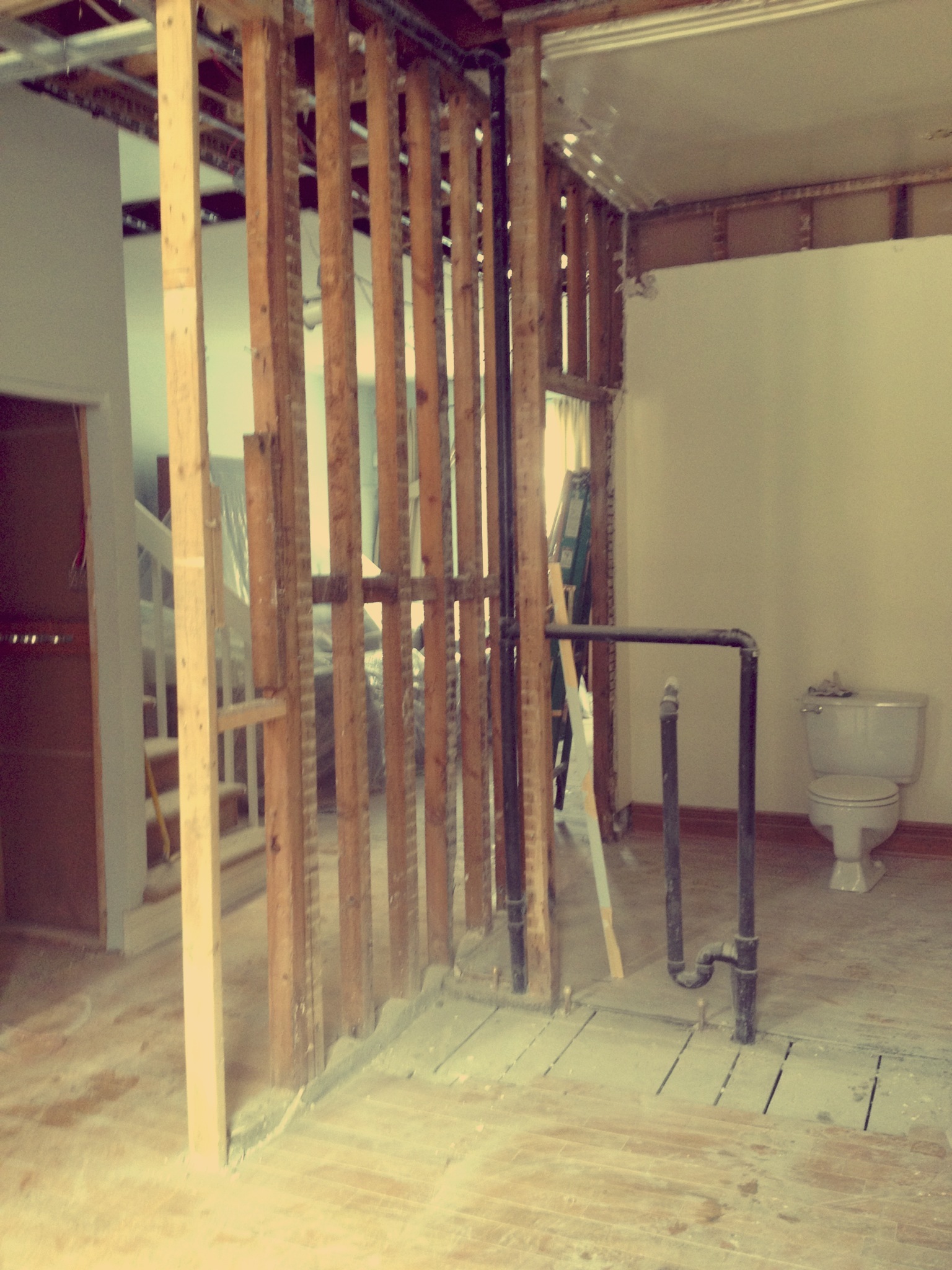
IMG_0865IMG_0868IMG_0869

Walls coming down.

IMG_0930IMG_0933  Beam is up.

One of the big surprises that came up was that the house’s existing structure was pretty shaky. Something you can’t know unless you open the ceilings and floors up. Because we were doing work in the basement/crawlspace and we were opening up the ceiling towards the second floor, we were able to see just how iffy the previous renovations were. Fixing these problems meant adding a couple more beams along the staircase ceiling. So yes, my clients had to invest more money into the project for the stair beams, BUT, and this is a big but, we were able to give them a way more solid & safe construction than they previously had.

IMG_0931IMG_0932 

The new beams around the stairwell. The plumbing stack you see in the centre was moved and tucked into the wall.

Windows:

Once the beam was up and the walls were torn down it was time to build new walls and add new windows. The small former den window was becoming a 7 foot wide by 8 foot high patio door. The former kitchen window and backdoor were becoming an 8 foot wide by 5.5 foot high window (2/3 fixed and one openable 1/3). We wanted an industrial look for the patio door and the large dining room window. We went to Alumilex. They had the style we wanted, they very patiently put up with me changing the dimension of the patio door 3 times, and more importantly, they delivered on time.

IMG_0869 IMG_0871 Old openings in den and kitchen.

IMG_1046  IMG_1047 And new. Love.

Floors:

Challenge# 1: the existing hardwood was different room to room which can be fine if you have a bunch of small rooms. Since we were tearing down walls to create a large open space, we would have had a hell of a job matching the different floor boards. Challenge #2: my clients wanted heated floors in the kitchen. You can’t put hardwood over top of radiant heating. Tile, cement, or engineered wood flooring is the only thing that can go on top of heated floors. I had been toying with concrete or even tile in the kitchen but as the space was so long (25′!!!) and as it was open to the dining and living rooms, the seam or connection between the spaces kept bothering me. How would one space blend into the other? It felt wrong to try to open up the whole ground floor and then to create such delineated and separate spaces with the flooring. And then we met Sébastien Boucher. Recommended to me by two trusted sources, I checked out his company Monticello Floors. I was worried that he only did fancy mansion style floors at first but when I showed him some Pinterest pinned floors that I loved, not only did he get it, it turns out that he actually had designed some of those pinned floors himself!

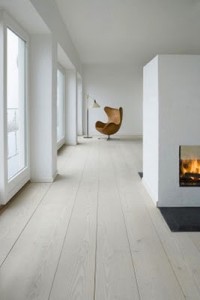
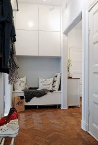
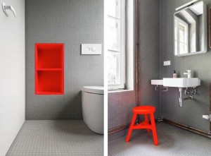
What we were going for:

1c25aa68157ea0d73f8931ac91a4f50a2c243315_me87fb9e9b49fe4afc823ceae8e16ea57WO107_660x980_330_490_c1denisendinesen81be94b34af48ed4fb4fbb2a89da13320

Sébastien had a solution for our heated floor challenge, a solution I never thought I’d agree to. He proposed doing engineered flooring in the kitchen that he would match with hardwood in the rest of the spaces. He was sure he could match it but the hardwood was pretty expensive. And then through a contact of his, he found a lot of engineered flooring for the whole space that he thought would do the trick budget wise and look wise. Now if you’ve ever seen engineered wood out in the world, it can be ugly and cheap looking- kind of great for basements but no way would you put it on the main floor of your house. Well this version was nothing like that-it was perfect: rift cut white oak engineered wood in longish, wide-ish planks. This meant that we could put radiant heated floors throughout the ground floor, and no one would ever be able to tell it wasn’t hardwood. And, we’d be getting rid of all the base board heaters! AND, more importantly the wash/stain he was applying to the floor along with the mat varnish he was putting over top was going to give us exactly the Scandinavian look we were going for. I love working with people who know what they are doing. The floor was a total score.

IMG_0866 IMG_0954 Samples of the flooring. 

Stairs:

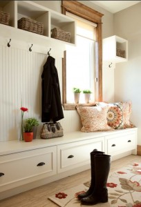
The stairs were another big challenge going in to the project. We were not only removing the existing stairs but changing their orientation. We wanted something airy and open but industrial to match the look of the new windows. We couldn’t do floating stairs as the clients have two young children and they needed to be safe. Our inspirations were the following:

1b8b39006e6a4aba47f278c52799faab 3df90db9e2f2a0f5bdbbb25a12ad152a 7df6daa2995f2280fdb82eb7fff88ed0

I liked the black mat steel which would work nicely with the windows. I loved the idea of a mesh guard that would protect little ones, let light through, and look cool. I liked the idea of bringing oak into the steps and hand rail to warm the thing up and tie in to the ground floor.

The demolition of the stairwell went something like this:

IMG_1208  IMG_0931

Based on some rough sketches I did and a compilation of our various inspirations, our draftsman Michel drew up these 3D sketches for our welder to work from:

IMG_1062IMG_1061

The new staircase will look something like this…

Paint:

I want the whole thing to be bright and airy and soft. I have chosen my beloved Oxford White for the ground floor open areas-kitchen, living, and dining. And I chose Horizon for the powder room and laundry room-which will look great with the floor tile and the pops of colour in each of those rooms. Both colours by Benjamin Moore.

eefe3802b5362aa00a1c1dd7a9c72ccd 8f46ced2ec89a43a894b12ad5af87b4a

Oxford White CC-30 and Horizon OC-53

The team is now busy plastering and sanding and painting away. I am looking at fabric for dining room and kitchen banquettes. We have chosen our lighting. The tiles are in. The kitchen gets installed next week and the stairs get installed by Monday, fingers crossed. The built-in cabinetry is being built off site as I write this. It is really full steam ahead. We are hoping to be almost totally done by the end of next week. Fingers crossed. It is so satisfying seeing this project come together. I feel like we are accomplishing everything we set out to do. There has been very little compromise, very few drawbacks, only teensy tiny blips, no tension. Kind of a dream come true. I will miss working for these lovely, design-concious, wonderful clients. I really really will. I need to convince them to let me tackle their cottage next…

May is looking way way up compared to horrible April. Can’t wait to show you all the finished project. And I can’t wait to see it all come together. Stay tuned!

xa

Comments { 0 }

Mile End Project Part 2: The Design

Holy smokes! I totally lied when I said this wouldn’t take me weeks to write! Life is just getting away from me these days… Anyhow, here is part 2 of my Mile End Project.

After figuring out the layout of the space and the overall direction of the design( see my previous post ), it was time to start locking down the look of the interior spaces.

The ground floor layout plan:

Plan Entrance opens into a mudroom. Once you enter the living area proper, there is a powder room to your left and after that it is wide open kitchen, dining, living room. Laundry room is accessed through the kitchen. The stairs configuration gets changed so that you now end up in the living room.

PlanThe Kitchen

My clients and I started talking about the biggest change to their ground floor: the new kitchen. The husband in this couple is a great home chef and loves to cook and entertain. His current kitchen is small with virtually no counter space. His kitchen gadgets, mixers, sous-vide machine, tools are all tucked away under the stairs, next to the vacuum cleaner. This would not do. I worked on a basic layout idea: everything along one wall, all tall pieces like the fridge and pantry grouped together, all low items like the sink and counters and stove together, and a big island work top in the middle of the room. And then we went to Cuisines Steam. Steam is a GREAT kitchen design company based in Montreal. A small firm, they manufacture all cabinetry in Quebec and they have beautiful products. Their kitchens are so well thought out- every detail meant to make your life easier. I have worked with one of their designers, Patrizia Giacomini, on multiple projects and she is a joy to work with. She has great taste, will work within my clients budget constraints, and is all around lovely. Obviously these kitchens aren’t for everyone’s budget but if you are serious about cooking and about design, this place can’t be beat. I can’t gush about them enough! After showing Patrizia some Pinterest inspirations and giving her our measurements, we worked together to come up with a beautiful and functional cooking space.

kitchen view4kitchen view2kitchen view3kitchen view1

There are tall pantry cabinets and dish storage next to the fridge after which is another tall cabinet holding more storage and the microwave in the middle shelf. After the tall pieces comes a small counter with 3 drawers, the gas range, more counters and drawers, a large 30″ sink with storage below, the dishwasher, and an integrated bench with a niche style shelf above for everyday dishes. Tons of storage. Tall pieces grouped together. Easy access to everything. A functional, ergonomic, and beautiful kitchen.

The cabinets will be a light grey- Sico, Ciel Obscure. The counters will be a 1 1/4″ white quartz with no speckles in it (I HATE SPECKLES)- Silestone in White Zeus.

I really wanted brass accents and at Steam, Patrizia showed us these great handles and it all clicked into place.

744566f0f91fd3d9b9060da3524bc53a a6e6f7d88203dae538bbbbe06e08ef85

Brass and wood accents with white quartz counter tops. Lovely, classic but still modern.

We hesitated a lot for the backsplash and while shopping for a different client I came upon the perfect option and my clients fell hard for it too:

IMG_0769

A classic white marble beehive. I generally choose Carrera marble but this Classic White is so pretty and soft and will look stunning on such a huge expanse of wall. I CAN’T WAIT TO SEE IT UP.

A note about marble: because marble is a natural stone it can stain with contact to acid, like lemon juice or wine or vinegar. Things that do come up in places like kitchens. That being said: I love it. I think if you seal it properly every few years, you’ll be fine. I think that if you don’t leave a half a lemon face down on the marble counter for a week, you’ll be fine. I don’t think anyone installing marble in the thirties in Paris or New York cared an ounce about how it was a living stone that would most likely stain one day. And I think they were right because it is gorgeous. I think that a natural stone is prettier than a pretend stone. I think that especially in small pieces like these 1″x1″ ones, you’d have a harder time seeing a stain than on a large marble slab. I think that life is messy and if you can’t handle the occasional stain then you will have a hard time. I think that when you have kids you need to not necessarily embrace the mess but learn to live with it. And I love the look of it. I just do stained or not!  So there you have it, my marble rant in a nutshell!

That being said, to resolve the potential occurrence of  stained marble around and behind the stove top, we will install a sheet of stainless. All good.

The island is huge and will provide tons of storage. There will be a utility sink there and a lot of prep space. We are adding a wood block to one end of the island which carpenter Chris Swansey is building for us. On the left is the inspiration pic and on the right is kind of what the wood will look like minus that base:

a1d8b1c06f858da3f372a6b4467111ab   IMG_0791

This space will give the family a designated eating area and will break up the textures in the space. 

The integrated bench is inspired by these references:

6686897915efa9b5b7736c3a88e492d7  74ba7de70c1d0012679f6cff85d32d6d

I love the idea of there being a cozy nook in the kitchen for looking at a recipe book or reading with a child. Or just looking out the new giant patio doors we are having made for that spot.

The Powder Room

This space is not huge, about 6’8″x4′ wide. The main design lines are: having one poppy wall behind the sink, small tile on the floor, storage behind the toilet. A cute, functional space that lets you know right away that these are people that care about design but aren’t too precious. I think we nailed it with this design:

IMG_0656

A wall mounted toilet makes the space look bigger as does having a sink without a vanity. The shelving and wall behind the toilet hide the tank and provide storage. The door will NOT be red but may be another fun poppy colour. The tile behind the sink will be an old favourite from Ciot and the floor tile from Ramacieri Soligo will be carried through to the laundry room.

pixel tile IMG_0794 wall tile, floor tile.

#2318650000 HAPPY D.2 + CONSOLE#2221090092 HAPPY D.2 TOILETTE MURALE Happy D.2, by Duravit.

powder room

powder roomLove this little powder room: modern and fun and family friendly. Grey and white and big pops of colour-totally my style.

Laundry Room

We are going with cute and functional here too. At 6’x 7′, it is a decent size: large enough for the side by side washer/dryer my clients’ are keeping. There will be shelving. There will be storage. There will even be a rod to hang clothes up on. Here is the design:

IMG_0655  A great little space that serves every purpose it is meant to serve.

The floor tile as previously mentioned will be the same as the powder room and the niche holding the ironing board and future brooms etc will be in a penny-round Chicago tile from Ramacieri again.

IMG_0831  I love this combo! With the dark grey appliances and wood shelves, this will be so cute. Just because you are in there doing dirty laundry doesn’t mean the space can’t be lovely!

So that, my friends, is what I have been up to in the last while: firming up the designs, researching the materials, taking it from inspiration to design to real life. Check back in soon for pictures of the massive demolition that is currently happening to make these designs a reality. My big upcoming challenges are the stairs and the floors as well as the built-ins for the mudroom and dining room. This is so much fun.

xa

p.s. I LOVE THIS PROJECT AND I AM TOTALLY UP FOR THE CHALLENGE!

Comments { 0 }

Mile End Project part 1: mandate & layout

First of all, I’d like to apologize for the ridiculous amount of time it’s taken me to write a new post. I really think about this writing business a lot, I take it very seriously, and don’t like to half-ass anything. I’ve been sitting on the idea for this post for a long time but have been so busy with IT all, that I was worried about doing the project and the post justice. Finally, today, after getting my clients blessing to spill the beans, I thought it was high time I wrote about the behind the scenes of this great and exciting home renovation I have been working on. So here it is: Part 1!

In late fall, my friends A+S contacted me for a consult at their Mile End home. It was originally a duplex and was converted into a single family home before they purchased it. This is a warm and cozy home. Although the space was comfortable, it was quite tricky space-wise for a family of four. You walk in to a tiny vestibule then into an open space and immediately to the left is a closed play room/library. After that is a closet, also on the left. Then, a large bathroom/laundry room – again on the left of the house – followed by a den. The left side of the house is basically a series of closed off spaces. On the right of the house is a dining area right at the front, an open living area, a massive staircase going to the second floor and, behind the stair wall, is the little kitchen. Below is my super rough-eyeballing-the-dimensions-sketch of the existing space and some pictures of the ground floor care of my contractor, Terry.

IMG_0819 Rough sketch of the existing layout

IMG_3037  Vestibule and a peek into the playroom/library

IMG_3036 Long wall of doors and view of staircase

IMG_3038 Bathroom/laundry room

IMG_3035Den with view to the front door

IMG_3034Kitchen with view to den

When they approached me it was to ask my opinion on whether they should build an addition at the back or open it up in some way. Now, I love me an addition! When done properly they can look so very cool. But you resort to the expense of an addition when your home has a tiny footprint, when you have no choice but to grow out or up. In this case, the house is a good size but you wouldn’t know it because of all of these closed rooms. And as parents to two young kids, how frustrating would it be to be in the kitchen while your kids are at the opposite end of the house in the playroom and your partner is in the living room? This is a family of four that due to the awkward geography of their ground floor were being split up constantly. So my advice? OPEN IT UP! Not everything exactly, but get it to a place where you can be in the living room and you can see the kids playing and you can see your spouse in the kitchen.

I do love an open plan space but realistically you need storage, and you still need a laundry room, and you still need a bathroom, and you still need a designated kids area. Here are the boxes that needed ticking to make this design work for my clients.

The mandate: Remake the ground floor of the home into a bright, open, practical space

The Entrance: The vestibule is teensy and they need to walk into the house and a good ten feet before they hit a closet. This means that strollers stay outside, rain, snow, whatever. It means that boots are everywhere when you walk in. It means that the bench after the second door into the house is a pile of coats and mitts and hats. Basically, it is chaos. They need a larger entrance, storage, a mudroom of sorts and a closet that can be closed off.

The Bathroom: They are blessed with a large bathroom for a ground floor, but that’s because it does double duty as a laundry room too. So your guest goes to the bathroom and gets to see your piles of dirty or clean laundry. Not the end of the world but it means that when you have company, you need to make sure all laundry is done and tucked away. And one disadvantage to the large bathroom is that it ends up storing many non-bathroom things. They need a powder room and a separate laundry room.

The Dining Room: It can not be in the entrance! The kitchen is so far away! Your baby spills food all over and you have to run to the other end of the house to get a cloth. You drag the peas and carrots all over the house with you. Your guests are tucked into a corner by the door. They need a dedicated eating space, preferably next to the kitchen.

The Kitchen: The husband in this couple is a real gourmet – a food lover and great cook. They both enjoy hosting and having people over for dinner. Their kitchen has minimal counter space, decent but older appliances, and poor storage – especially when you want to fit in all the small appliances that a home chef would want to have. Right now, all of those appliances are tucked under the stairs in a closet along with cleaning supplies, pots and pans and wrapping paper. They need a larger, more modern, more practical dream kitchen.

The layout: Knock most of it down!

Working with Michel, our 3D plan guy, we came up with a new layout for the space, one that would solve many of the problems with the existing space.

IMG_9683  IMG_9684

Our first round of layout sketches (the layout plan is more in line w/ the design than the 3D sketch on the right)

My first thought was to blow out the left-hand vestibule wall, take over part of what is now the playroom and turn this new space into an entry/mudroom. This way, not only can the clients walk into a heated floor, tiled entrance but they have ample storage with a closet at the far end and a wall of hooks and benches and storage. Also there will be room to wheel in the stroller or hang the sled or the kiddie bike up too. Something like this:

c6bba29ab5cc1ffddd92855526623dbdd1539cb1038ab1dfd63124266350c063e5561c595f1bf64f8c3639d6ea9e3258

The other half of the playroom would now become a powder room, accessible from the living space. On the other side of that would be a new laundry room, accessible from where the new kitchen will be. This way, the ground floor bathroom takes up less potential living space then before and can be solely a powder room. And the dirty laundry never ever needs to be seen, unless the hosts want you to see it. The new laundry room becomes a utility room as well, where the brooms and vacuum can live. Following is some of the design inspirations for both spaces.

da75fac3431a9f797c41e118f6d0979c707333b2f28ca90776fe2308c2c53a6b9e414f5a05e31552484e61b4b1fb9d26

Small bathrooms with punches of colour & smart storage solutions

09c50bdebdbaf13b138a5904d4ef0275 0c6121ff708af9677a87942223b792711038f01104d06a6deff9998cc1cc21b1

Cute & functional laundry rooms

The sink wall of the powder room becomes the last wall of the front of the house. After that point it is all kitchen! We are giving the man who loves to cook and entertain over 25 feet of kitchen. Everything will be in one long line against the Southern wall of the house, with a large island in the center of the space. We are changing the rotation of the staircase as well so that we can open up the entire underside of the stairwell. This means that you won’t be coming down the stairs and hitting the island, you’ll be coming down into the living room. We are also opening up the back wall of the house and where there is a window in the current den, there will be a huge patio door in the new kitchen.

Penelope-kitchenwide 7a10dae47764852abf2d019aa954b60f 6686897915efa9b5b7736c3a88e492d7 a1d8b1c06f858da3f372a6b4467111ab 86c17b0887fa2fb3e20c4f6ba126562b f78d125646014364150e4e4838ae0bc5

Some kitchens that inspired me along the way.

Finally, where the kitchen now stands will be the new dining room. We will turn the door going out back into a giant window, same width as the kitchen patio door but not to the ground. With a built-in banquette and maybe some wall storage, this room will be bright and functional. You’ll also be able to see the dining room right from the front door because we are opening up the stairs and removing the visual barrier they were creating.

60976db3282c22c1b3b8e1a0cbccf4f4 66494fbf13a16cfcbd061fc5aa44bf09 a1aef637e0f06456bd48f077437c9285

So there you have it! I am loving working with these clients/friends. They are super into the design. They care about the way things will look. They have good taste. And most importantly: THEY TRUST ME! I can’t describe the joy of a respectful and honest back and forth. You will never always agree with everyone or have everyone agree with you, but feeling confident and having my clients total confidence is downright awesome!

So please stay tuned for Part 2 where I’ll give you a sneak peak at the approved kitchen, bathroom, and laundry room designs. I promise it won’t be weeks from now. Pinky swear.

xa

Comments { 0 }

Dr. Penfield Project

In late December I started working with a former client of mine . We worked together last when I was pregnant with my youngest and he was a bachelor in a great apartment downtown. Today, my youngest is two and a bit and my client’s girlfriend of two years is moving in. He called me to help him change up some of his furniture which has started to seem dated and to create space for his girlfriend’s move. Specifically, we are looking for a new dining room table and chairs, some bar stools, a new desk for him, a better desk area for her, and a few carpets. There are areas of the home that need attention. The entrance is almost there but still too impersonal; the dining area needs love; the bedroom feels like a hotel; the office area is dark and needs brightening. My goal is to warm these spaces up and bring the apartment from “bachelor pad” to “grown ups living together in a nice, bright, welcoming pad”. Luckily, we are starting with a good base: my clients have good taste, are open-minded and they have a budget that allows for quality. Trust me this does not happen every day!

Let’s take a closer look…

 The Entrance      

 IMG_0118

856-scene-3-full   +   SI3334-Jielde-1

Two years ago I had this gorgeous wallpaper from Marimekko installed in the entrance. We bought the red Jieldé lamp and that great marble table. But the space still doesn’t work: the rug, the plastic boot mat and the wall of mirrors are really dragging the space down. Not to mention the umbrella holder. My first change will be to have the wall of mirrors removed and replaced with a large, framed mirror. Something like these ones:

img56clinea-floor-mirror

We will then need to find a new shoe/boot storage system, a runner and an umbrella holder, maybe something like this?

a45048b421cf048c53345c730faeeb9f+  trellis-natural-indoor-outdoor-runner+85885ac2f91d4c24ca6d8a7b8f6064a1or chelsea-umbrella-stand

The Dining Area

IMG_0111

Though the round shape of the table makes sense for the space, the chairs are too big and round and the round light fixture means that everything has the same shape. Also everything is see-through: glass table, plexi chairs, glass globe. I really believe that mixing shapes and textures makes for interesting, eclectic, and inviting design.

I want to bring in a rectangular or oval wood table. The kitchen is a deep honey coloured oak so I think that the best option (so that everything isn’t too orange or brown) is to go with either a painted wood table, stained wood table, or with a  bright lacquered option. Something like this:

prod2480660_av1 prod150067_R12 c7d474ca9882a0e25efac4686e6695abc1605f8861183f9f0c7fdf68a96af612parsons-white-top-60x36-dining-table-with-stainless-steel-base

As for the chairs, I was originally thinking a version of the Wishbone chair would be great. I love the vibe of the painted wood or lacquer table with that particular chair. But then last Sunday, we went shopping on Amherst street here in Montreal. This is where you’ll find a smattering of vintage furniture shops. At Antiquités Curiosités we stumbled upon 6 (so rare to find 6 of these!) beautiful mid-century danish design rope chairs. The shop owner said that they were Poul Volther designed chairs. They look like this:

 IMG_0515     IMG_0518   il_570xN.469883654_fzx2

Such a score! And almost half the price of those listed at that Etsy shop pictured above. Yay!

I’m going to add two upholstered chairs for either end of the table to keep it eclectic and soft. Maybe something like this?

d13142fa26600bf4316594a2dd081102ea34b7cfde20a2f27314fa0e2127b58d

All that’s left is a rug to cozy things up and the dining area is complete. We were looking at some neutral wool and jute blends from Lalonde et Fils. Like this:

IMG_0531   IMG_0532

The Bar/Kitchen Area

IMG_0113

I have a serious hate on for this angled, jutting island. So does my wise client. I want to chop it off and put a stand-alone piece of furniture (with a butcher block top on it maybe?) in it’s place. Something industrial to break with the kitchen a little. Maybe stainless or copper? And we need to ixnay those bar stools for real! Something poppy and bright and fun would work. Something like:

16-gauge-advance-tabco-tag-243-24-x-36-open-base-stainless-steel-commercial-work-tableor7f867c7c4b7eac4d167d5724c6a5a543 with714e740e21406ae46d64dc7742033e51orcounterstool1_orange_large

The Long Empty Hallway

IMG_0119   

This hall leads from the main entrance to the bedroom. It is a little over 12′ long and has zero visual interest. I want to warm it up and pop some art on the wall and a runner on the ground.

70e4ef537bc243745b0fe0648848be67  this vibe 3008e9cbc3b09a14b5d458de533a06155f42b73d6783938c5c214677ac09f559

The Bedroom

IMG_0126 IMG_0122

We will start with painting everything white. Crisp, clean and warm like Oxford White or Simply White by Benjamin Moore.

eefe3802b5362aa00a1c1dd7a9c72ccd f990d1eb17ca73d8b1c6e28db742bc7f

Next we will get rid of the nightstands, the lighting, the long piece of quartz on the bed unit. Maybe wallpaper or paint above the bed. We will add rugs and nicer, less bulky nightstands. Bring in more wood and natural, warm textures. This room needs to go from fancy, cold, hotel room, to chic, eclectic, and inviting bedroom. More like this:

ee6e8d3653bcc8879d41f3ca82e5315e424a07cbab1a78041c2bac66a77b788ece1ca65968d5d9281c356eb3aec26b47

The Office -her

IMG_0120   

This work space needs a complete overhaul. My client’s gf will be taking over this space and I need to brighten and soften it all up. I’ll keep the same desk idea (she needs as much desk space as possible for work), but I’ll paint it white. We’ll get rid of those dark brown melamine cabinets and look for white storage solutions. We want to go from drab to welcoming. And I think we can take it from the picture above to these, below, pretty easily:

606351d8ae2aa125b649e9b07d15748b32d5193403155d0cc77829b65fd921ce965386fecae5d14bcd15cd7c4f68d1e6

The Office -him

IMG_0124

We are going to take this random waiting area in the bedroom and make it into a home office for my client. Though the chairs hold sentimental value, they serve no real purpose- other than to dump stuff on which is really the case the minute a chair is allowed in a bedroom. It is most definitely like that at my house  anyway. The chairs and rug will go and, instead, I’d like to bring in a nice vintage or vintage-inspired desk. Again the wood will serve to warm the space up. Also vintage furniture is, in general, quite fine and delicate. It won’t be big and bulky like those chairs! Sorry 😉 Below are images that are inspiring the direction I am going in:

426c7884ada91c0eef472da2f9ab154a4f3cfdc485f54453ae2d8afaf1f8cb386a0eab6e8856064a7f1120bb7cf0348a

I am super excited about where this project is headed. I am grateful to be getting the opportunity to transform this whole apartment room by room. I think the choices we are making will most definitely add warmth, character, and light to this former bachelor pad. You need to balance all of the glass and metal and laminate with something warmer. And bringing wood and textured carpets and art to this place will really do the trick. We are hopefully creating a great space for this couple to build their future in. So fun!

xa

Comments { 0 }

Getaway #3

Happy New Year! My 2014 started off just right. Lots of lovely family times, friends over for impromptu dinners, playing outdoors, and tons of kiddie dance parties, fort building, and dress up. I have gone sledding more in the last two weeks than I have in my entire adult life and I loooove it!

Though most people have been back at work for a week now, I am officially back today. Which is not to say I didn’t work a little throughout the holidays, cause I totally did. But our restaurant closed on January 1st for a two week break so we had last week off and we took a mommy and daddy mini vacation. After all the family time over the break, as lovely as it all was, the hubby and I desperately wanted a little time off, for just the two of us. And though leaving the kids behind is still pretty hard for us, sometimes I think you really need some space, to make you a better parent and a better spouse.

I have written before about mine and my hubby’s deep love for Vermont. We love the food, we love the scenery, the people are lovely and above all the hubby loves the craft beer. So given all the love, we decided pretty last minute to run away to Vermont for 24 hours. We dropped the kids off at daycare and started driving. After a little bit of in-the-car research (Gosh, technology can just be the best!), we headed to Winooski for lunch. Misery Loves Company is a great little restaurant/bar serving lunch and dinner. After some hesitation because everything looked so good and we were starving, we settled into our window seats and enjoyed local beer and cider and some delicious eats.

IMG_0334IMG_0335IMG_0333IMG_0327 IMG_0328

Unassuming design but with all the right details. Love the floor and the chairs were especially beautiful.

IMG_0330IMG_0331IMG_0332

The food was really nice and bright. The winner was the cauliflower dish on the end: fried & covered with lime, fish sauce, a carrot relish and some spice. I could have this every day.

After lunch and the necessary stop at a beer store for E, we drove the 15 minutes to our hotel, The Essex Resort and Spa. There is a great deal there from Sundays to Thursdays with the rooms under a 100$ and free use of the spa facilities: gym, pool, outdoor hot tub, steam room and sauna. Also they give you the most comfortable and fluffy robe to walk around the spa in. The hotel itself is nice and comfortable. Not the best or most modern design but totally decent and everything is of nice quality. One of us went to work out (not me) and one of us napped for a while (YES!) before meeting up again for an outdoor hot tub soak. Lovely.

IMG_0347   IMG_0346

The grounds of the Essex are very pretty and looked magical at night.

And then it was off to Burlington for dinner. This was our first dinner date in a while and it was a doozy. We had wanted to go to Hen of the Wood in Waterbury for a long time, having heard only wonderful things. But the kids were always with us on these little trips and it felt like it would be wasted on them or stressful if they were there. They are, in general, fine in restaurants, or as fine as a two and four year old can be. But this is the kind of place you want to sit in for awhile, a meal that you want to linger over, that you want to pair with a glass or more of wine or beer. Kids don’t do linger very well. In October, the owners opened a Hen of The Wood in Burlington, closer to where we were staying overnight.  What a lovely evening. What a great meal. And the service was just stellar.

While the Waterbury version is in a 200 year old mill, the Burlington one is in the Hotel Vermont, a modern, new construction. The design is great. Dark, cozy and very welcoming. There is a nice big bar, a fire place, tables in the middle and along the sides, and a counter overlooking the kitchen which is where we were lucky enough to sit. The space was designed by  Scott Kester, a New York designer of many well-known restaurants. It is rustic but modern, without that film set/ farmhouse /exposed barn wood look that everyone is doing. They do have the barn wood but also deeper richer woods and plywood too. And they do have a wall of logs but they are used by the cooks at the wood burning oven. Design touches that serve a purpose: that is my kind of design. Decorating for decorating sake is the worst. When you do that, especially in a commercial space, is when you end up with a space that looks like it was decorated and overdone, a film set. Touches of leather and dark walls make the place feel like a private club not a cliché mountain lodge. It is hard to do a space that is both modern and rustic and that doesn’t feel cold or too decorated. The space has low ceilings and to de-emphasize that and to have it work to their advantage, they built a plywood triangular grid, that draws your eye up and that makes the space feel bigger. This place hit all the right notes and they clearly had the budget to do so.

IMG_0354IMG_0353IMG_0351IMG_0357IMG_0358IMG_0356

Coming in from the cold we sat by the fireplace and had a drink. They brought us some gorgeous ham to nibble on, really one of the best things we had all night. I am a sucker for a fireplace and I was immediately won over. They then seated us at the counter more or less directly in front of their wood burning oven. So much fire! Not only did we have a firsthand view of the prep and cooking and expediting going on, but we could almost forget that it was January outside. After shedding some layers of clothing, we settled into our perch and our delicious meal. The Hen of the Wood people are really at the vanguard of the farm to table food philosophy, one that we especially appreciate given that is what we try to do at Lawrence. And full disclosure, they knew where we were from and had been to our restaurant which could explain the extra generosity perhaps.

IMG_0350IMG_0360IMG_0361IMG_0349IMG_0348 

The menu, carrots roasted and pickled with ricotta; Treviso Radicchio with blue cheese, pecans, apples and buttermilk; a plate of mignardises that blew me away and some delicious Vermont cheeses with a gorgeous cheese case at the end of the bar, beckoning us throughout dinner.

The best dish of the night went un-photographed, mainly because I was too busy stuffing it down my throat and also because I got swept up in the deliciousness of it all: lamb sausage and house pappardelle with aged goat cheese. Divine. Maybe it was coming in from a cold January night into a warm, softly-lit place. Maybe it was the fact that we had nowhere to rush off to, no babysitters to relieve (thanks mom and dad!). Maybe it was the company- it had been too long since we could sit and chat unhurried and uninterrupted by little people, and we really do enjoy each other’s company. Maybe it was all that mixed in with some great food and drink. But all of the ingredients made for one hell of a date night. And I can’t wait to go back.

We spent the next morning enjoying the pool (I needed to work off some of that lunch and dinner!)and all the rest of that fun spa stuff (those fluffy bath robes were the best!)and then hit the road, for the short drive back to Montreal and to our babies. Dates and getaways are so fun and so necessary but there is nothing like being on our own to make us really miss our little monkeys. We picked them up from daycare early and squeezed them tight. And it only took about five minutes in the car with them to miss Vermont! So we vowed to go back real soon. This time for two nights!

IMG_0414 HAPPY NEW YEAR!!!!!!!!

xa

Comments { 0 }