Archive | Blog

RSS feed for this section

Face lift

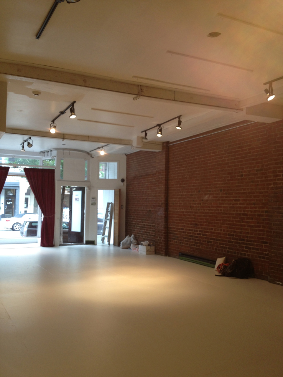
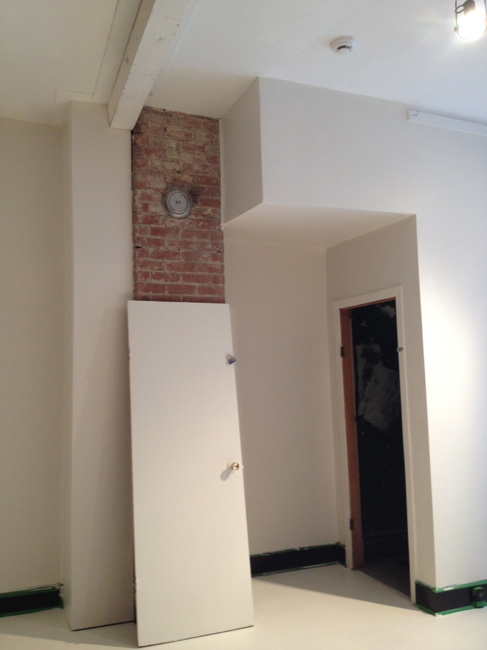
Back to school still stresses me out even though it has been many, many years since I was in any kind of school. Still that specific-to-Fall feeling is all around me. It is busy work-wise as people tend to start planning their spring and summer renovations now. Busy, busy, busy and there is not much time for anything other than work and the kids. And with a cold that just won’t quit, I am struggling to keep up. That being said, Autumn is as good a time as any for home improvements. And the hubby and I decided that we would join in the reno/repair fun along with all of my clients. Good times.

When we bought our little cottage two years ago, the main issue that came up during the inspection process was that the brick at the back needed work. And a bit of brick at the front too. And the window ledges need to be replaced. So we figured that if we were already going to do brick work, we might as well work on the façade and give it a makeover.

First up we wanted to strip our front porch because the paint had started peeling and, really for durability, it would be best to varnish or stain the wood instead of painting it. My contractor had replaced a couple of the floorboards a few months ago and since then, they have just sat there mixed in with the old painted boards, looking a mess.

IMG_9240    IMG_9239

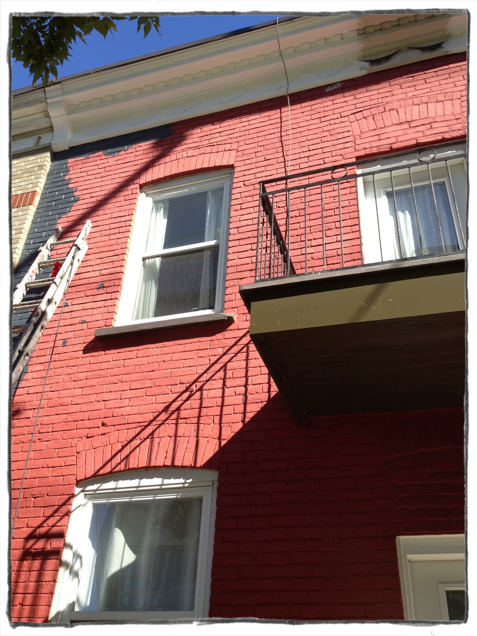
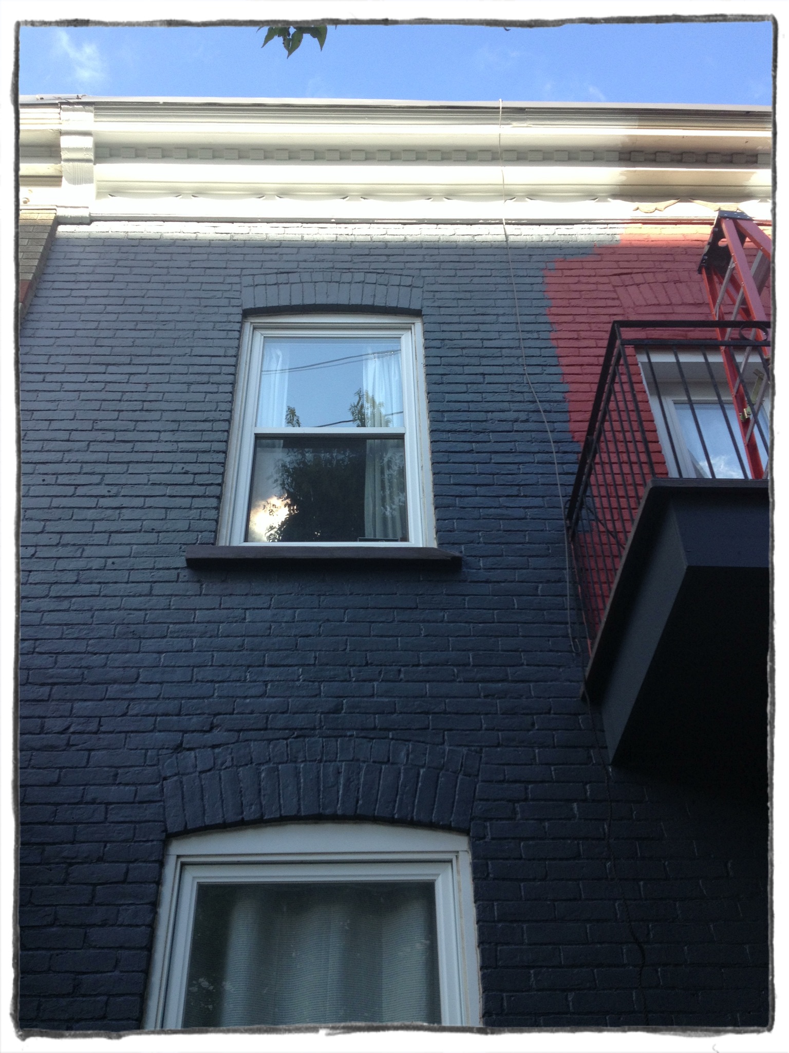
The second job, and the one I have been the most excited by, was painting the already-painted red brick a nice deep grey. The red had always bothered me and the cornice was a dull beige with brown accent. The building just needed some love. Most brick guys will tell you to NEVER paint your brick. It doesn’t allow the surface to breath and is bad for the mortar. BUT, our house is 113 years old and that brick has been painted on for many many years. So we will fix and repoint the bottom of the wall in front and paint the house grey. Proof that I wanted to change the colour from day one: my very first new-home purchase two years ago was to buy these fire-engine red Richard Neutra-designed house numbers from design within reach.

PD_23002_ALT1 PD_23002_ALT3PD_23002_ALT4 PD_23002_ALT5 PD_23002_ALT6PD_23002_ALT7PD_23002_ALT8

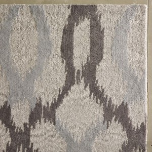
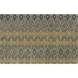
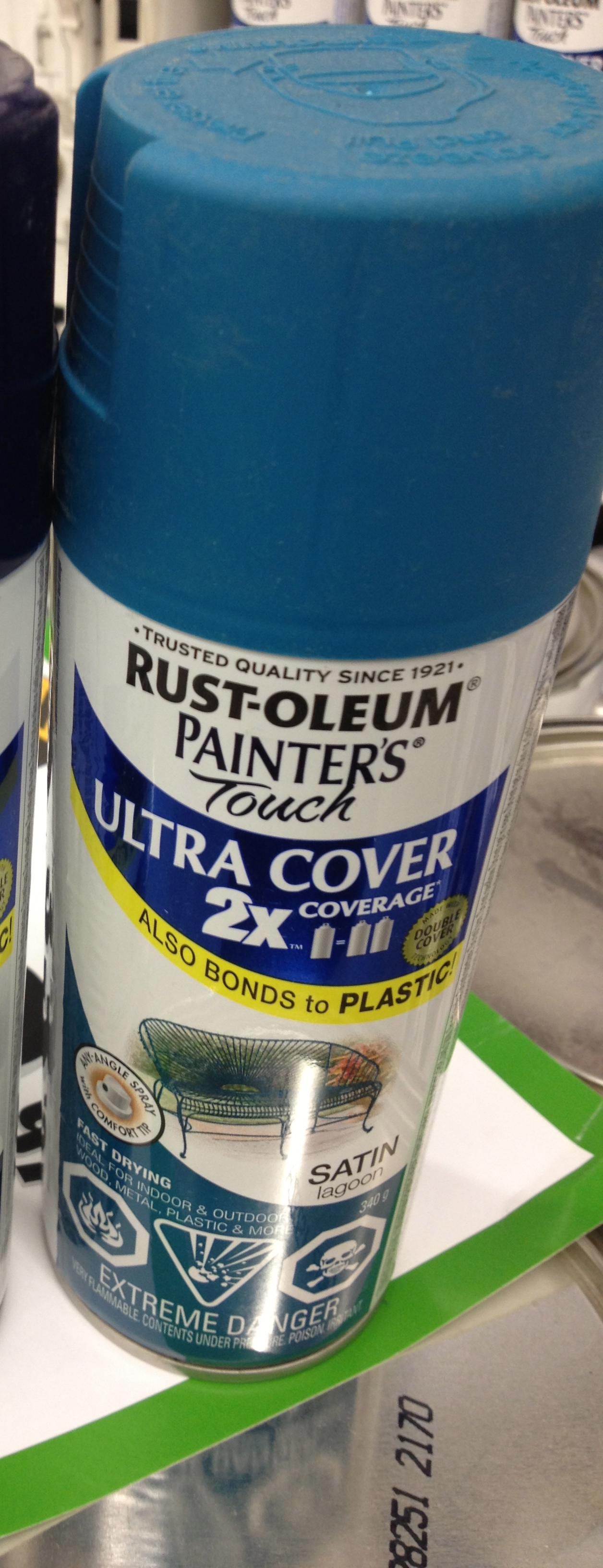
OBVIOUSLY, one would never put red numbers on a red house, amirite? Ha! So the search for the perfect grey began. My finalists were:

2c0a05acd5f4787db9120cff00dae1ab 36e245a92d251f05c3e62e7a01b66bc3 bf5d3d3ee31da2cac2505c56971a166c830005235605525acc12ac17274d9c89

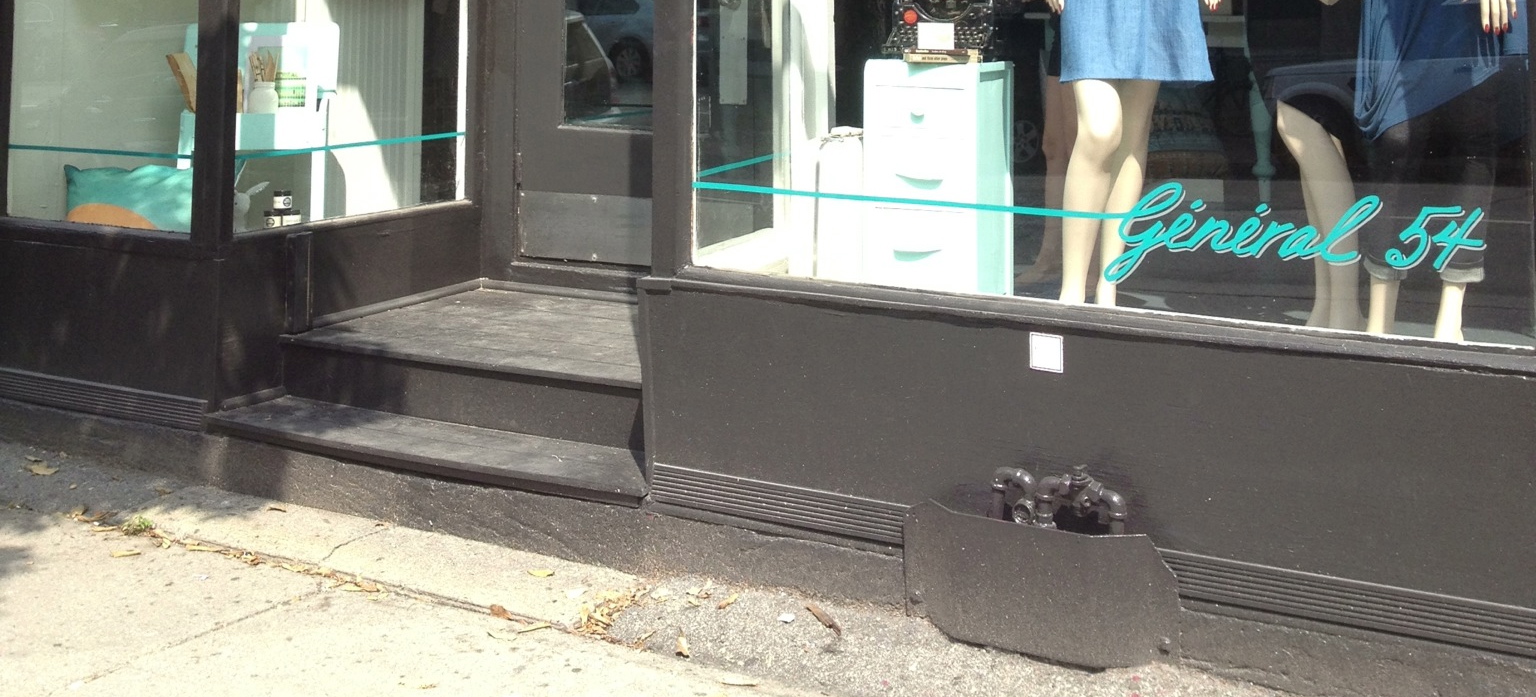
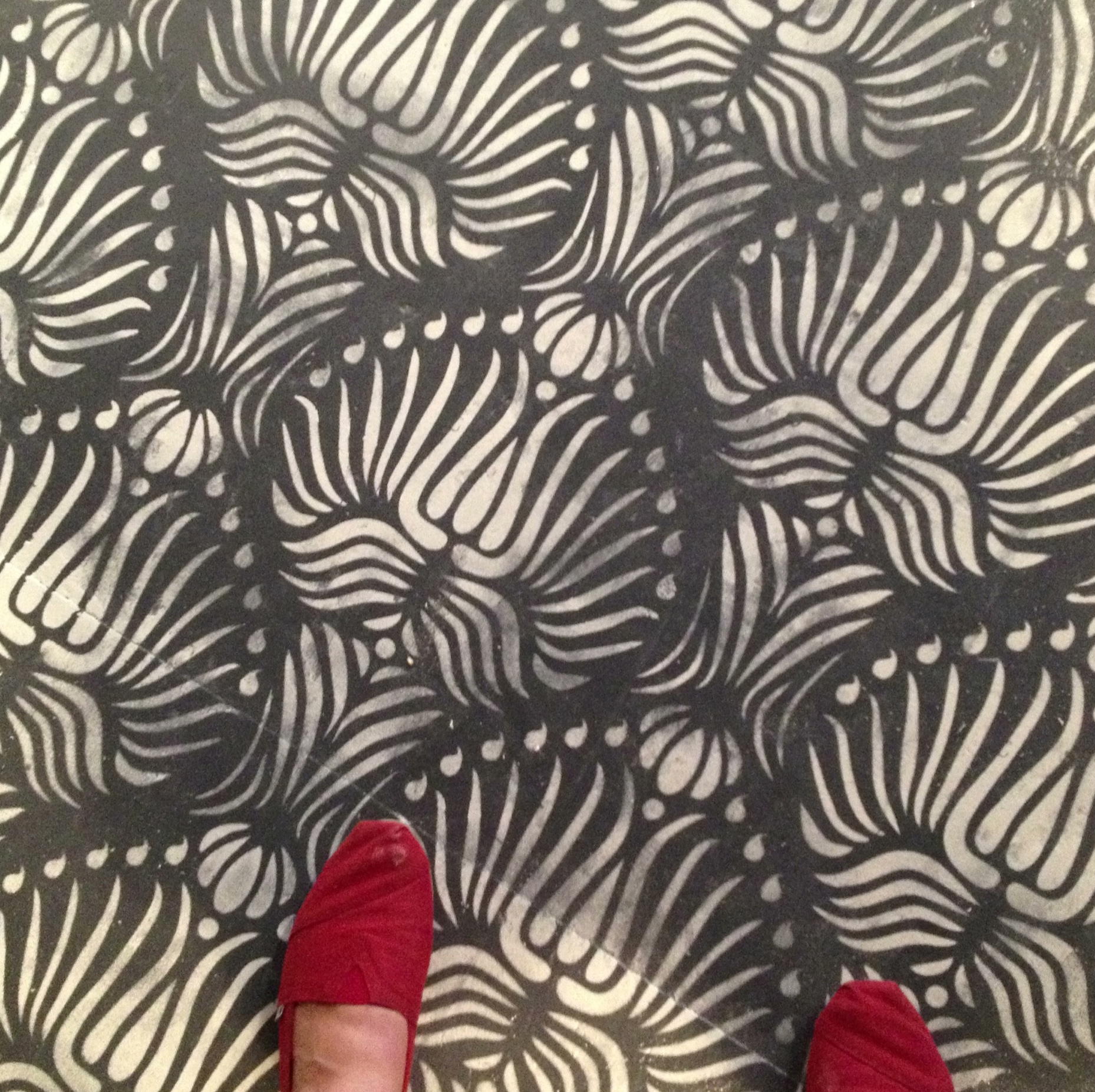
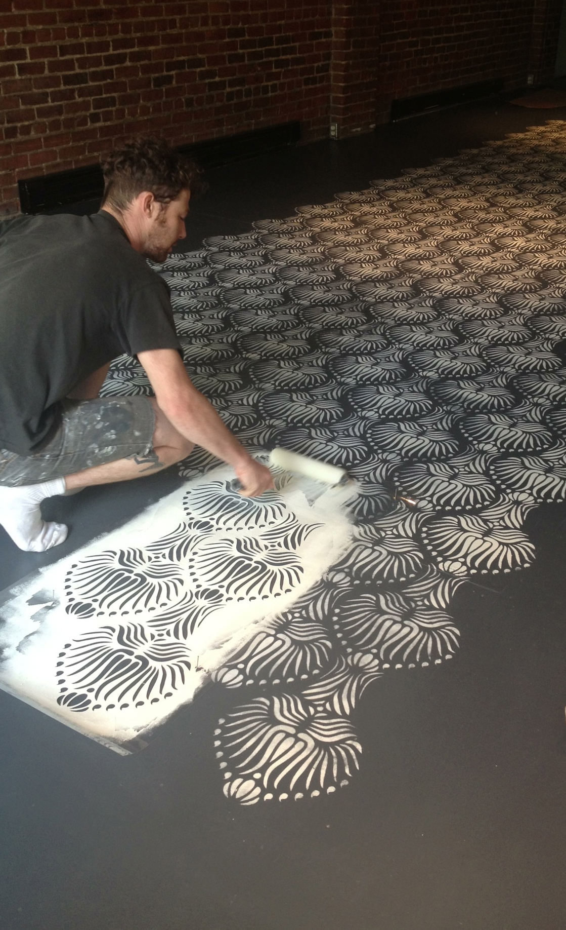
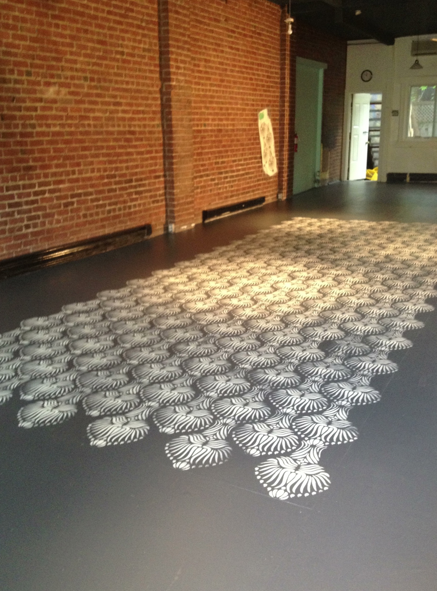
And the winner (decided by Hubby) was my new favourite grey Westcott Navy! The same grey I used for the General 54  floor. I love it. It has tons of blue in it, so none of the purple or brown tones that I especially wanted to avoid here. I also chose my new favourite white for the cornice, Oxford White. It is soft and clean and warm and crisp. The paint started going on today and I have been grinning ear to ear since seeing it on the brick. All of a sudden our little house looks so glamorous. It is crazy what an impact the colour change has made. So simple yet so striking. Walking up to the house now, even with the ladders and tools scattered everywhere, my heart just skips a beat.

IMG_9258 IMG_9270 IMG_9268

Those red Neutra house numbers are going to look stunning here. Can Not Wait.

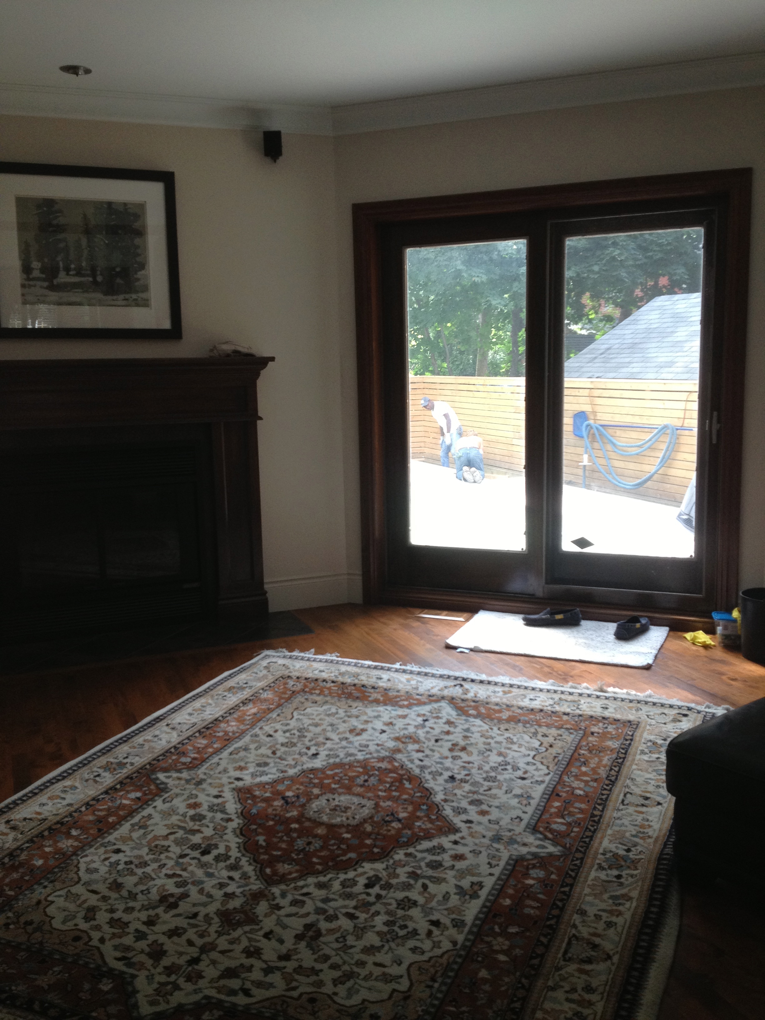
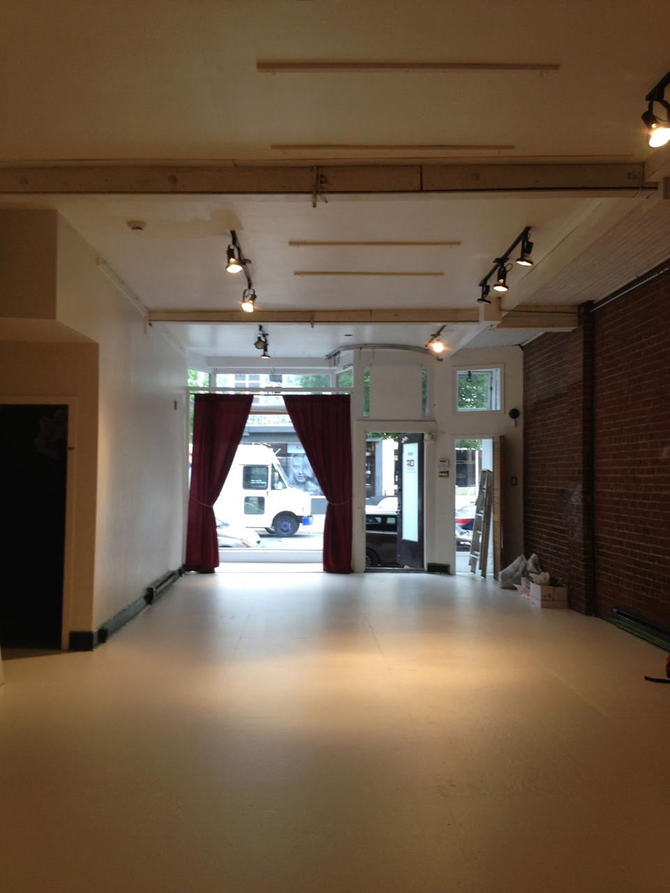
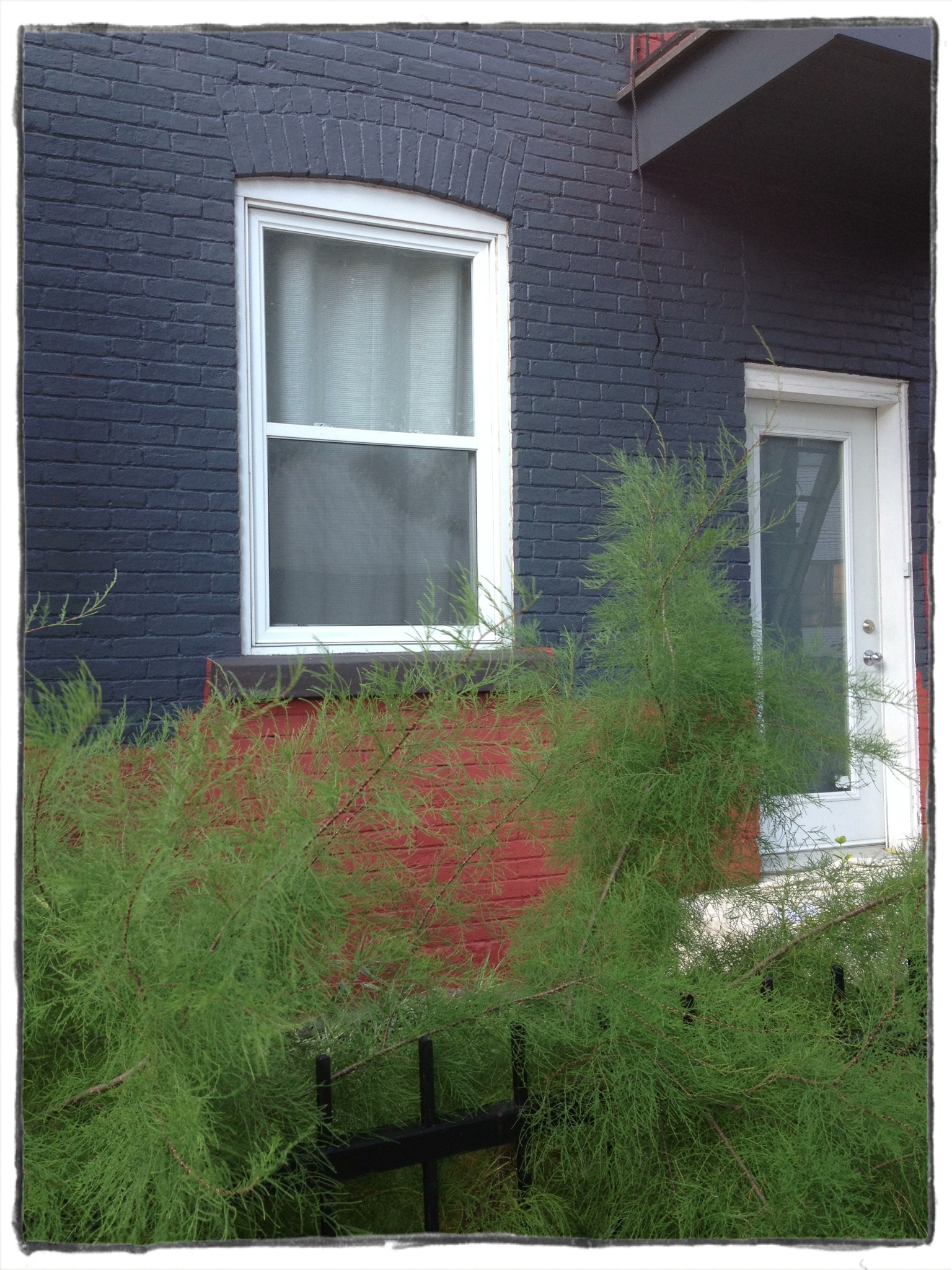
The third job, the biggest, messiest one, was repointing and fixing the brick at the back of the building. So while my front looks like that, the back of my house looks like this:

IMG_9271   IMG_9266

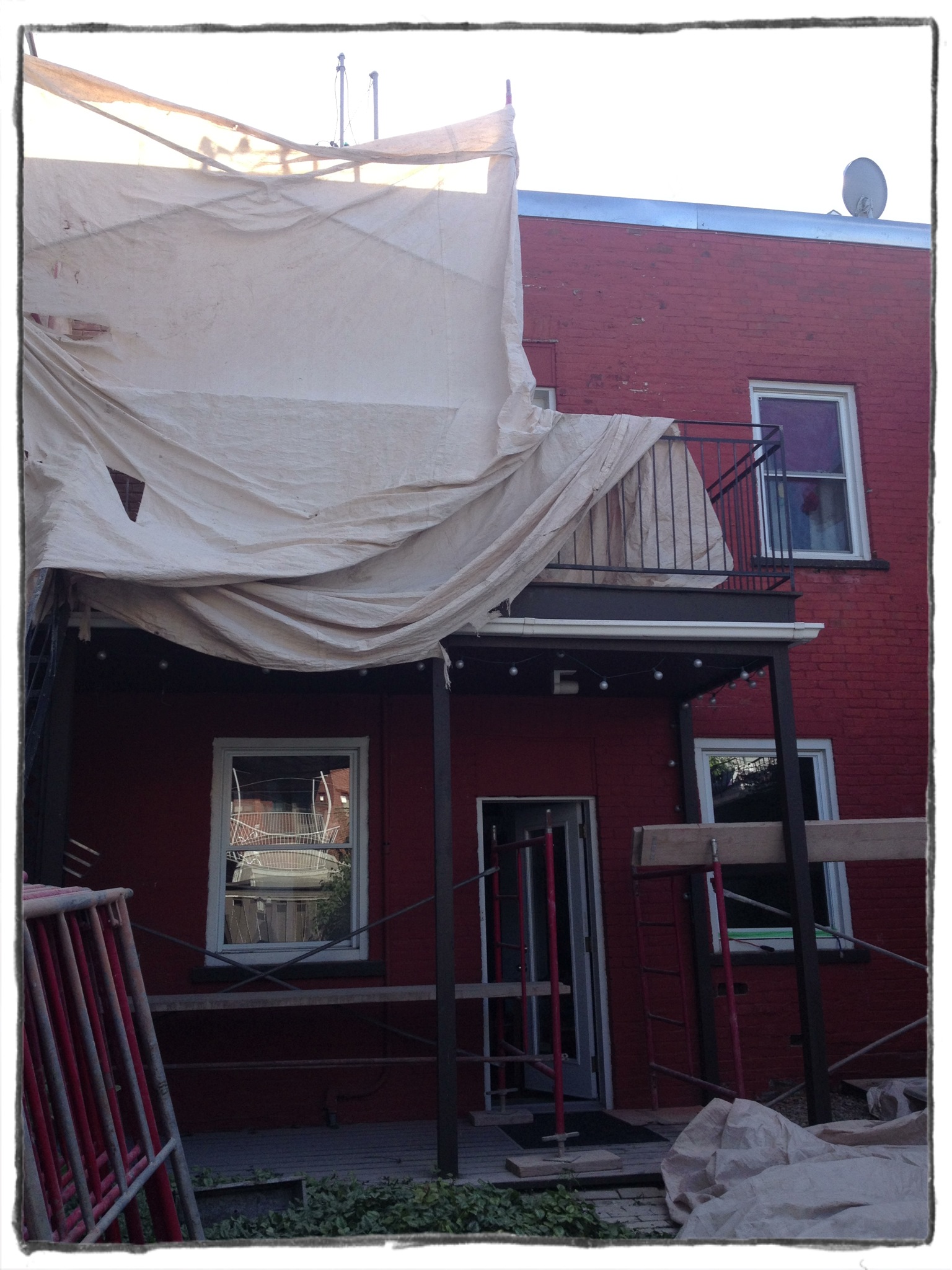
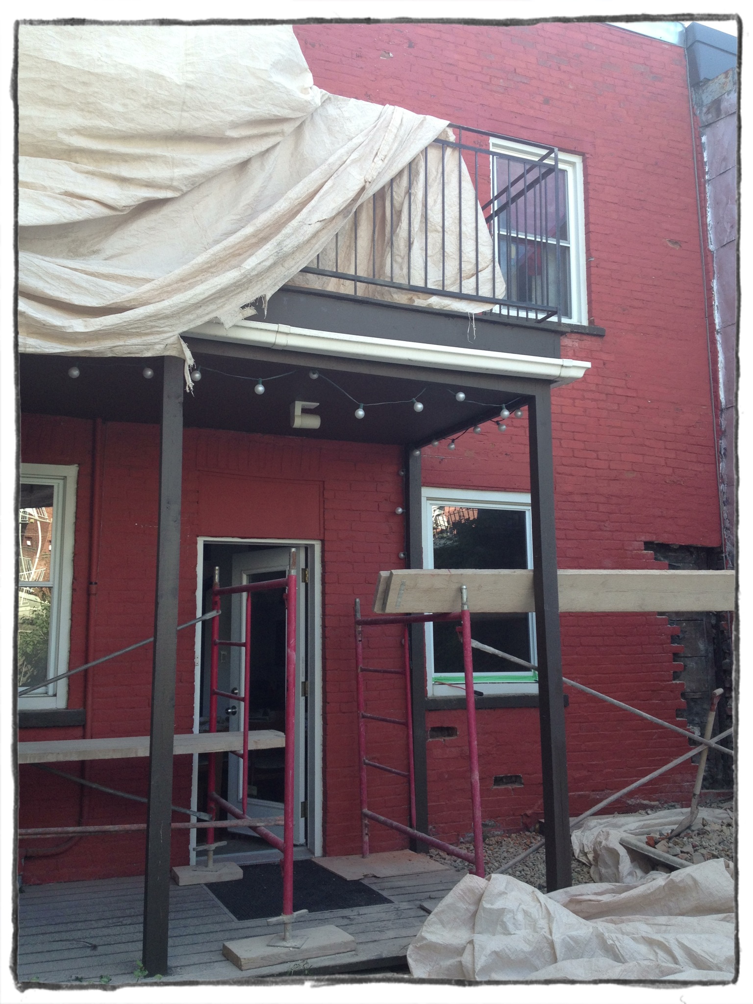
And my poor, beautiful garden looks like a haunted house filled with ghost plants:

IMG_9267   IMG_9265

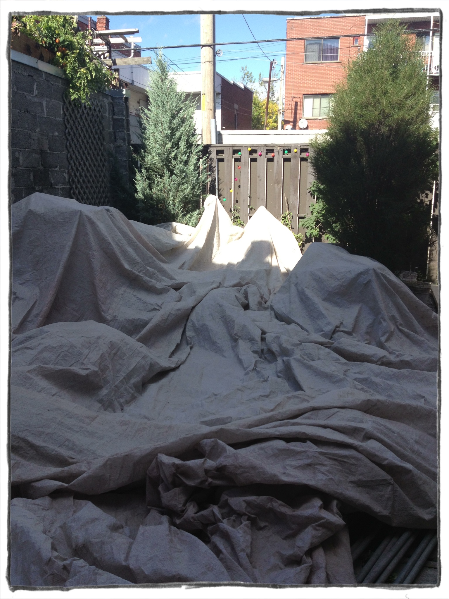
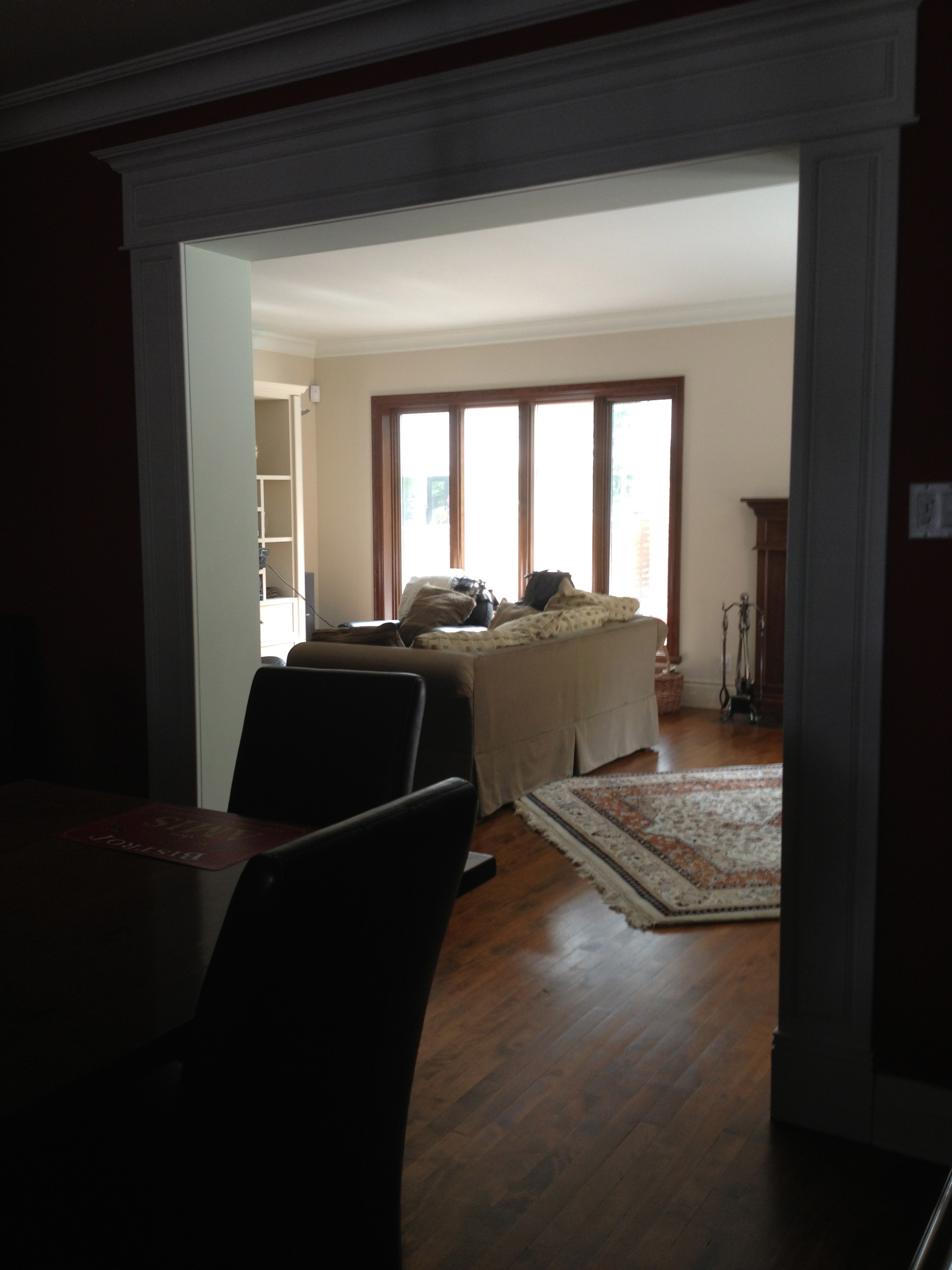
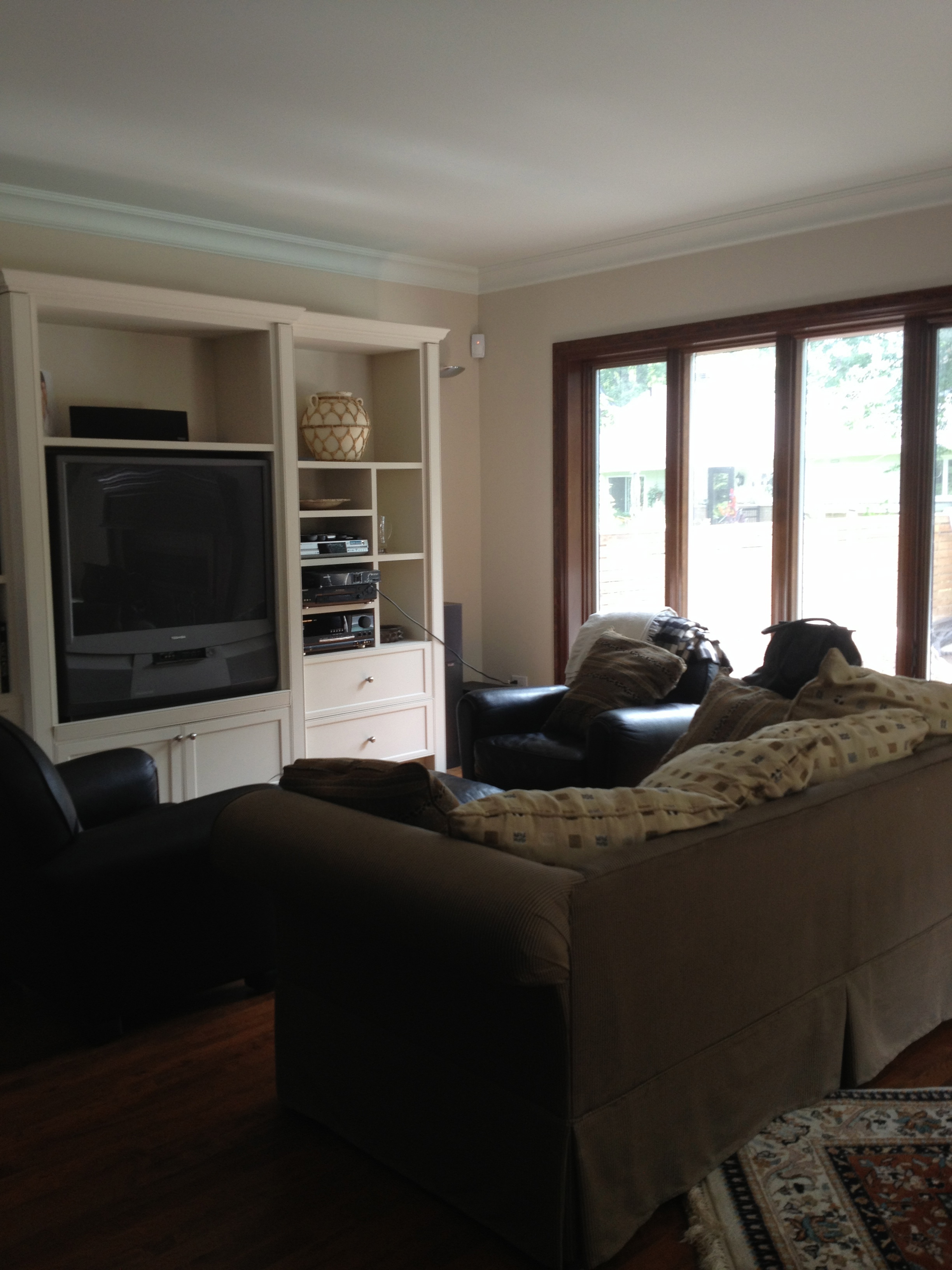
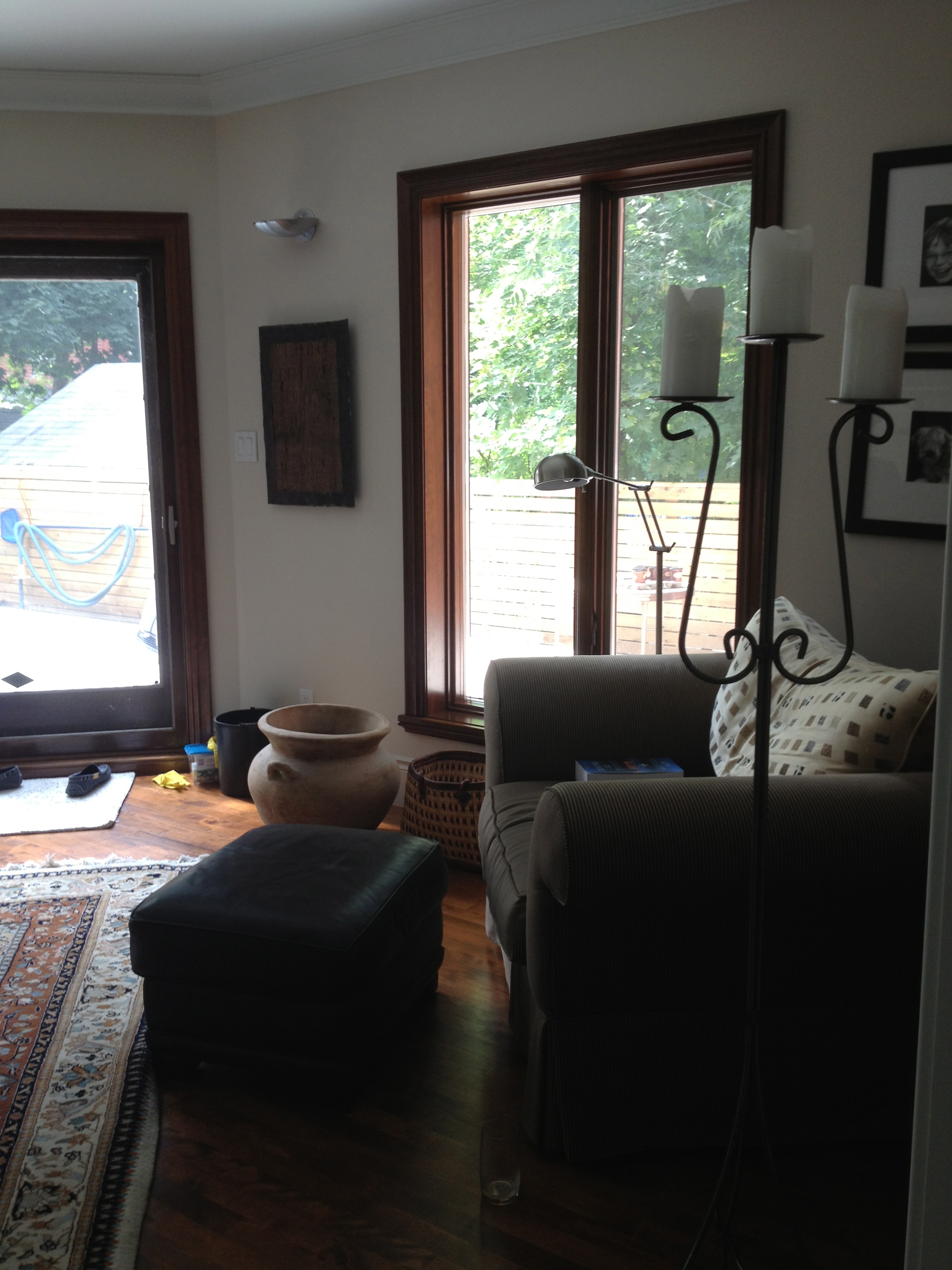
Going to the backyard makes me want to curl up into a ball on the floor and rock back and forth. Though the windows are shut, I can’t help but feel that all the mortar dust that the workers are creating is seeping into the air inside the house. And it probably is. Gross. There really is nothing like a little renovating, a little dirt and mess in my own home, to make me feel even more for my clients. I get it guys – I really do. And we are lucky that, for now, all our work is exterior. I am not looking forward to the massive interior re-designs I have planned when budget and time permit. Hello basement and rooftop master suite!

In the meantime, the hubby and I will escape the dust and the mayhem for a couple of days, park the babies with my wonderful parents (thank you guys soooo much) and head to New York City for a night and then on to Allentown, PA to visit hubby’s grandpa. Our first time away without kids in over TWO years. Now that is just plain crazy. And I’m so excited that it’s also making my heart skip a beat.

xa

Comments { 1 }

Layout

Recently a client of mine asked me back to help with her living room. I had worked on her sitting room over two years ago and then helped with her daughter’s room, study and bedroom. She has spent the summer redoing her backyard and wants the living room – which looks out on said backyard – to reflect her taste more. She wants the living space to be cozy and inviting, but also wants to add some oomph to the room. She has struggled with the furniture placement in the room due to its large size, its awkward angles, the fireplace, and the windows/patio door placement.

IMG_8896IMG_8897IMG_8898IMG_8899IMG_8900IMG_8901

When I design or decorate a space, one of the first challenges is the layout. Often when walking into a room it seems crystal clear where things should go – the pieces fall into place like a puzzle getting solved. In some cases though, it is more of a struggle. Whether due to an awkward space or due to a customer’s requirements (and sometimes both at once) the pieces of the puzzle sometimes feel like they are in a different language, one that is super hard to understand. The more elusive the layout, the longer the design takes. Right now I am fighting my way through this particular layout headache. It is no wonder that my client has had a hard time figuring her space out.

My main issues in this room are the shape, the patio door and fireplace placement.

IMG_9125

But there are other obstacles. There are windows and doors and doorways on all sides of the space. The fireplace is off centre and very close to the patio. The windows are low to the ground so placing furniture in front of them is tricky. The large built-in furniture piece can be removed but most likely the floor beneath it will need to be repaired. And the TV needs to be placed in a spot that most of the seating areas can visually access. Also I need to keep two of these black leather sofa chairs in the space as well as the large sofa chair below:

IMG_8906   IMG_8902

I can reupholster the sofa chair on the right but not the leather one…

Normally, one could picture placing a big L-shaped sofa in front of the fireplace, but in this room the fireplace is off centre. And do I want a giant piece of furniture cutting the room in two and potentially blocking access to the patio door? These examples of big couches do work though because of the styling and the room shape and because they are, simply, gorgeous.

d1934129e1e637f64b2297fe25f3e39f   7df4f070e4ce7507653e35ba46581299   542cd15521c5d1432e82ccd90e123ad9   d975371b003f5dde5b48d0d2db43c6ac

And then we come to one of the most annoying things to deal with in decorating a room: where do you place the TV? This question comes up in 90% of my decorating contracts. In general, I dislike the television being the first thing you see when you walk in to a space. As it stands now, the TV is in the “right” spot, i.e. on the only long, uninterrupted wall in the room. If I change the room’s “centre of operations” to face the fireplace, does the television get put on the wall above the fireplace? How do I feel about that? Really not sure about this…

0f09e60c67db9da9dadf3a7c0119b35d   3dcd391f831a377804844f86566f2890   f8a483b30e4e67ec4dd3c703ab97dec6   4a15d475a69f7a24b9b99bce2d732d97

So I am left with tons of questions and decisions yet to make. I will need to come up with at least three valid scenarios by Friday, so the pressure is on. Big time.

Yet, there are certain changes I am fully confident in suggesting at this point. Suggestions that I feel will brighten and modernize the room instantly.

#1:

Go from this IMG_8905  to this 1ax

Painting the fireplace in a crisp, bright white will really make the room. And some “montages” on the mantle of objects and art will help too.

#2:

I would like to get rid of this tall and bulky piece of furniture and find something low and long for this wall, also in a bright white.

This IMG_8897   to this 2ad5c162710de27c885b51bd96129471

I am moving away from tall furniture all together – upper cabinets in kitchens and big hutches in dining rooms – and this long and low piece would look great along this wall.

#3:

I want to paint the brick walls:

Go from this IMG_8903 to this bccdc71400ea755c0927063538382c60

Getting rid of the brown-y/orange and painting the brick either grey or a creamy white will give the room an instant facelift.

#4:

Rugs and curtains EVERYWHERE!!! Big rugs will help define the different areas of the room and make it feel cozier. The curtains will also help warm the room up and make it look more “finished”. Nothing too heavy: light and soft and breezy is the way to go in here.

img24o img10o img80o … such as these options from west elm.

or these from Crate and Barrel:

phila-rugs anice-rug-1 agave-rugs orissa-rug

I definitely have my work cut out for me here but the potential for a real transformation is huge. I know I can bring the space to a bright and calm and warm place. As soon as I get the layout figured out.

xa

p.s. General 54 is hosting an opening party tomorrow so if you are in town, check out the beautiful, new space!

Comments { 0 }

Iutka

When I started writing this thing I made two pacts with myself: I would try to write once a week (at the very least), and that I would try to be as honest as possible about my work & my life.
I was having a hard time this week coming up with something design-related for the post because I am in the process of losing someone very dear to me. And maybe this is a weird or wrong thing to do in this platform but it is the only thing I feel I can do right now.
It is a tiny testament, a goodbye, a photo tribute to my beautiful grandma over these last few months…

IMG_8228   IMG_8231

IMG_8251   IMG_8300

IMG_8299   IMG_8323

IMG_9037   IMG_9038

IMG_8908   IMG_8907

IMG_9036   IMG_9035

xa

Comments { 2 }

Open!

The new General 54  store opened this week and I am really happy with the results. Take a look at these before and after pics:

IMG_7961     IMG_8852

IMG_7929     IMG_8859

IMG_7930     IMG_8862

IMG_7931     IMG_8865

IMG_7936     IMG_8867

IMG_7935     IMG_8857

IMG_8038     IMG_8853

As you can see, the space is completely transformed. It is warm and cozy and exactly what the client wanted: a more sophisticated and inviting space. What I especially love is how everything was either made from scratch or found and transformed. This is becoming my commercial design trademark! Because of budgetary constraints, a will to recycle, and maybe just because I love transformation in design, all of my work seems to follow this mandate. Lawrence, the Lawrence butcher shop, Cocoa Locale – transform what is there, buy used and paint it or change it somehow, and build what you need. There are very few elements that were purchased new and used as is.

Here is a rundown of what was done to the space:

A key element to the decor is the lighting. We decided to keep the existing track lighting (and although I generally dislike tracks, I believe that in commercial situations they are sometimes a necessity). We had the lights that Jen purchased spray painted:

IMG_8100 + IMG_8242 =  IMG_8872

We had these gorgeous Lambert & Fils lights installed over the merch table:

IMG_8854   IMG_8874

They add a warmth and a beautiful glow to the room. I love these so much.

And we had this light made by them and installed over the cash:

IMG_8865

I found some beautiful fabrics and we had the armchairs, that Jen already had, reupholstered. We also had the change room curtains made (by Jen herself):

IMG_8855   IMG_8856  IMG_0003

We needed something to separate the front of store from the back office area. I wanted light to come through as there is a window at the very back. We came up with a rope and ribbon wall:

IMG_8861   IMG_8858

You can still see the back space but it is less noticeable and a nice way to break up the space.

We painted the exterior and brought in the always delightful Mr. Sign (Dave Arnold) to paint the window signage.

IMG_8883   IMG_8884

IMG_8853

I really like the stripe running through the windows. It helps to connect the smaller, weirder shaped window space with the rest of the store.

And then there is the floor. Love the floor. Love it. It was primed plywood when we got the space. We painted it this great grey blue colour and then found this stencil online and voilà! A beautiful, statement floor that I haven’t seen anywhere else. Really nice and a cheap and cheerful solution to a drab floor. Everybody wins!

IMG_8581  IMG_8409  IMG_8400

IMG_8871   IMG_8870   IMG_8860

Here are a few more detail shots of the space:

IMG_8866     IMG_8868     IMG_8864     IMG_8871

The space looks great. It was a true team effort and everyone worked so hard. With a great layout, beautiful statement lighting and pretty details, the new General 54 is ready to go and open for business. I wish Jen and Dan tons of success in their new work home. Go check it out!

xa

Comments { 0 }

date night

Things are ramping up.That back to school feeling is already in the air. Work contracts are coming in and I think fall will be a busy time for me. I have the General 54 shop finishing up, three new clients in the pipeline, three old clients coming back for more, an intern (!) offering to work with me, and a wedding to plan . I’m feeling a little out of breath just thinking of it all. And then there is this teeny tiny blog I have been so enjoying writing. I checked recently and over two THOUSAND visitors have checked the site out! And there have been almost 14 THOUSAND page views! Now, I know that mainly people I know are visiting and then revisiting the site (hi mom and dad) and I know that this is peanuts compared to other design/mama blogs out there, but it feels like lots and lots of people to me. So for those of you reading, thank you. It warms my heart, gives me courage, makes me take a minute to think, and keeps me honest.

Because of all the busy-ness I thought I’d keep it short today and just write about the super fun date I had two nights ago. I know that this may seem lazy of me but it was an inspiring date and it got my creative juices flowing and I will write about it anyway. My love and I went out, sans children, to the  Grunman ’78 HQ space down in St-Henri. The team behind the space has pretty much singlehandedly brought food trucks to Montreal. They have a food truck too and work many of the events in the city but they also have an old space in an industrial part of the city that they have turned into an awesome, cool, and beautiful restaurant/party space.

IMG_8776    IMG_8777

Sunday night, they were hosting a party with Omnivore, a food festival, and the guest chef was Pierre Sang Boyer from Paris. A very handsome korean french chef that created a real stunner of a menu.

IMG_8771    IMG_8763

the event flyer and a sneaky pic of the chef in the bottom right corner of the photo on the right.

First we had cocktails:

IMG_8761The Yamanashi for E & The Miyazaki Mule for me. So good.

We asked Eric D., the manager and a former Lawrence staffer, to order whatever he thought we should try and soon beautiful plates arrived on a plain old cafeteria tray.

IMG_8775    IMG_8774

The gyoza was the best I have ever tasted and the spicy pork and tofu dish was ridiculously delicious. I decided that given the choice I could eat this kind of food every day of the week. And E and I couldn’t have enjoyed the date more. If we hadn’t had to pick up the kiddies before 9:00 and if I didn’t have to be the designated driver (St-Henri is far. Not really, it just feels far.), we could have stayed there all night drinking yummy cocktails, chatting, sharing really good small plates of food, listening to music and soaking up the cool, warm atmosphere. I geeked out and walked around to take pictures between courses.

The space:

IMG_8767IMG_8765IMG_8762IMG_8760IMG_8769IMG_8770

A large open room with two garage doors open to the early evening light, a corner bar made out of a mix of antiques and industrial materials, a mishmash of chairs and random tables, a second area with a long open kitchen and more communal seating, hanging christmas lights spread throughout the space. Artwork up on the walls some by, my favourite, Mr. Sign a.k.a. Dave Arnold (including the Grunman logo and exterior sign). A simple, raw space like this one can totally handle tables and lamps made out of shipping palettes. When I see a regular restaurant or store use these materials I find it annoying. Here it works. It is that easy, cheap and cheerful type of decorating that makes perfect sense in an old garage or whatever the space was before. It is unpretentious and unaffected, not trying to look that way but actually that way. They really get it here: a great blend of casual ambience, cool people, good lighting, and last night anyway, great food and drink. A real tricky combination to achieve. The stars were alined. The space was a perfect match for what was on the plate. A tricky thing to master.

I felt like I was on vacation: relaxed, into my surroundings, loving the new food, loving the company. Everything a date should be.

xa

Comments { 1 }