Only 4 sleeps left till the shop opens. And the space is coming together in giant leaps and bounds.
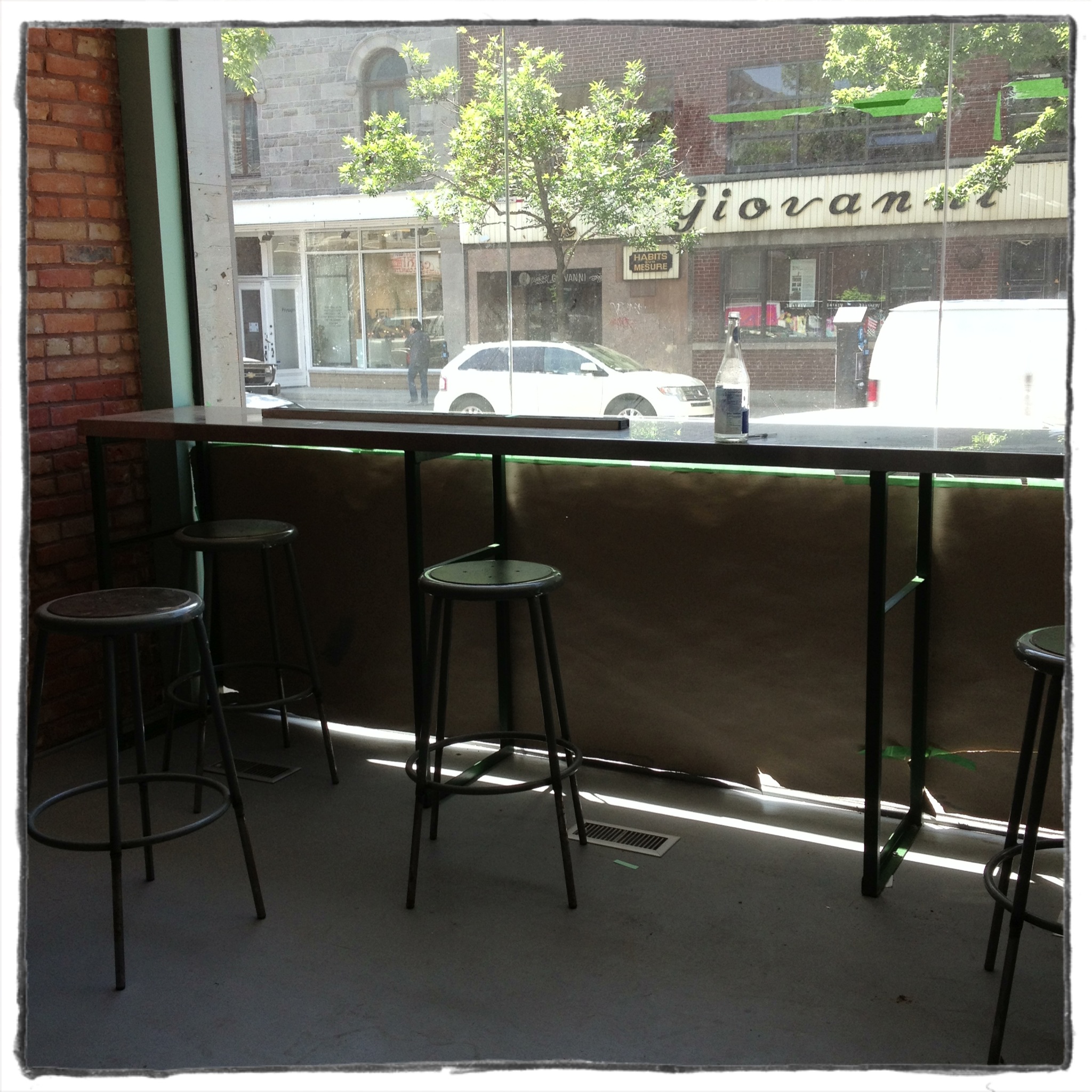
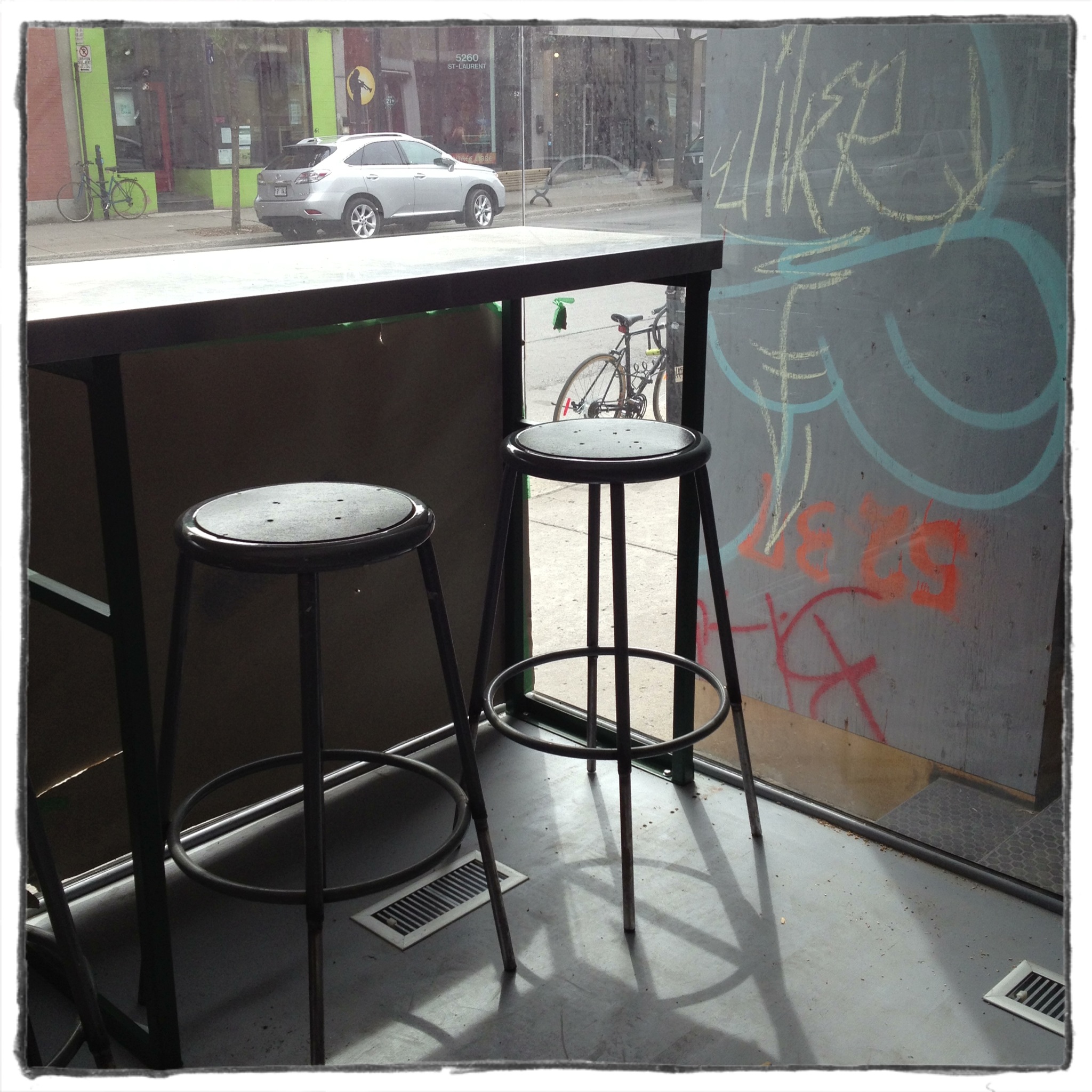
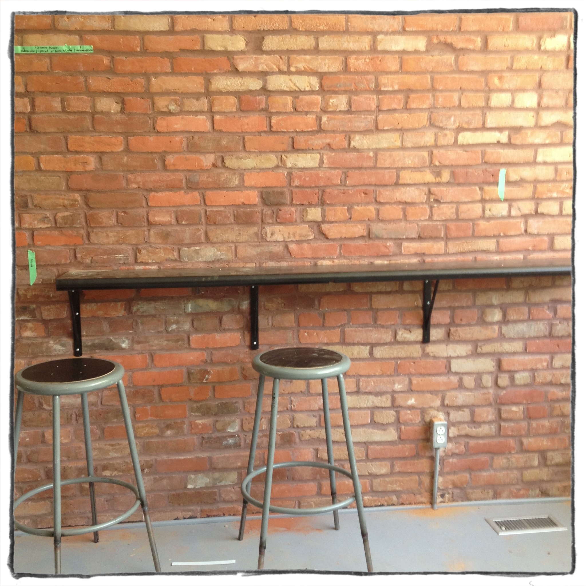
The counters are in. The stainless one looks awesome up against the window and is exactly what I pictured.
Basically this top: These legs:
 +
+ 
= this counter:
I had planned U-shaped counters- one counter against the wall, the stainless window one, and one against the entrance glass.
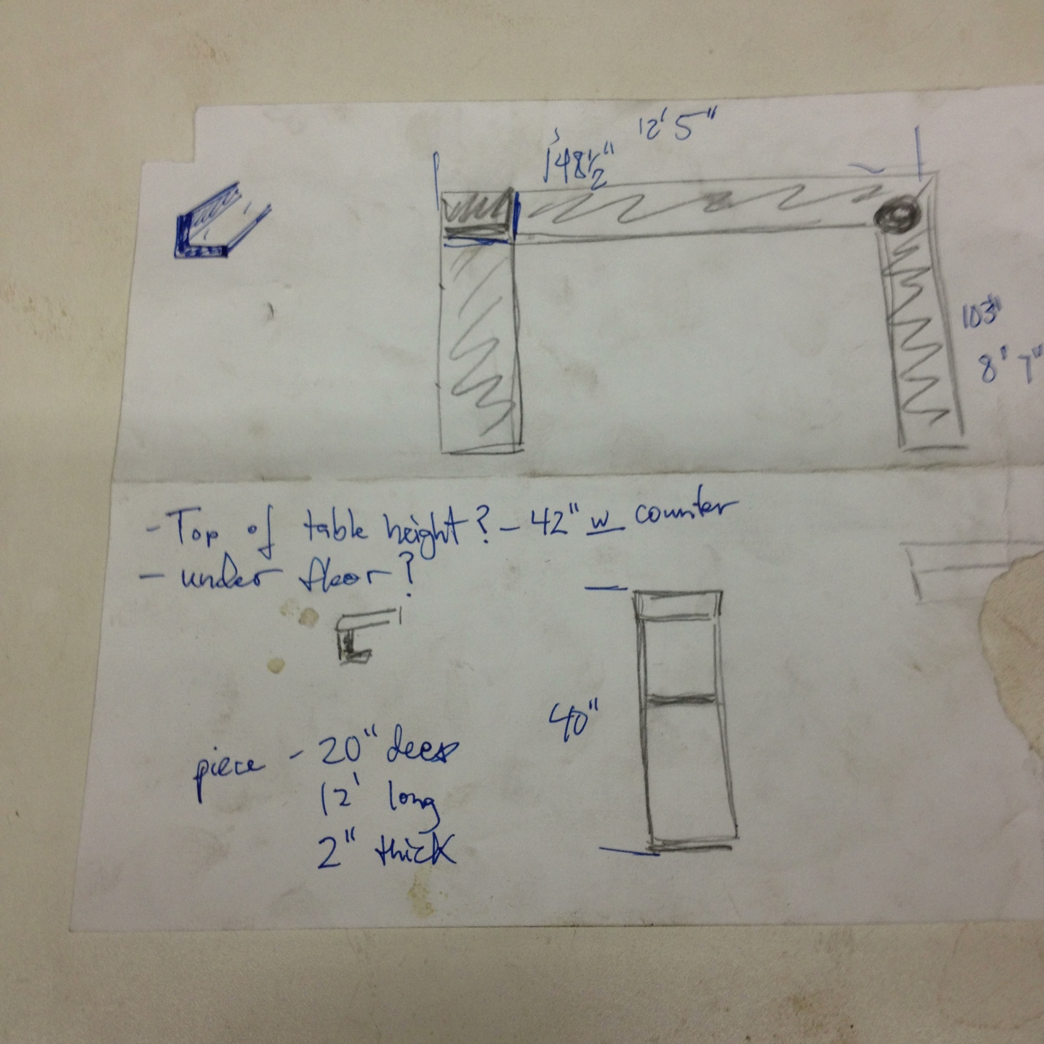
the quick sketch of the U counters and the leg sketch
But looking at it installed it just didn’t work. The wall one looked good but the entrance counter was not right for the space, material-wise and execution-wise. The wall mounted counter was installed with a healthy gap between it and the window stainless one and the fact that they are made from different materials works fine. The entrance counter was placed right up against the stainless piece and it just didn’t work. It wasn’t exactly the same height and it didn’t work. It just didn’t work! You really need to not have a huge ego in this line of work. Confidence is essential but I can admit when I’m wrong about a design decision. And maybe had it been perfectly matched up and at the same height it would have worked better and been more what I’d pictured. This U- shaped counter was not worth fighting for. Even though it meant sacrificing some additional seating it didn’t work, for real! And anyway, we don’t have enough actual stools for that extra counter. So there.
But the wall one is nice:
And we even found a use for the extra counter: it will be closer to the kitchen and hold coffee cups and an ice bucket for lemonade and ice tea. Nothing goes to waste here!
And speaking of not wasting anything, there is meat in the walk-in fridge! It really is a butcher shop now.
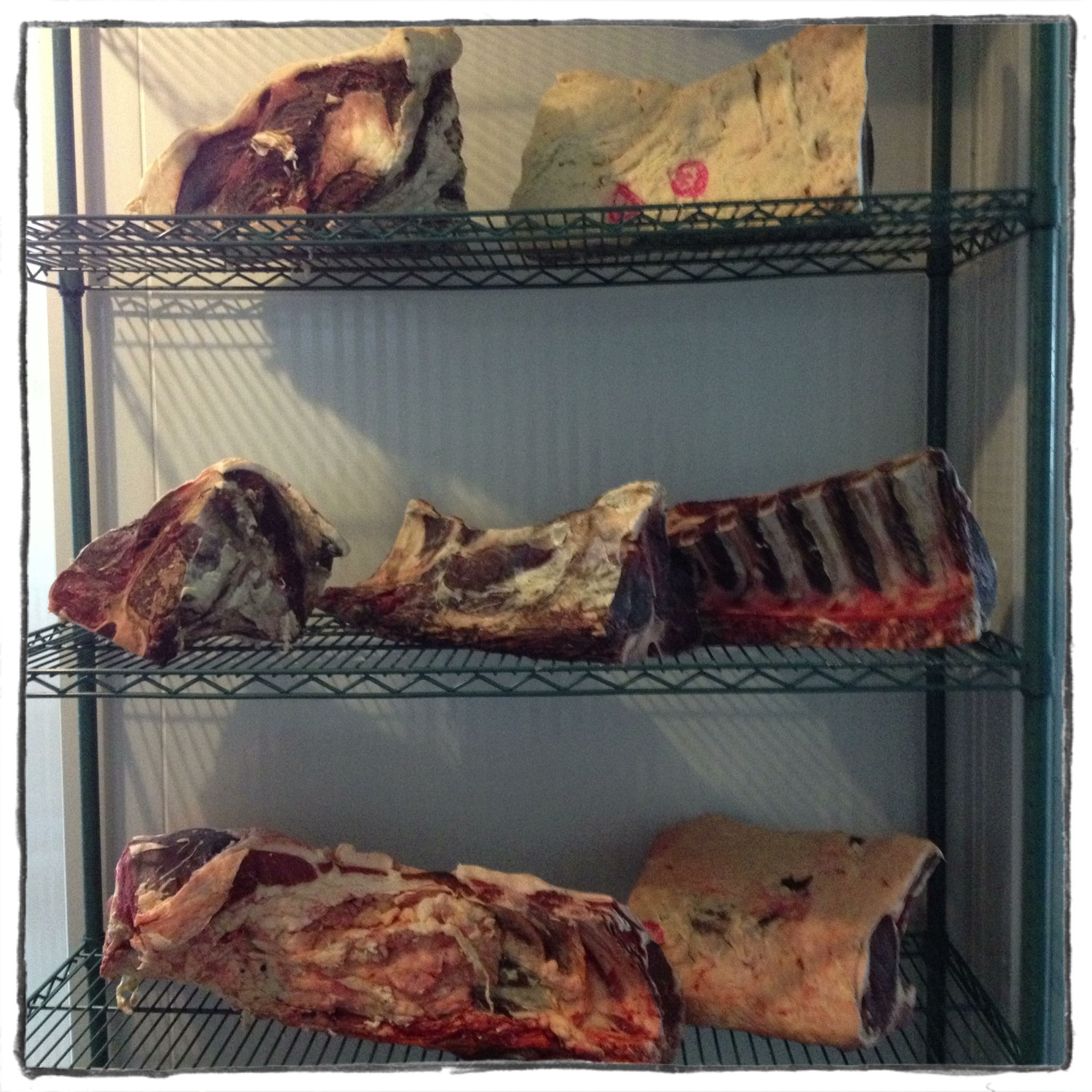
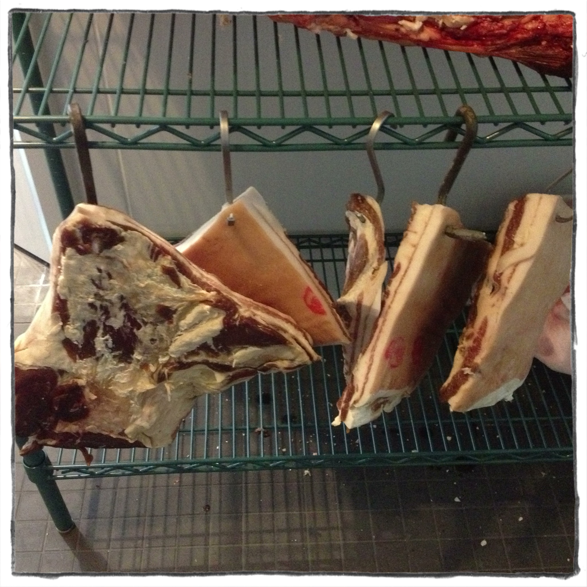
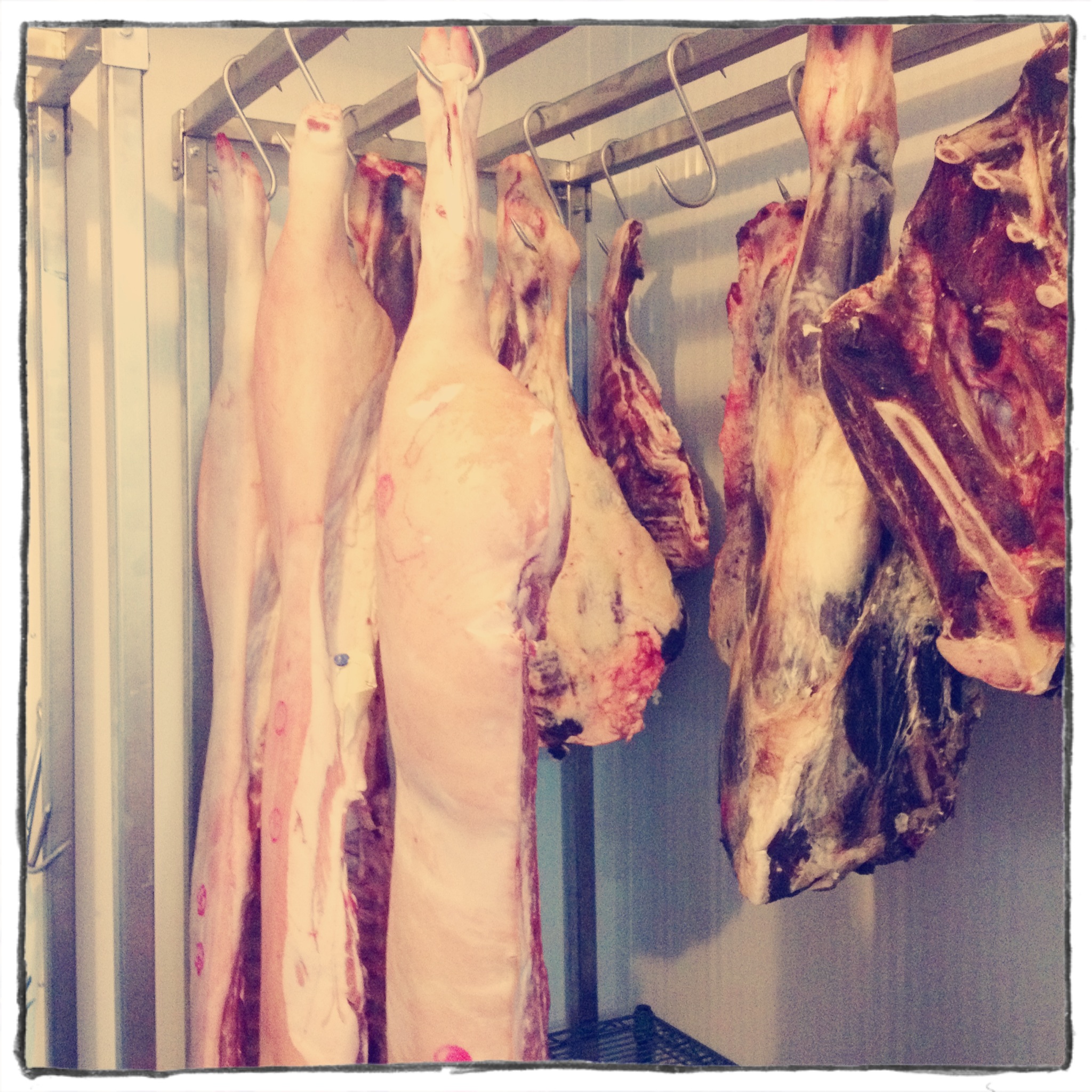
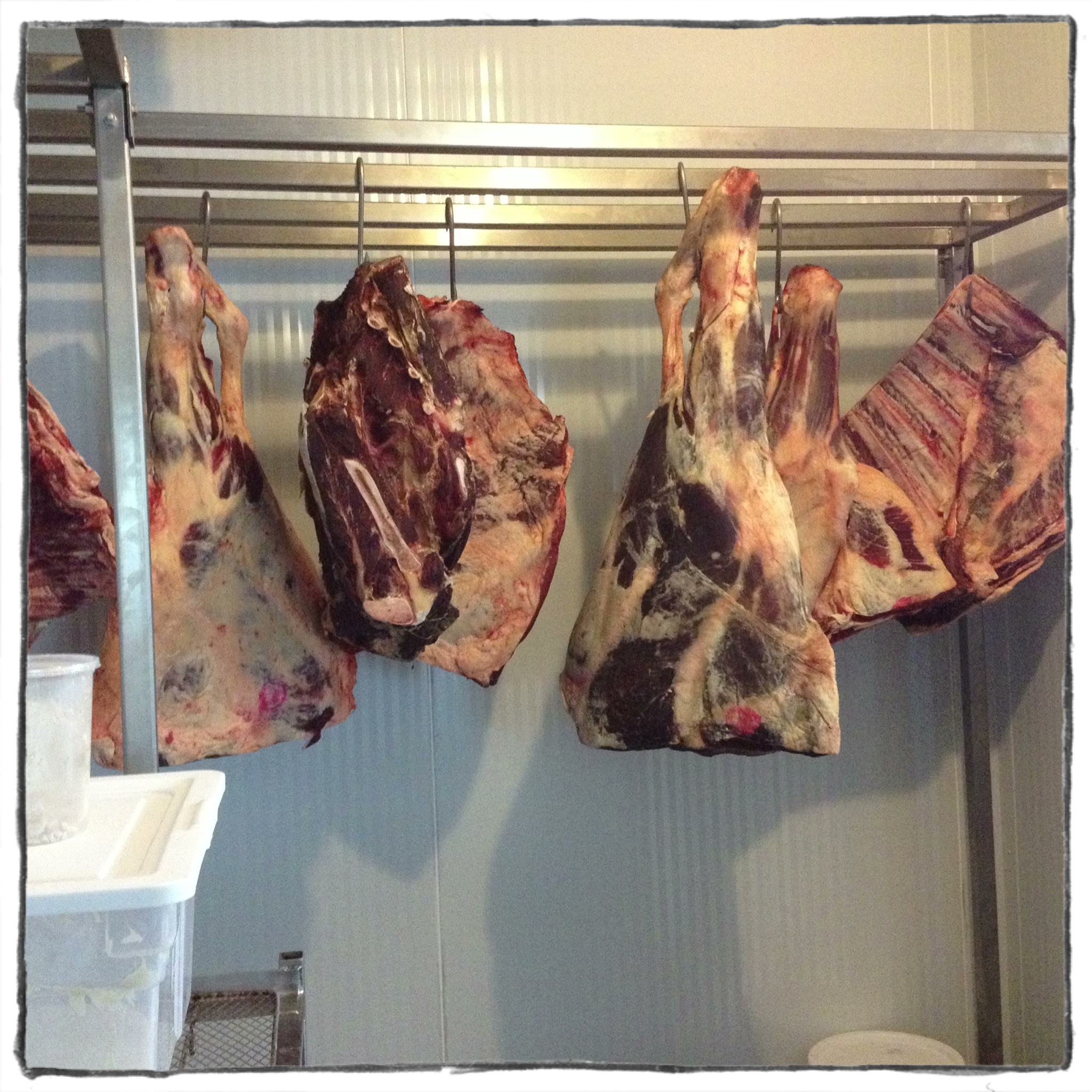
yum.
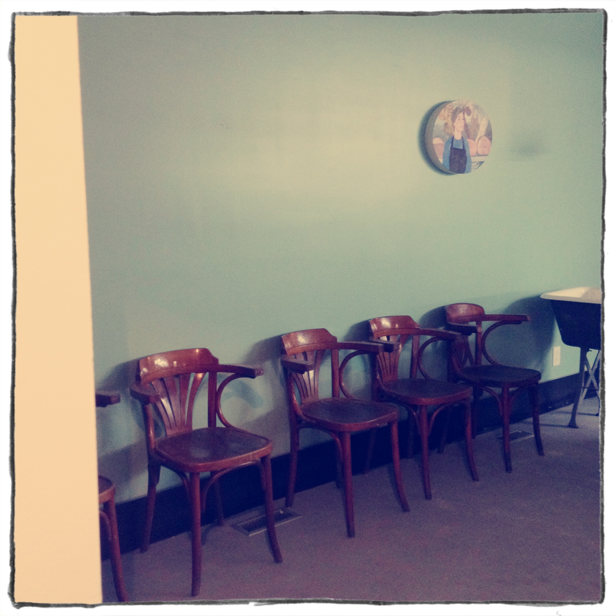
Other new elements to the space: art. It so important to me for any space be it commercial or residential to have artwork up on the walls.
Jason Cantoro’s framed strip of the Lawrence wallpaper is up on the wall, right near the window:
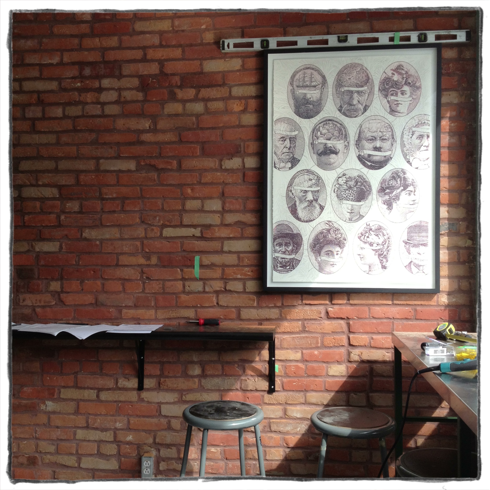
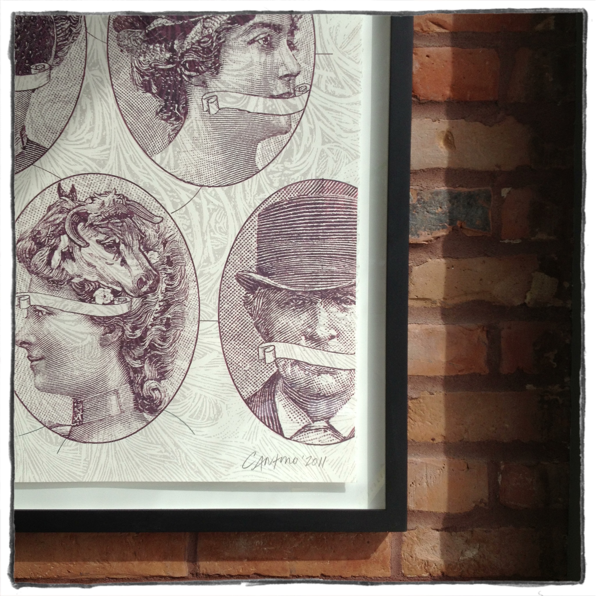
I like that passersby will see it and those that know the restaurant will make the link. And it looks so beautiful framed.
We also put up this self-portrait that Sefi made in London in 2005. She was working in a deli and here she is, eight years later owning a meat (and more) shop. I mean it couldn’t be more perfect.
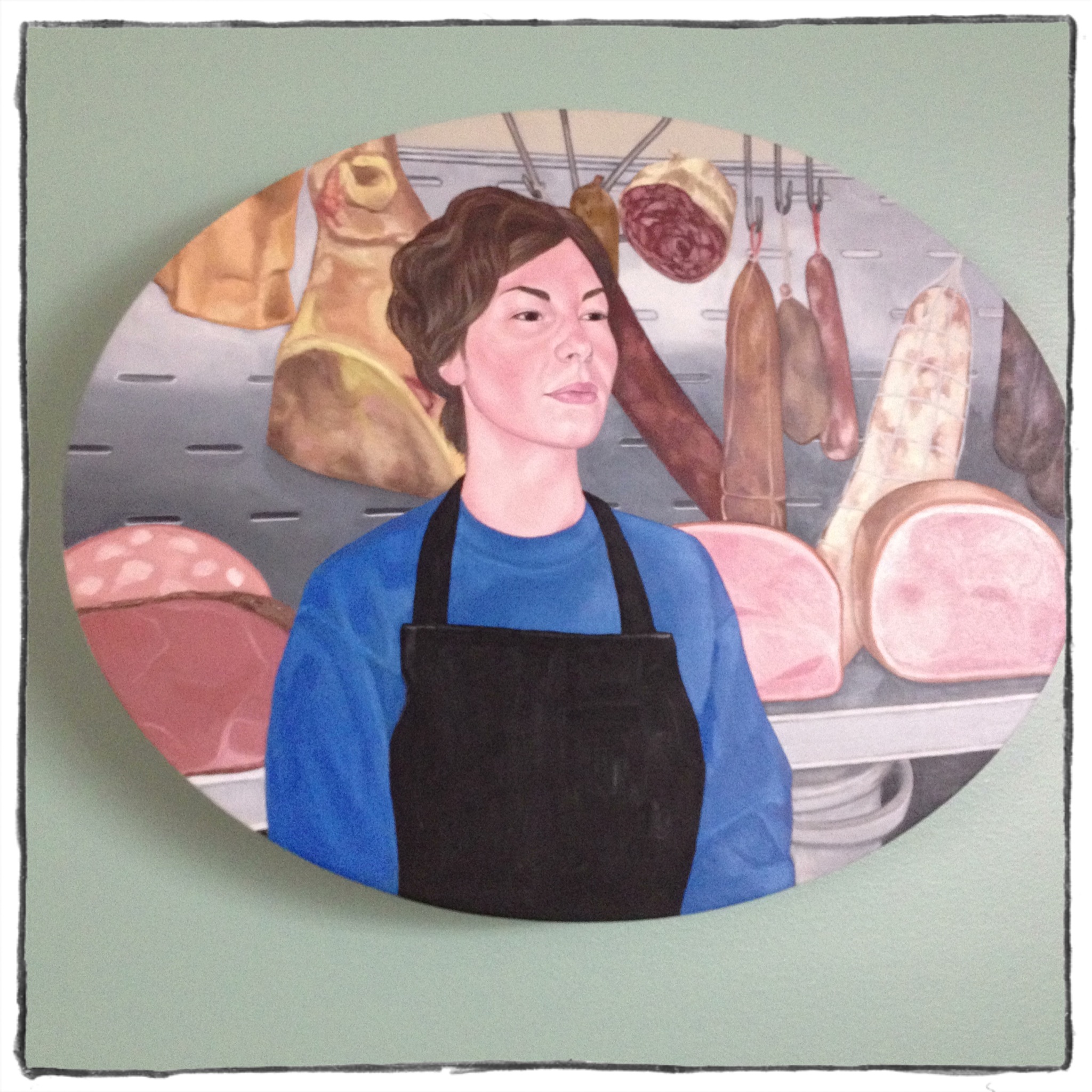
This project is her baby and it seems fitting to have this painting up. I think she was a little bit uncomfortable with it being all alone on this big wall but in my opinion, there was NO better place for it. It is funny and beautiful and weird to have it placed all alone there. Kind of like the painting is funny and beautiful and weird. And it looks so good on my Covington Blue wall (I lOVE this colour more and more each day).
The final artwork that has gone up has been the most difficult to get up there. At my first meeting with Sefi about the space she mentioned wanting a Quebec map somewhere with dots or pushpins showing the location of the farms that are supplying most of what we are selling. A way of demonstrating how very local we are being. Well what started as a framed map became much more. I suggested making it a large piece of art taking up most of the entrance wall. I wanted it to almost look like wallpaper so we asked Jason to help. But after some thought I realized that I wanted it to look like a mural: something graphic and hand painted and really big. In the end after more thought, we decided that Sefi (given her painter’s background) would paint a black outline of the Quebec map directly on the wall with the help of a projected map that Jason put together. I loved where this was going. I felt like the space needed something bold and graphic and handmade. Something that would cut into the stainless steel cold kitchen vibe. Sefi was on board. Then our partners, Marc and Ethan voiced their concerns. And this, my friends, is where I did a little battling. I believed in it strongly. They tried finding other options for the spot but nothing was right and I stayed pretty stubborn.I felt it needed to be big and it needed to be that. And worst case, if it didn’t look good, I offered to paint the map over myself. And had it been wrong, I would have been the first to admit it. I mean it is in my best interest to have everything work well design-wise in there. And if that means backing down from a bad idea, I’ll do that. But this was a good idea and I believed in it. And I won.
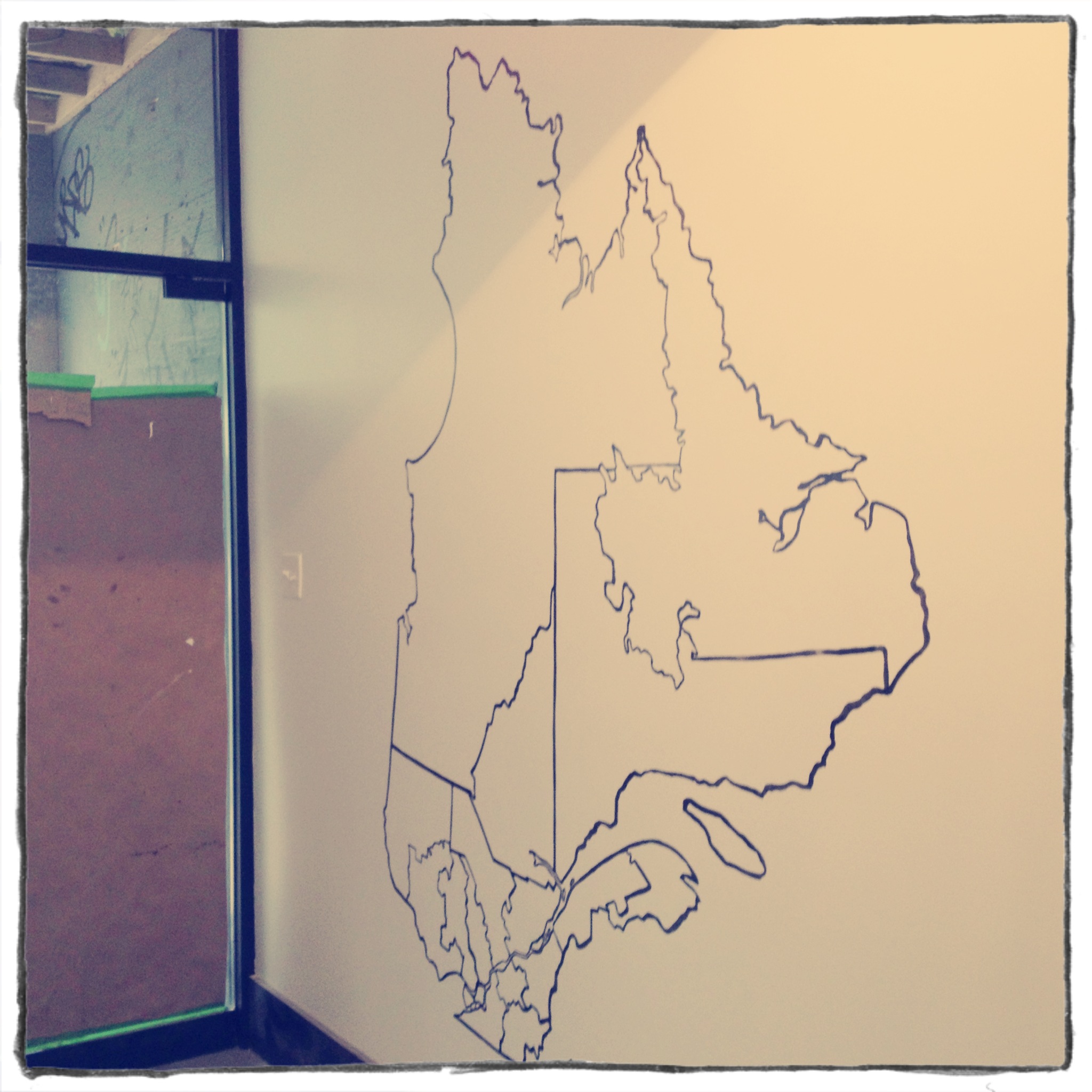
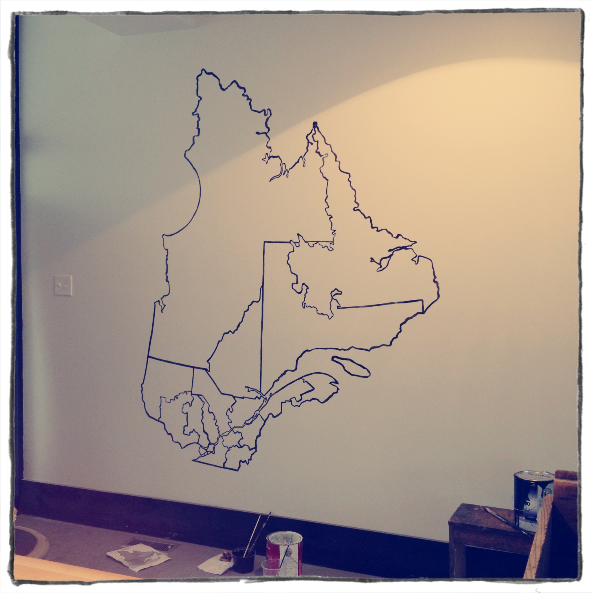
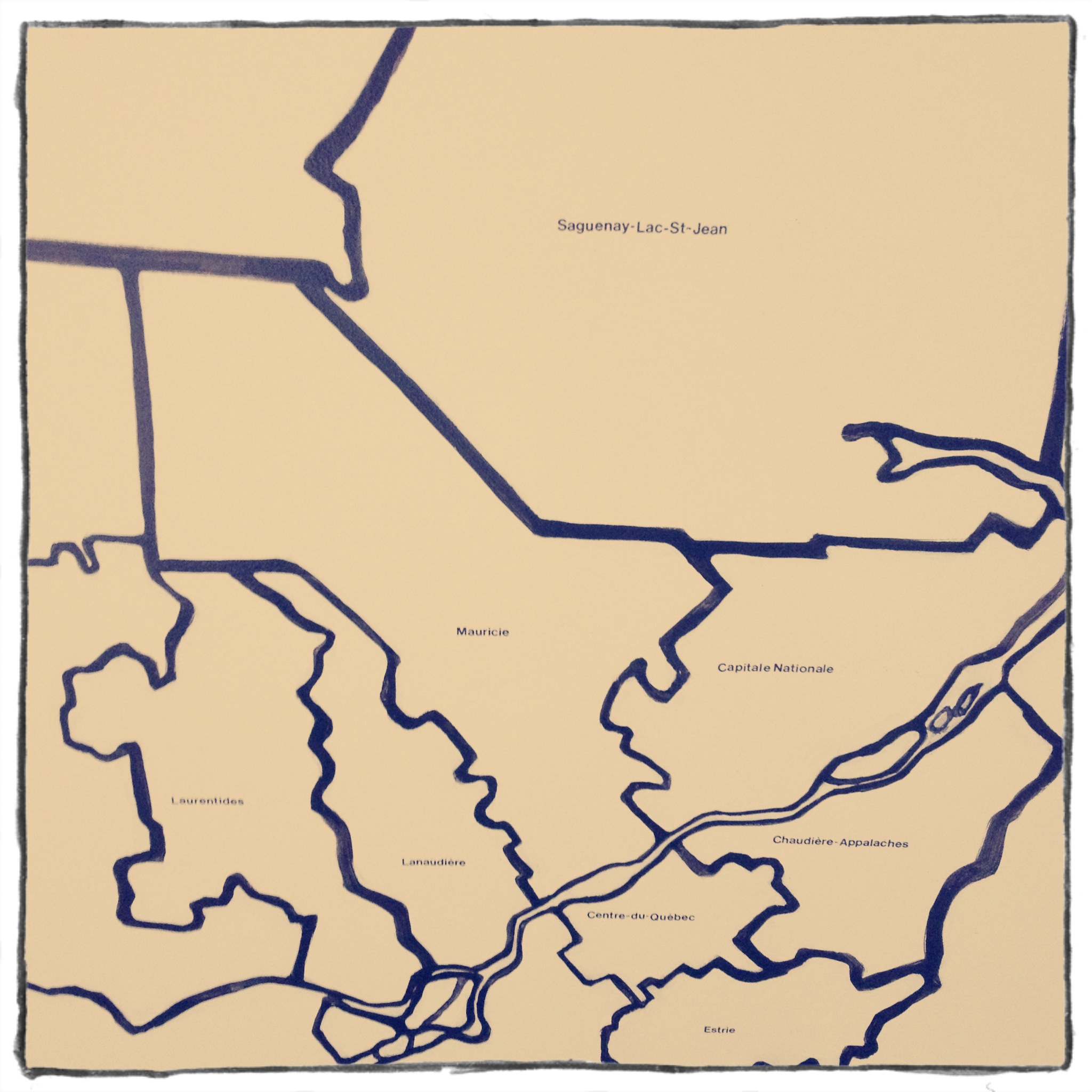
It looks so good. And Sefi even letteraset-ed the names of the different regions and will put dots on the map referring to the villages where the farms are. And later on maybe Jason will screen print some textures and backgrounds to it. It will be a cool, graphic work in progress and I really like it. So there.
xa

No comments yet.