Archive | Blog

RSS feed for this section

Treasures

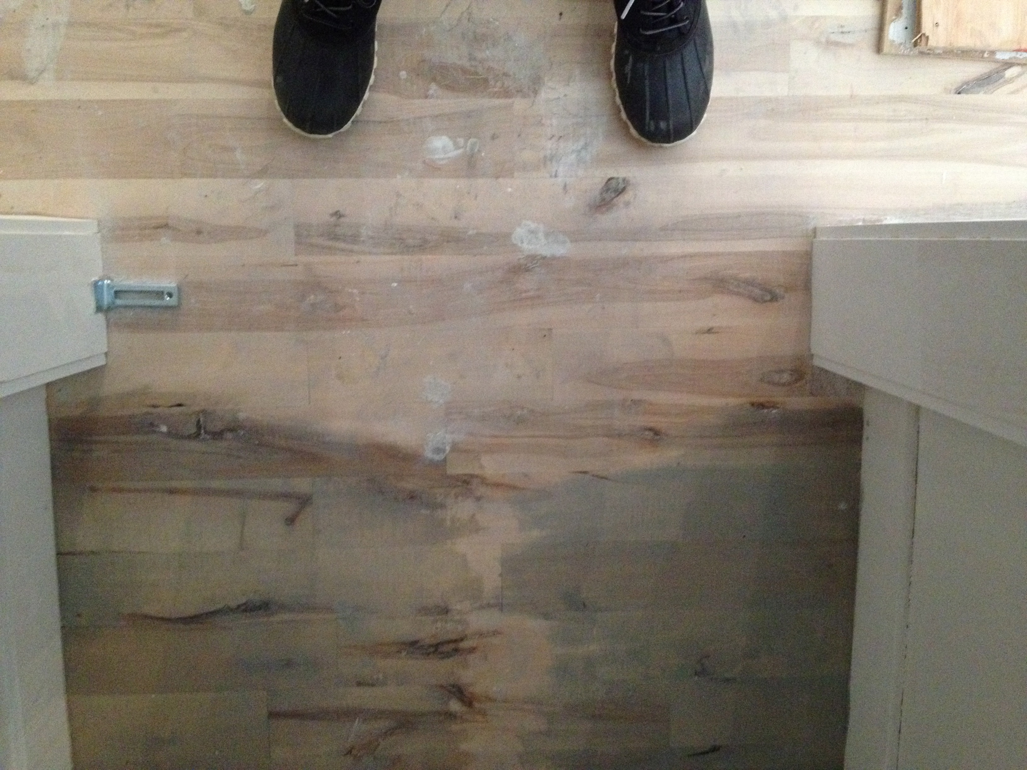
After a truly brutal Tuesday which was topped off with taking a cranky 18-month-old to Ikea all by myself (NEVER AGAIN), I decided that today I would write about a few things I am really loving right now.

First up, this tile that I found at Ramacieri Soligo, my favourite tile place in the city:

IMG_7435     IMG_7436

IMG_7382

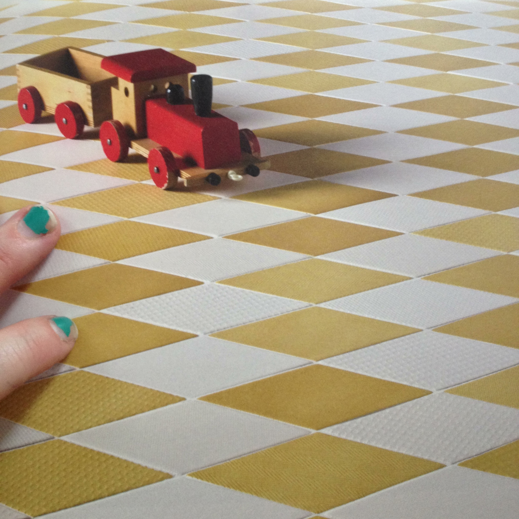
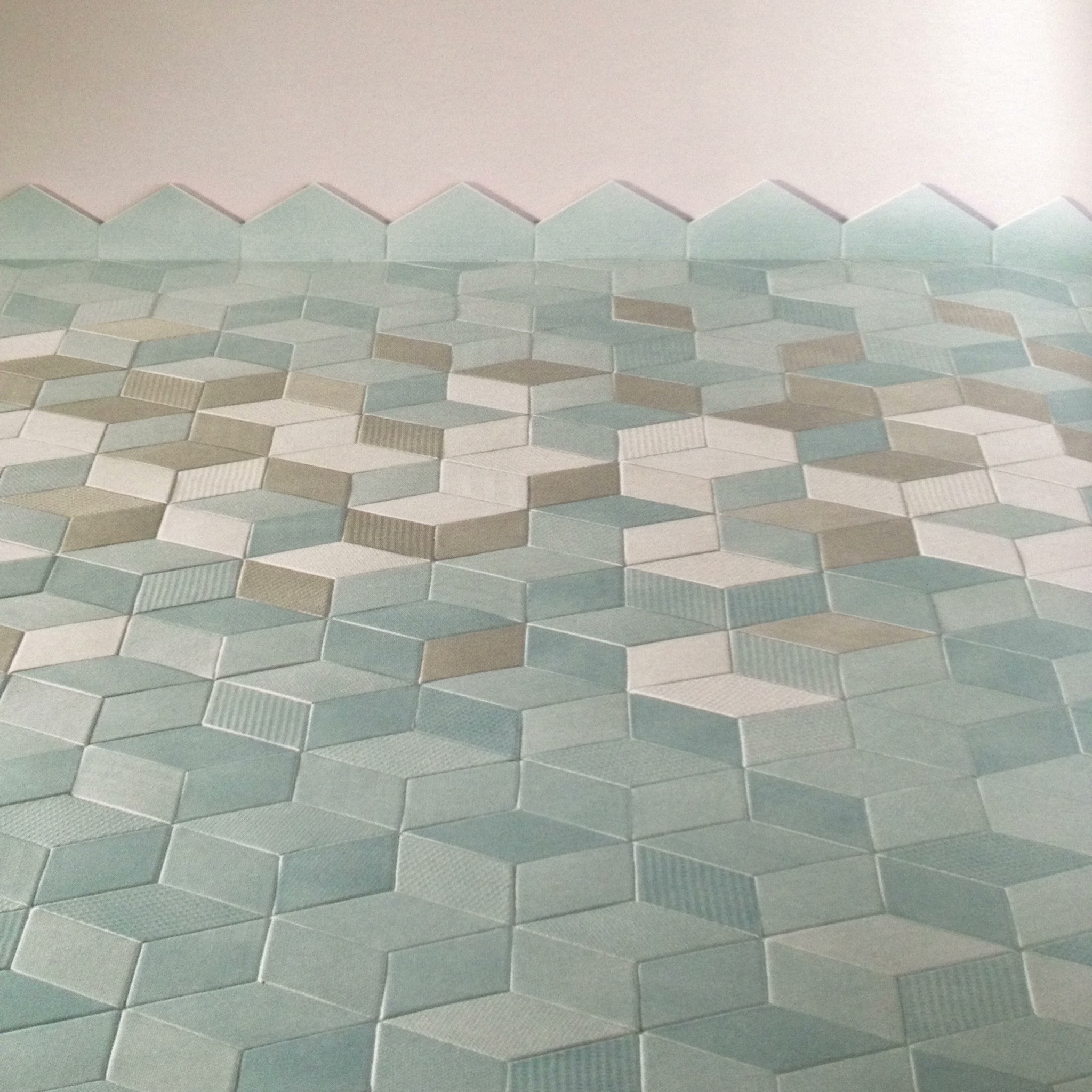
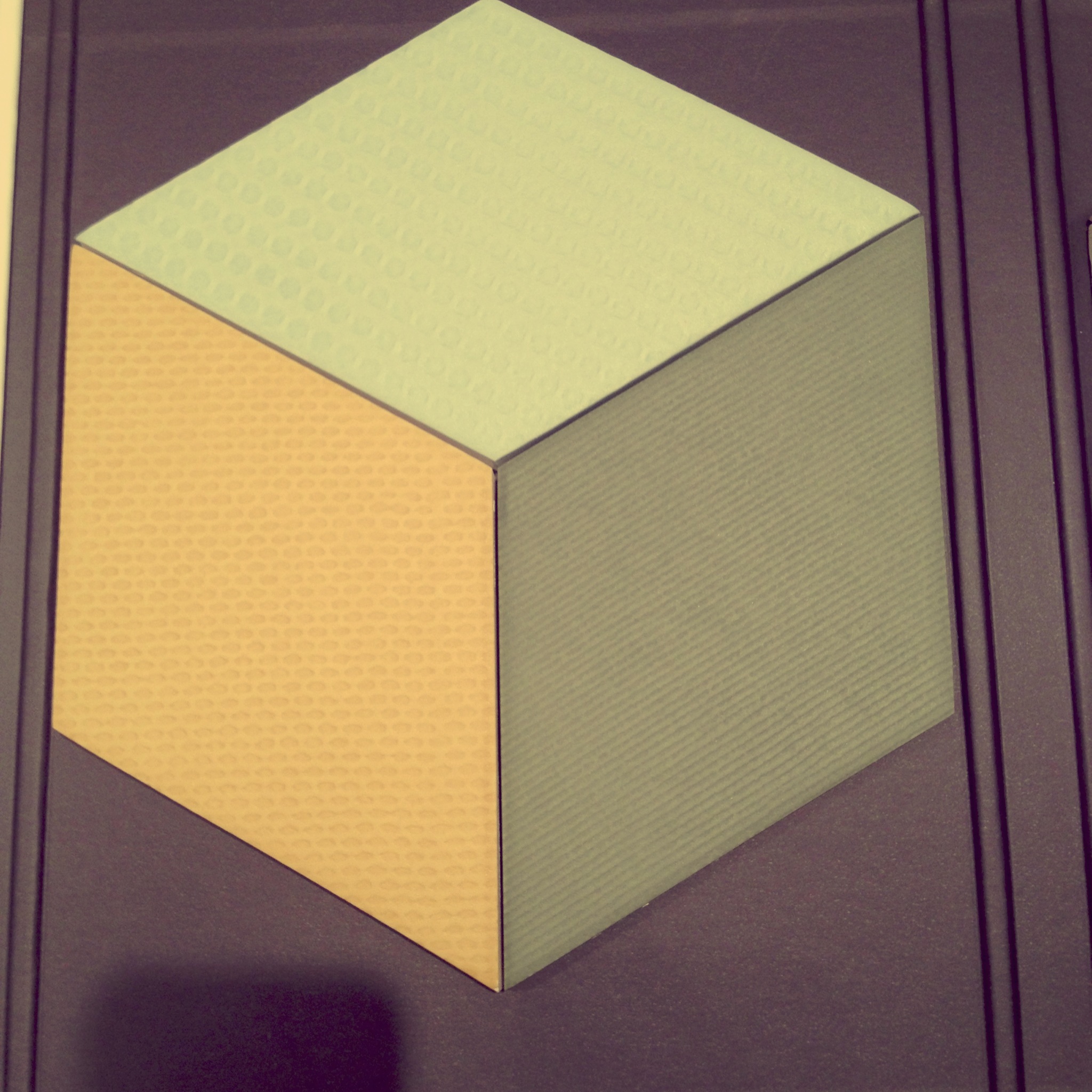
It is designed by Raw Edges studio in London. They are so cool and their designs are jaw dropping. These were commissioned by Mutina, an Italian tile manufacturer that works with some of the top designers around. I actually used the Mutina tiles designed by my big time crushes the Bouroullec  brothers for a client’s country home bathroom. Gorgeous. This Raw Edges design is called “Tex” tile and was inspired by textile design. It comes in eight different colours with three shades per colour and there are five different textures.

IMG_7431     IMG_7432

IMG_7433

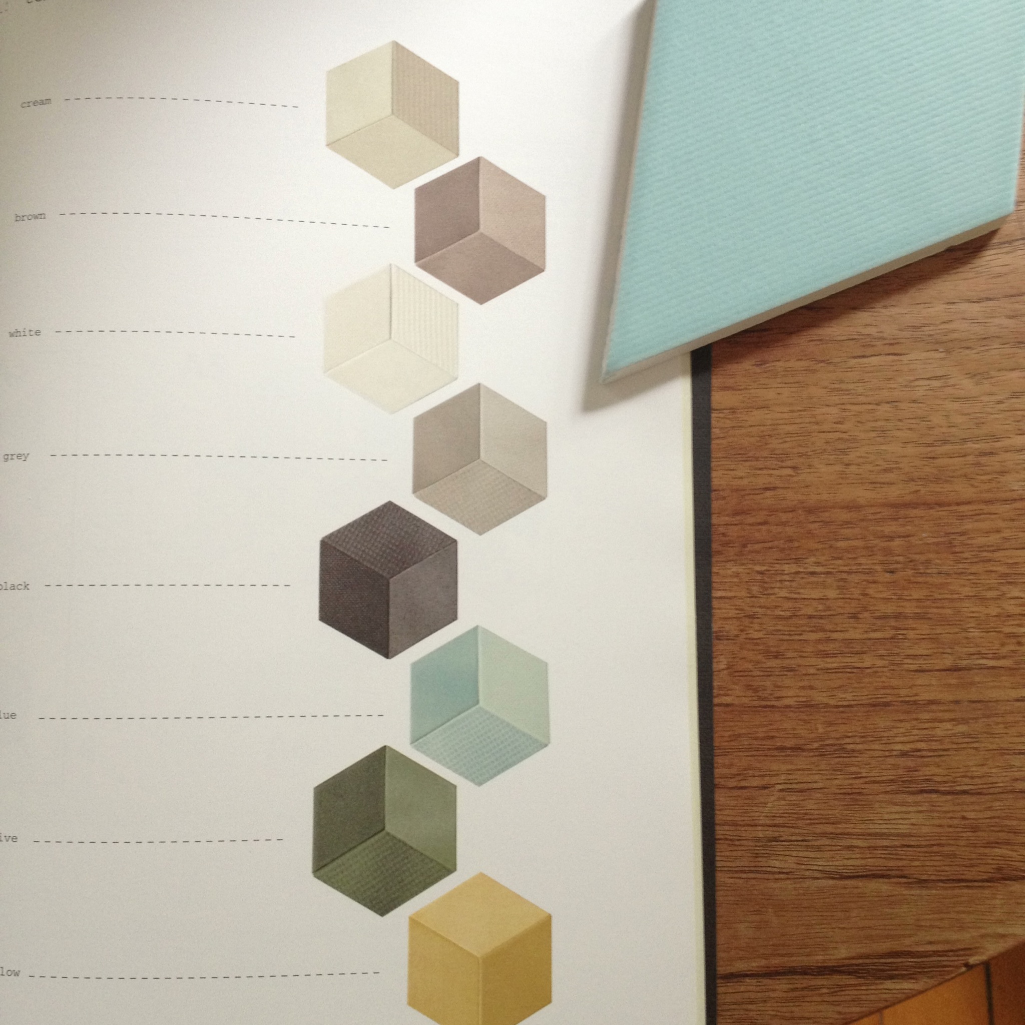
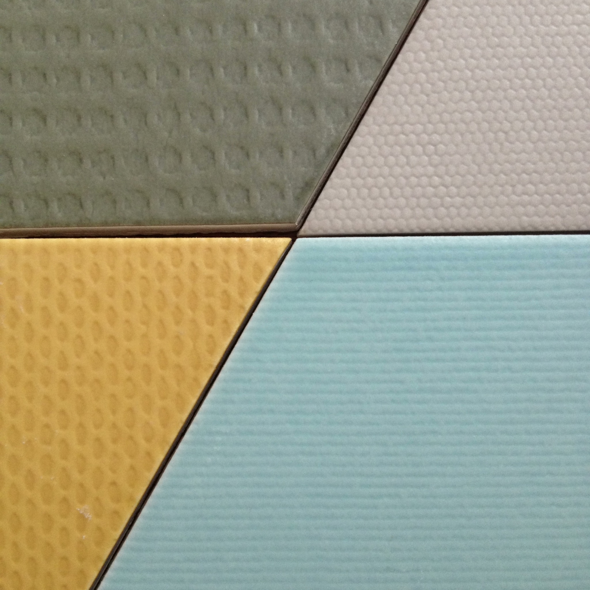
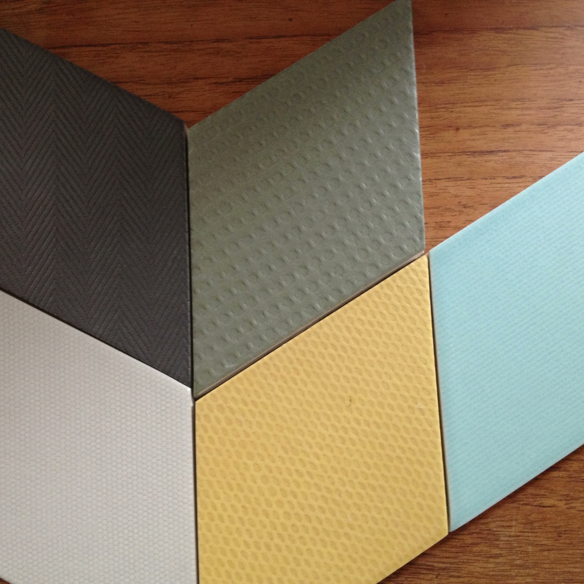
The rhombus shape means that you can make different patterns on the floor: arrows, diamonds, squares. The different textures mean that even if you used only one colour way, you would still have a visually interesting element. The three shades per colour give you an instant 3D effect. I LOVE this so much. For a kitchen floor or backsplash, a bathroom or a playroom, this is not just tile, it is ART.

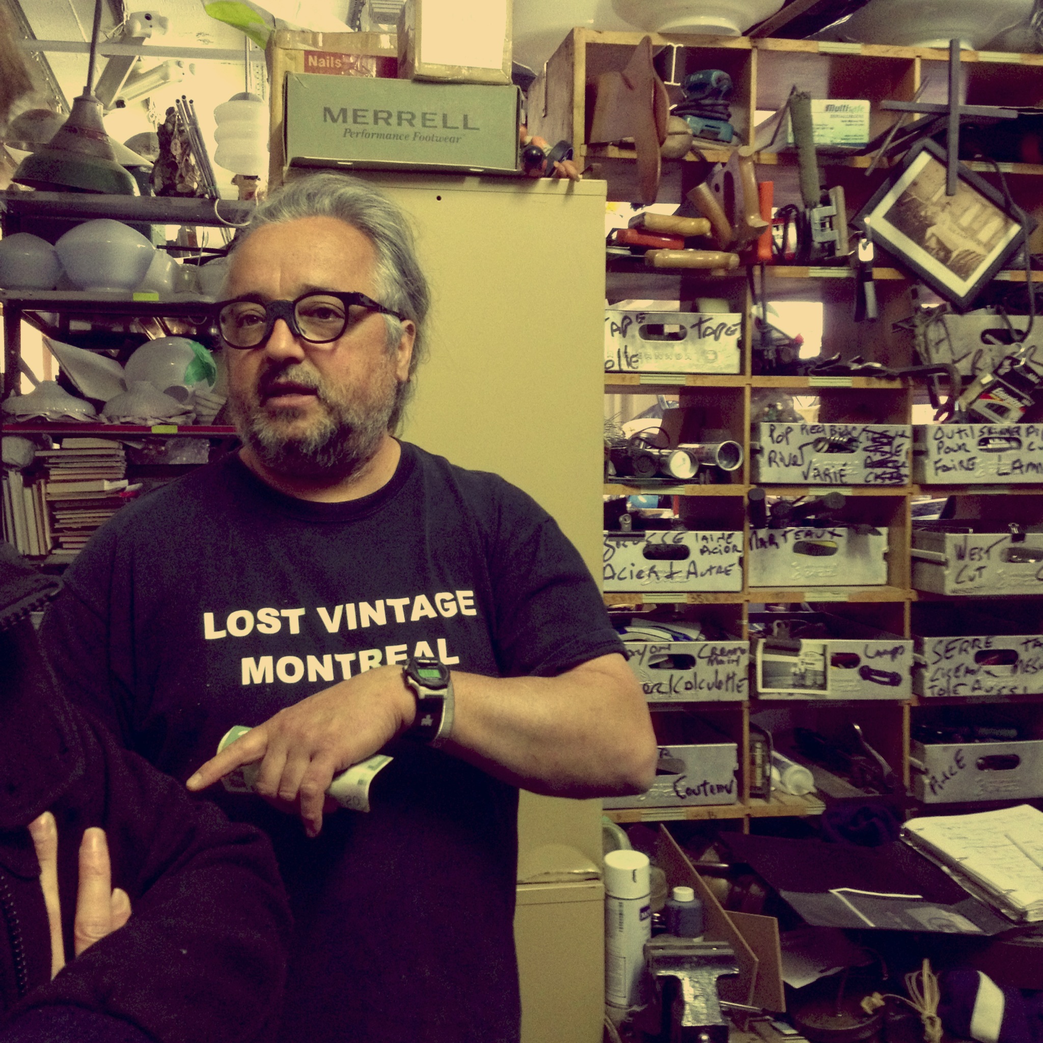
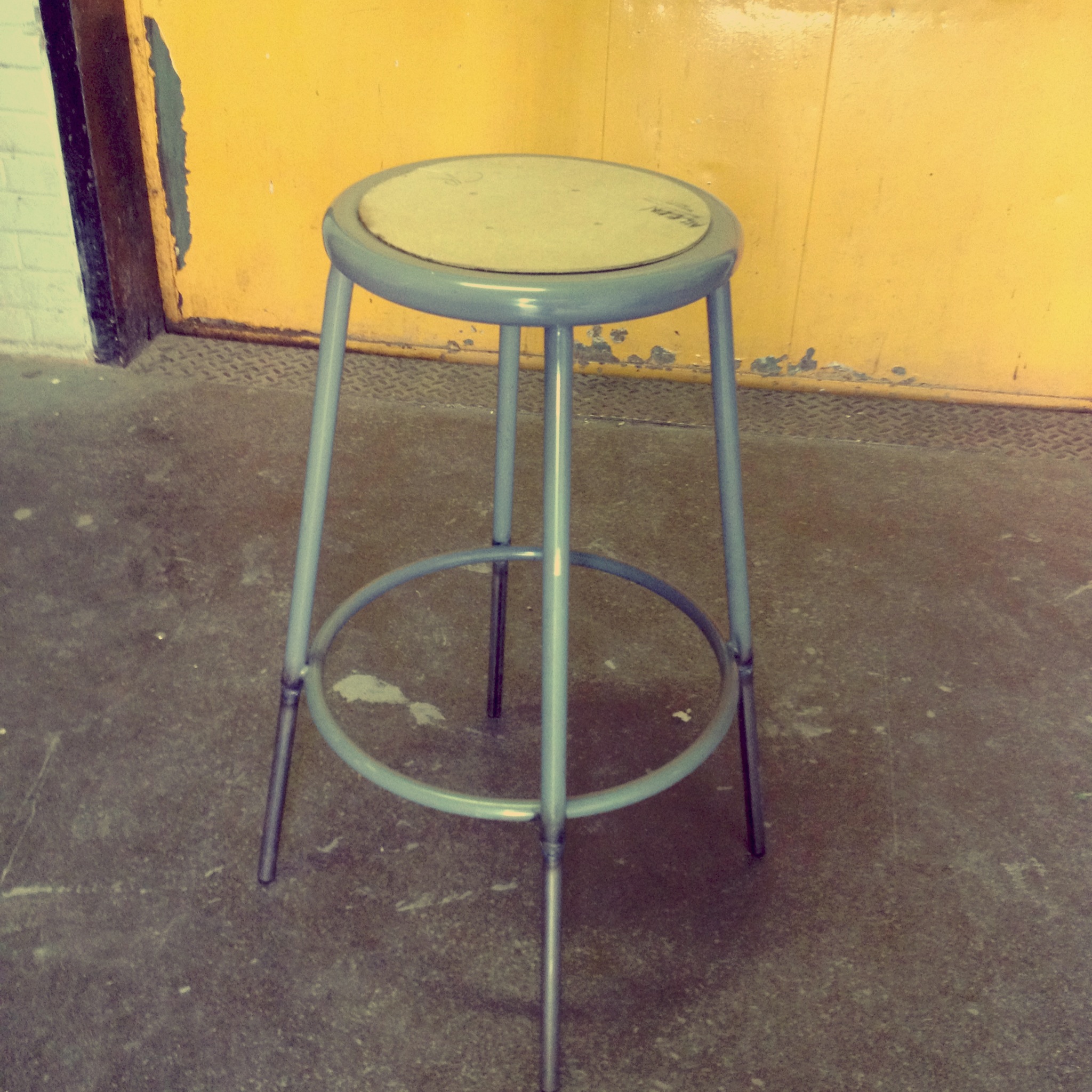
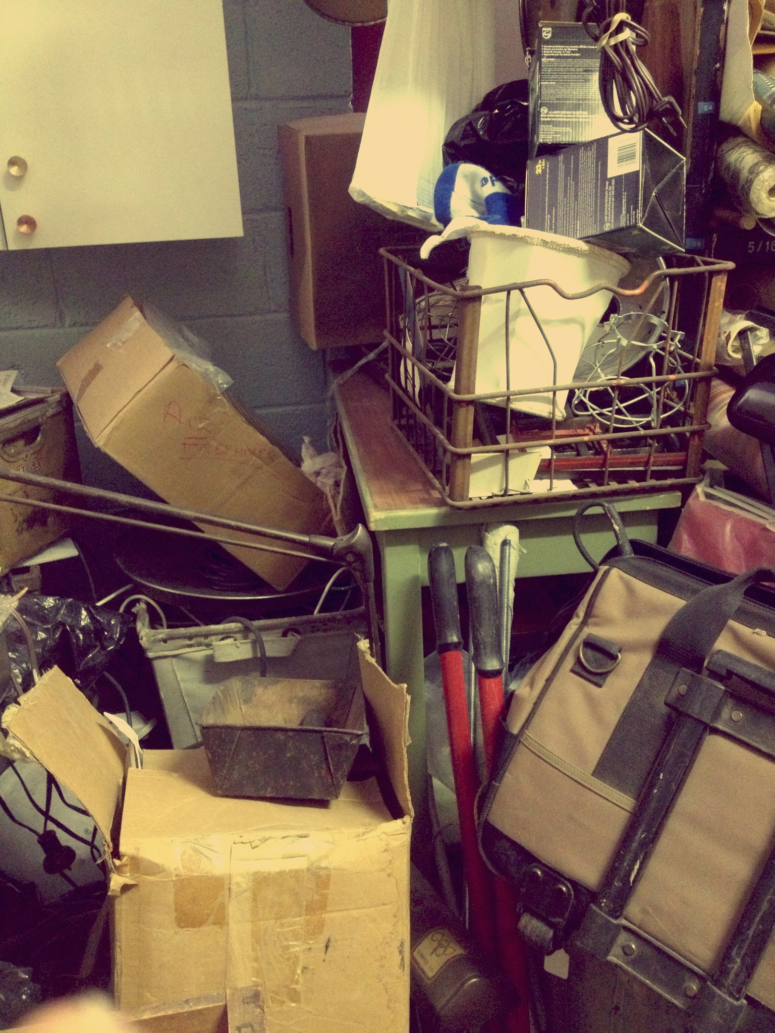
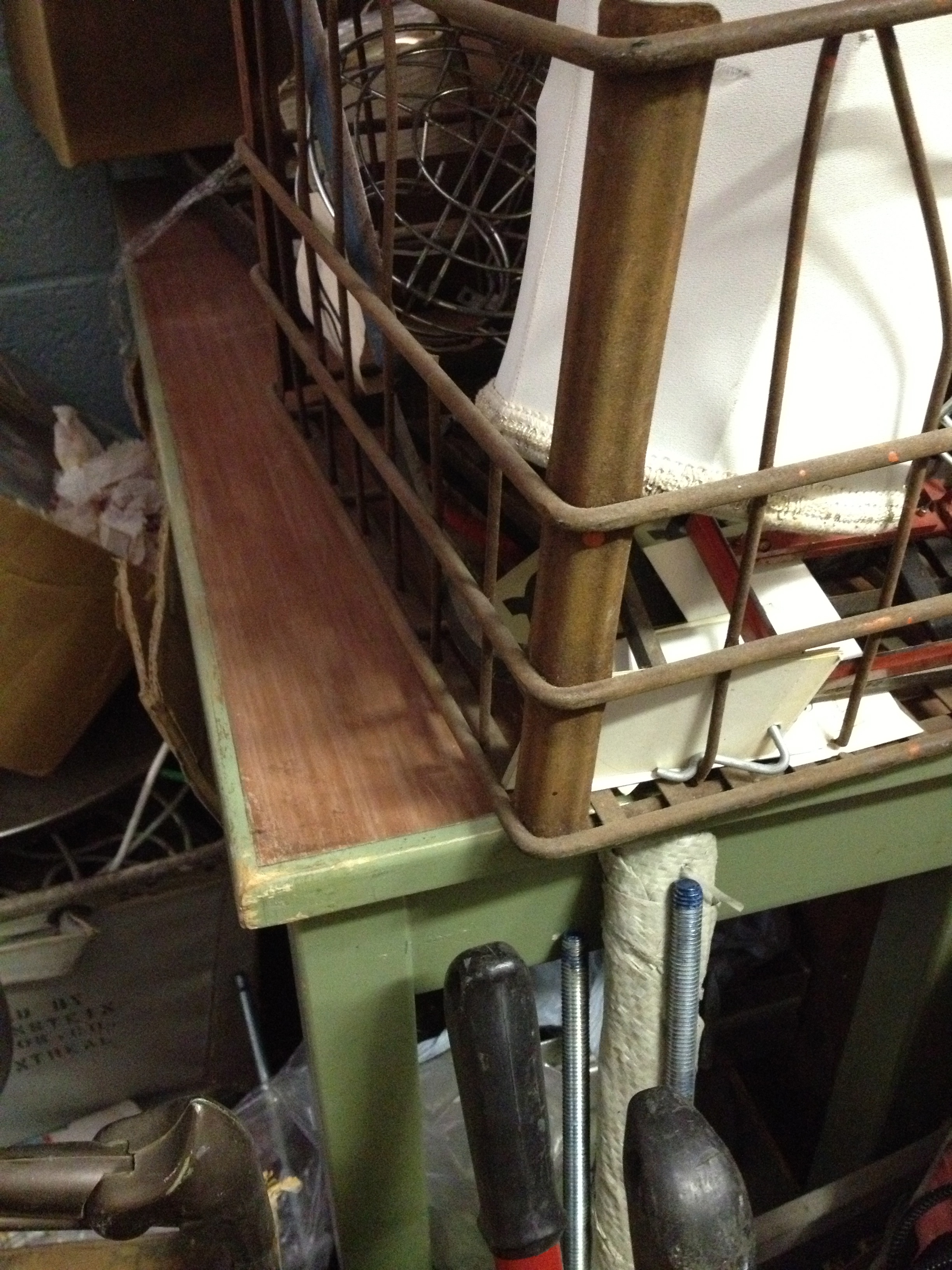
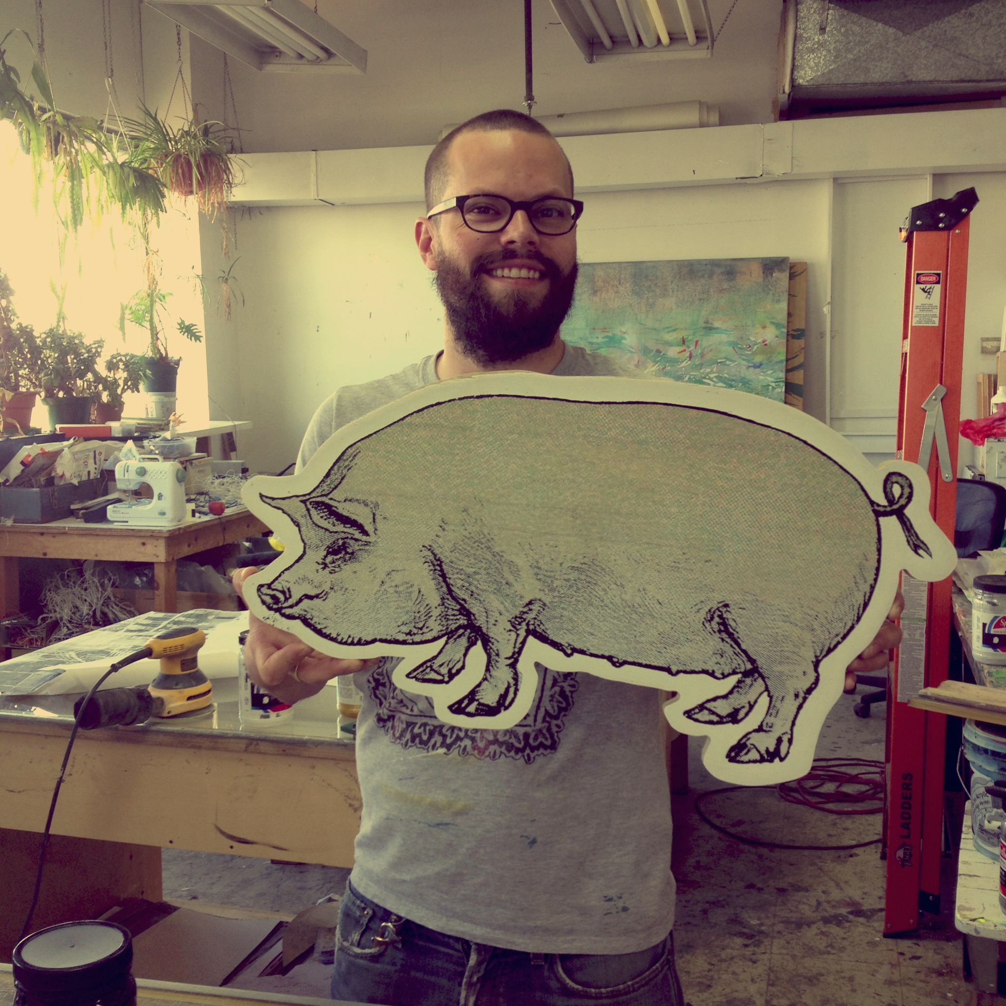
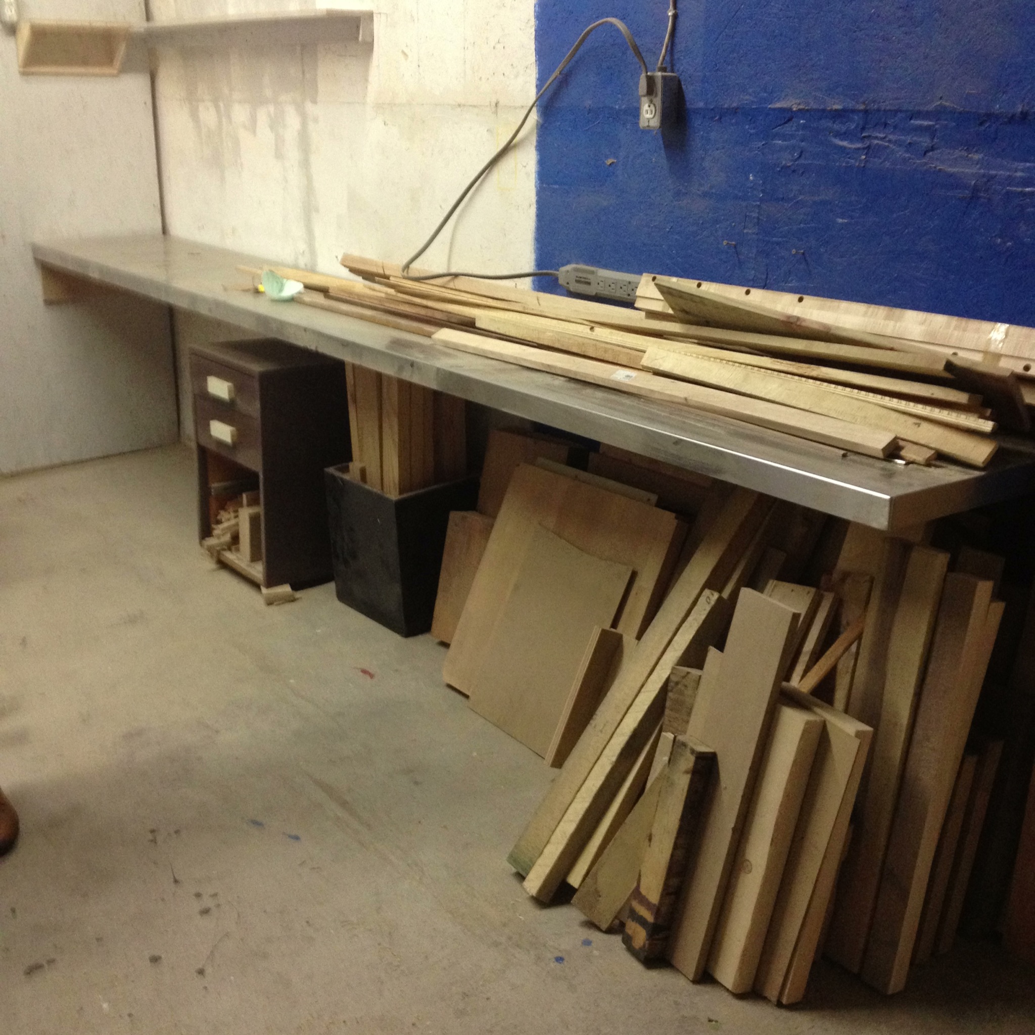
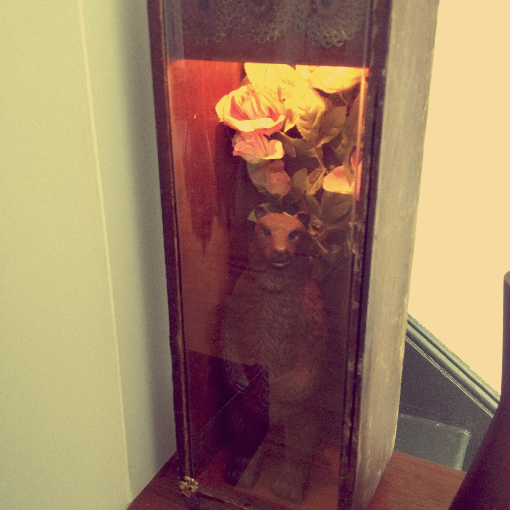
And speaking of art, (albeit in a completely different vein), one of my closest friends has been making beautiful works that are really worth seeing. Her name is Jessica Moss and we have gotten very close over the last three years. Our sons were born two days apart. They go to the same daycare, so we see each other every day. And we really, really like each other. She is beautiful and talented and a great mama and I’m so lucky to have her in my life. For many years, she has been making light and shadow boxes with mostly found objects. For the boxes themselves, she uses old suitcases, tool boxes, crates, etc. They are beautiful and magical and haunting. These are some pictures I took of her studio, a cabinet of curiosities – a beautiful, magical, haunting place:

IMG_6738     IMG_6742

IMG_6744     IMG_6735

IMG_6741     IMG_6743

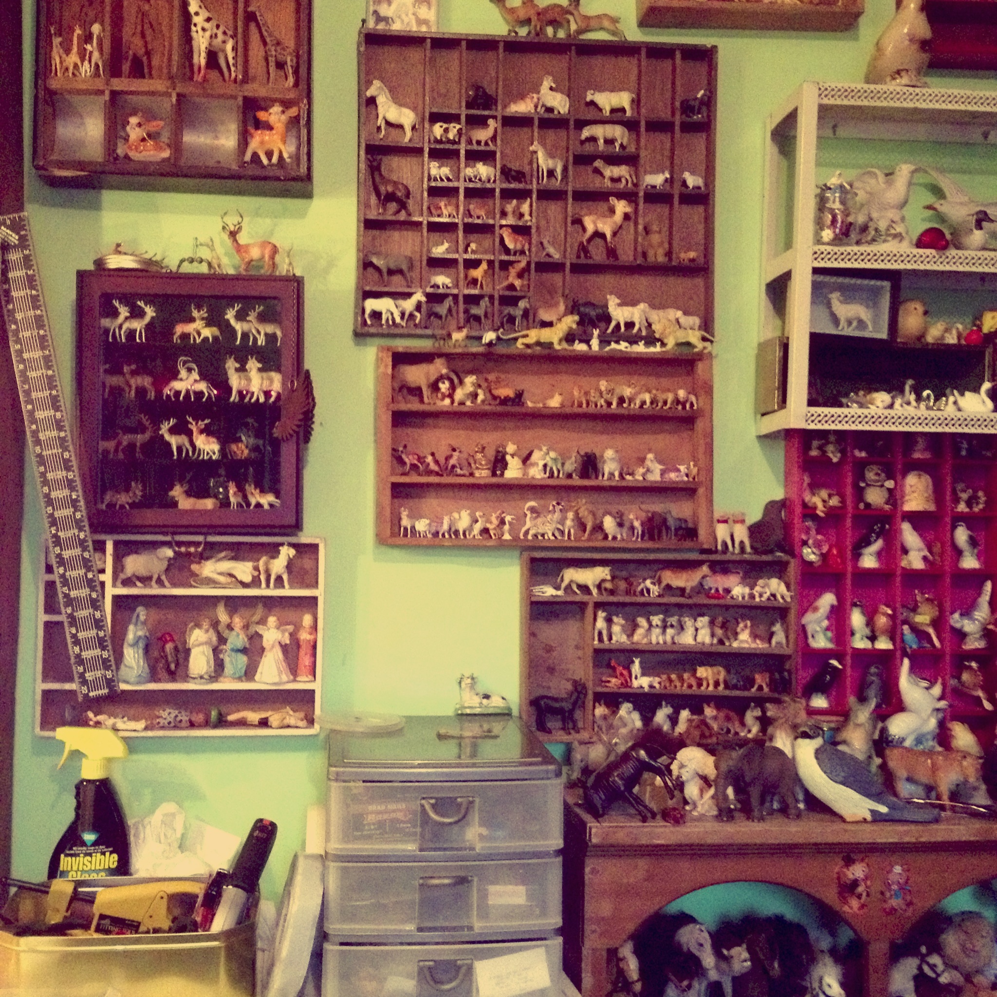
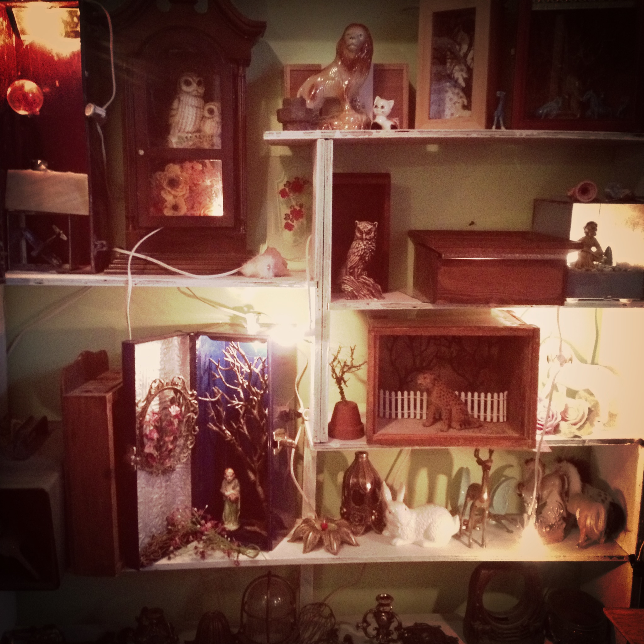
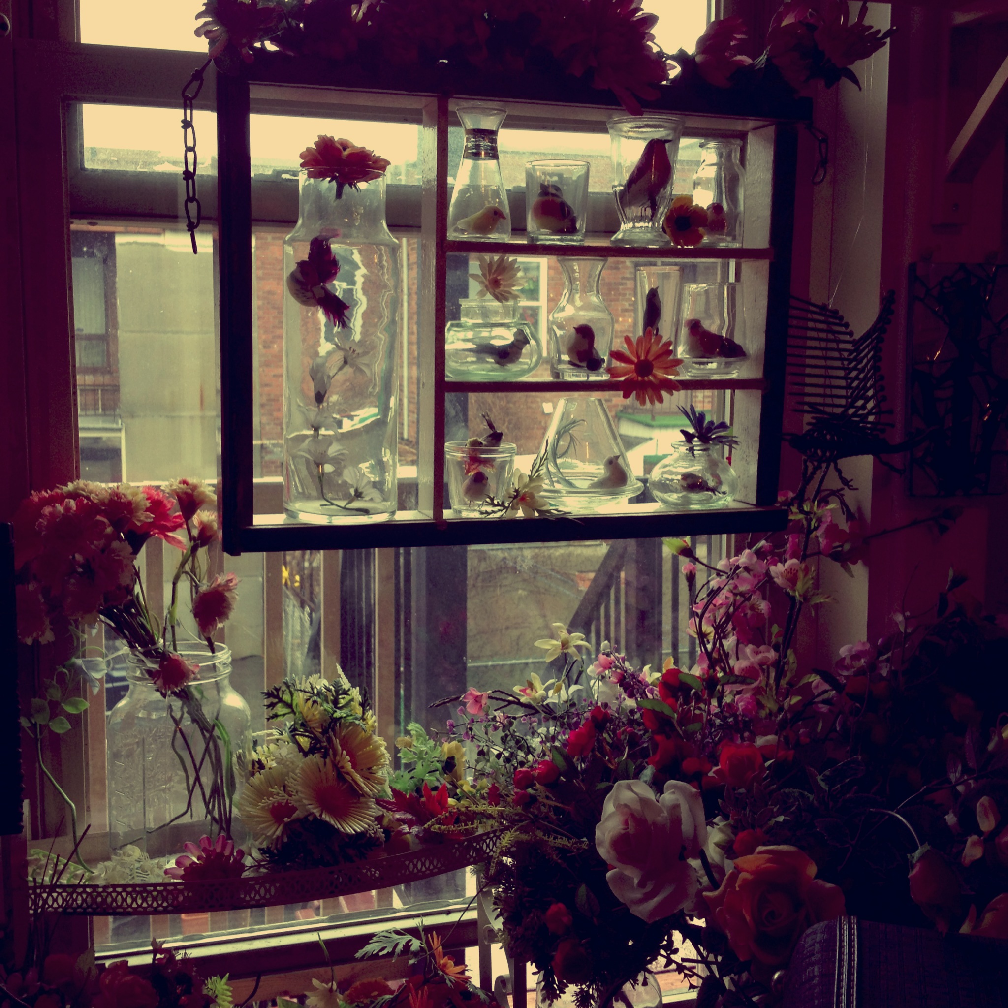
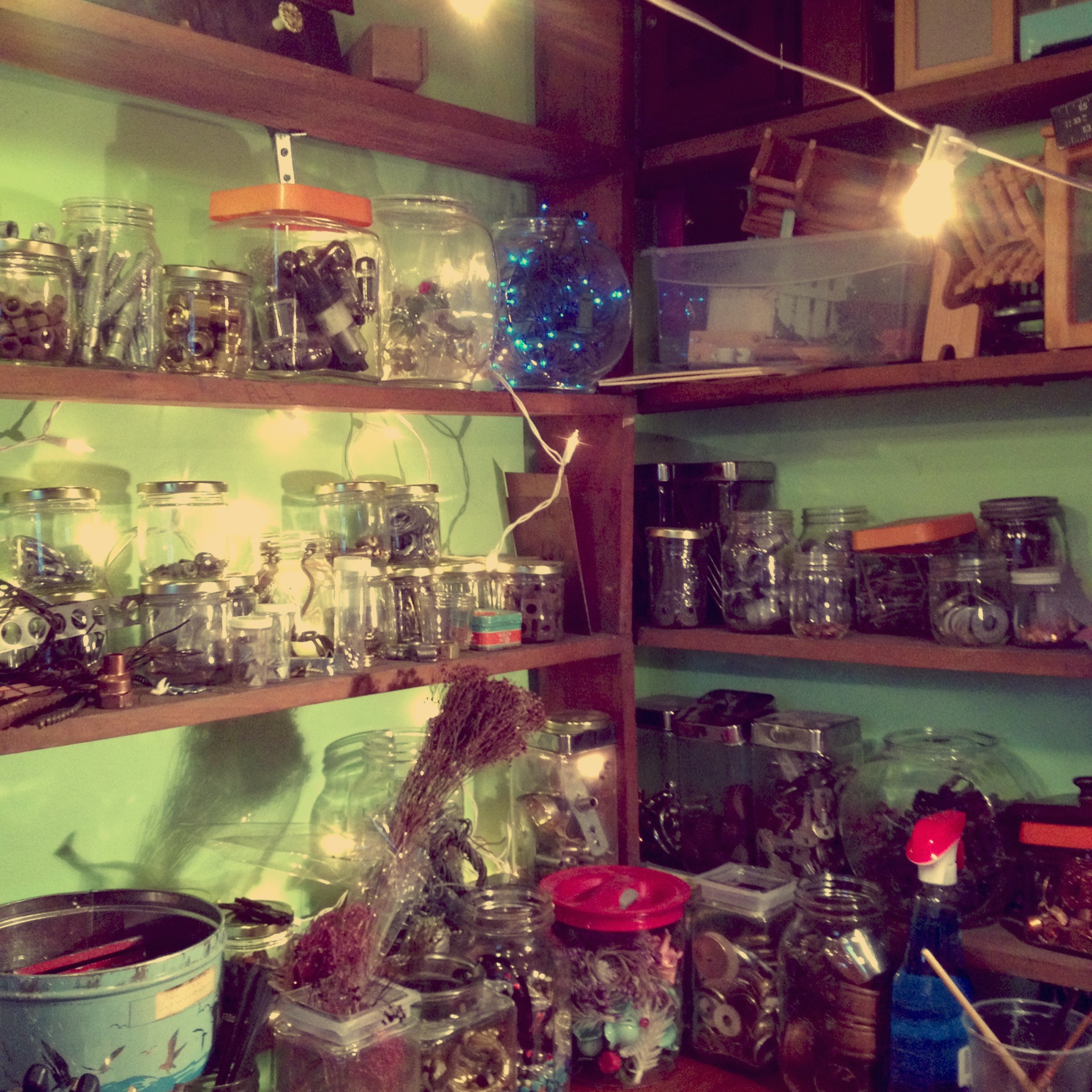
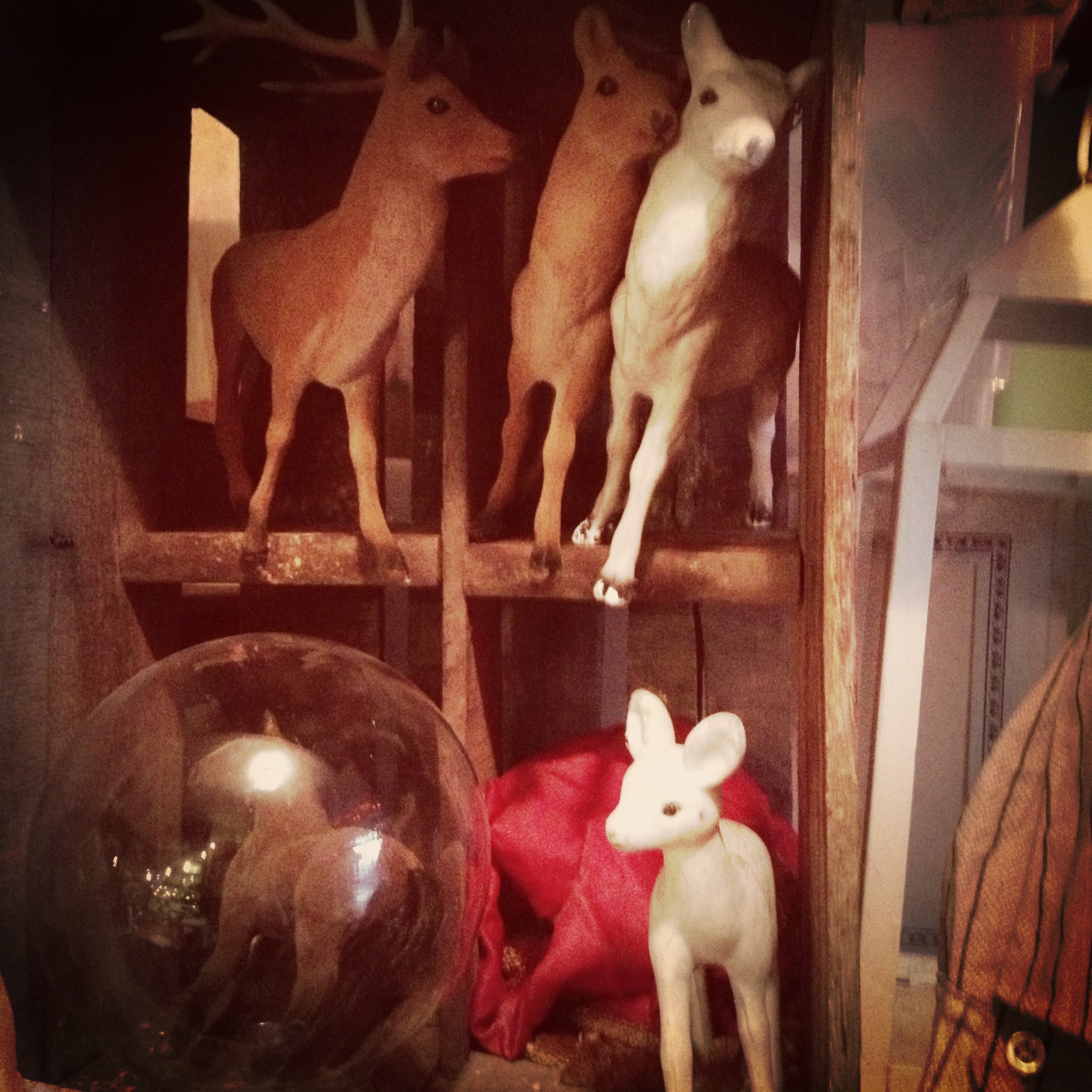
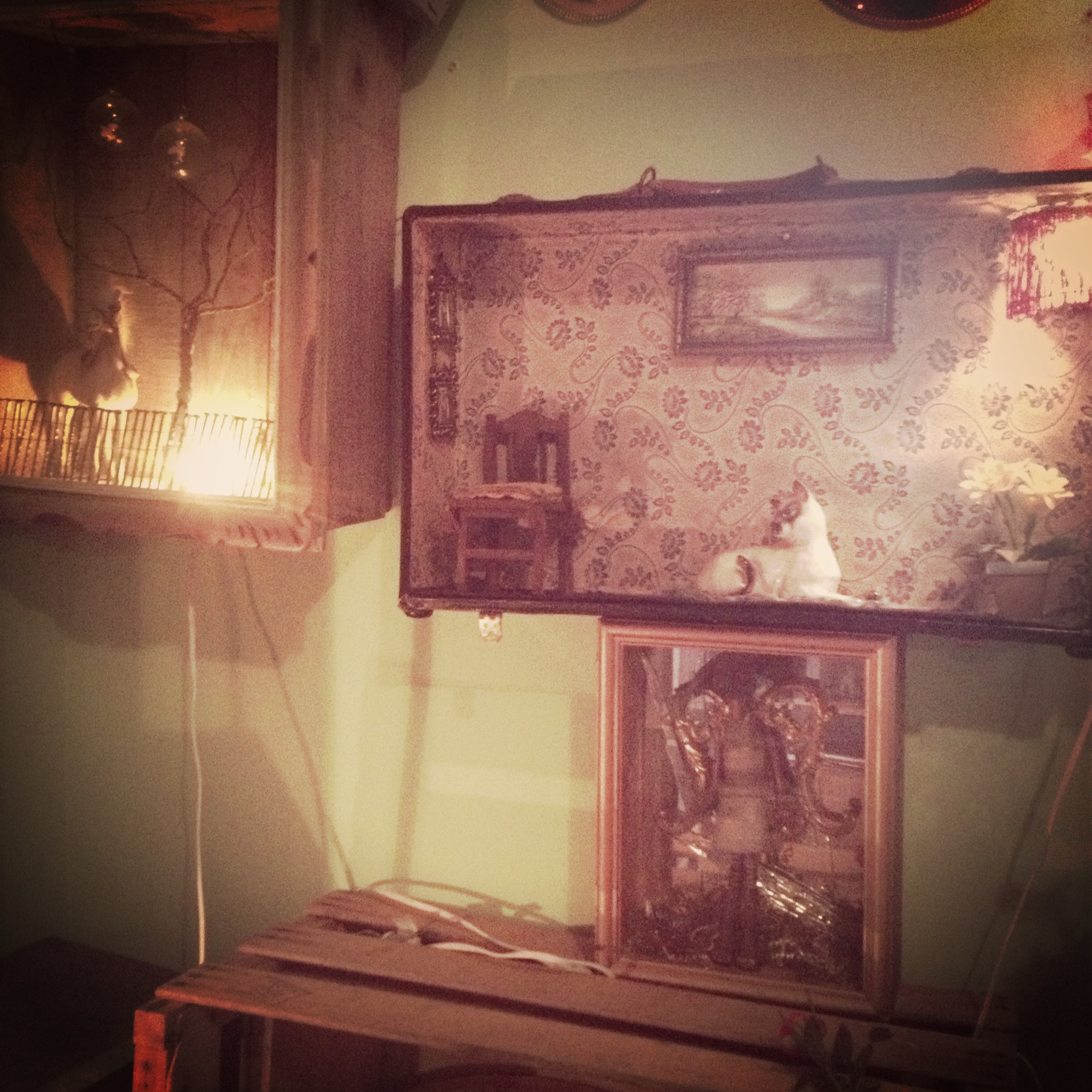
There are places that I absolutely love going to: pharmacies, hardware stores, flea markets. Jessica’s studio kind of feels like that – maybe not a pharmacy but definitely the other two. Bits and bobs everywhere, pieces of wallpaper and fabric, tools and little animals and angels and plastic flowers and feathers. And the boxes themselves are so sweet and romantic and sad. I love it when you have to get right up close to a work of art, really get in there, and you see all the little touches and textures and treasures.

This is a shadow box that we bought for our home. We haven’t found its permanent spot yet but for now Mr. Bear stands guard.

IMG_7430      IMG_7438

At the end of my bad, bad Tuesday, I picked up O from daycare and went home with the kids and we made pizza. It was my first time ever trying and I knew it could go either way. He is a picky eater and little Lou is too young to really enjoy the process. But I needed to try and turn the day around. I had picked up pizza dough from my neighbourhood Italian grocery store and a rolling pin from my horrid Ikea trip. I sautéed some veggies in advance and then let the kids roll out the dough. They got to choose what they wanted on there. My son loved it all and my daughter loved eating flour off the counter. We made a mess. We made faces on their pizzas with the veggies. We had so much fun. And the picky kid ate the whole thing.

IMG_7429     IMG_7428

IMG_7427

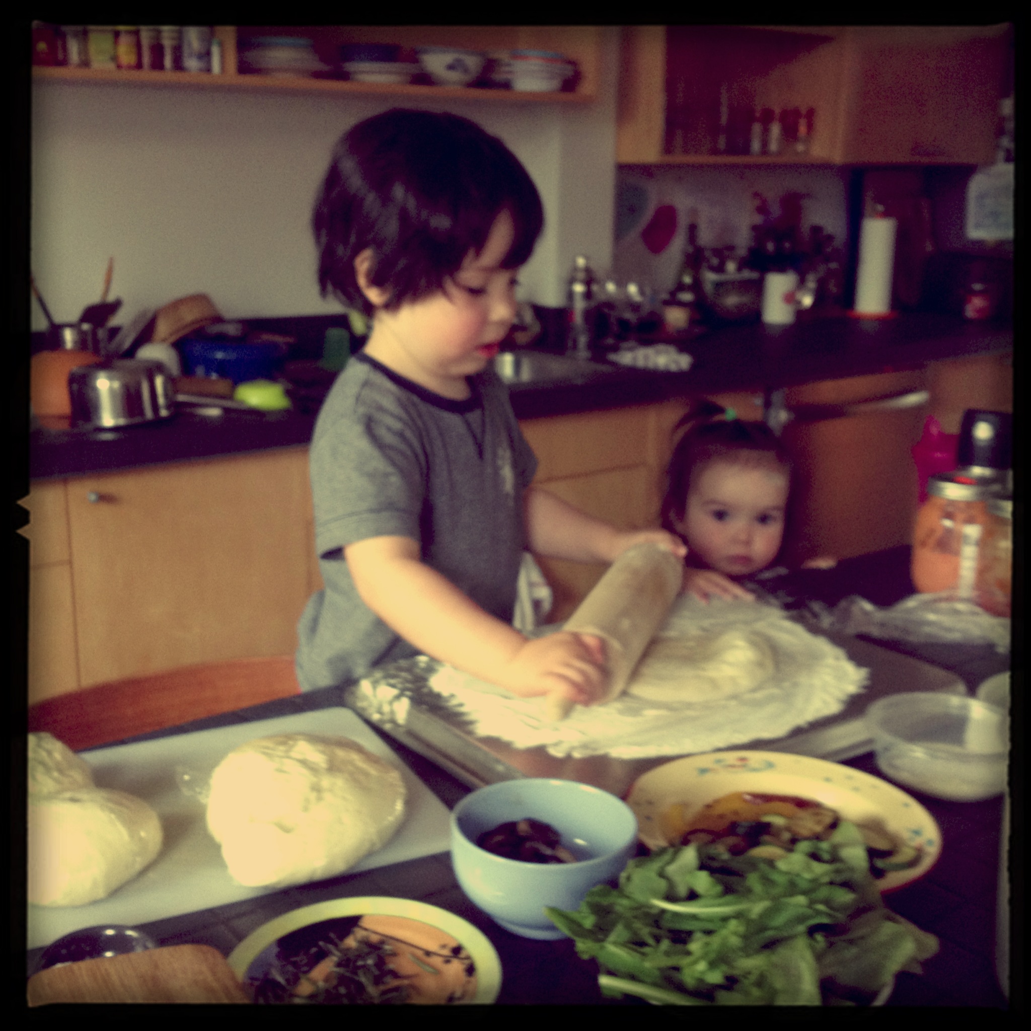
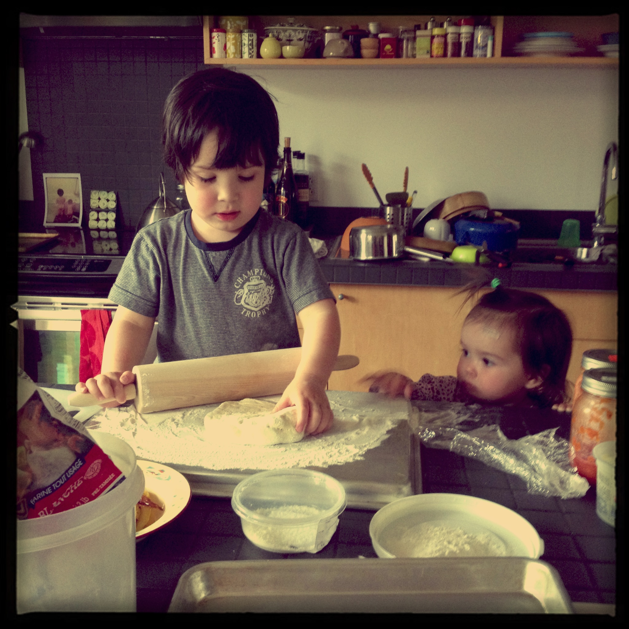
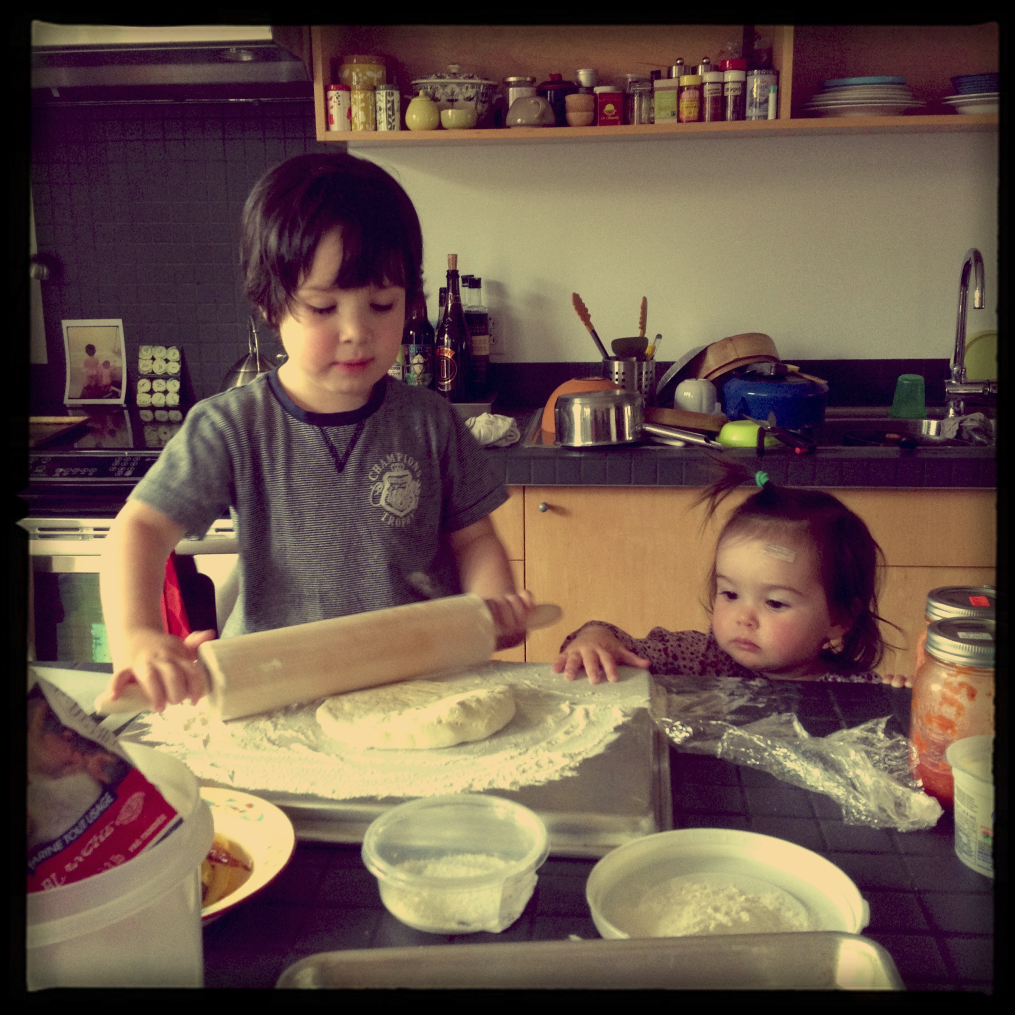
Thinking about these beautiful things and beautiful people I love was a surefire way to turn the bad, bad Tuesday around. Pizza also helped.

xa

Comments { 2 }

Finds

While the floor debacle continues, we went to visit Bernard from Lost Vintage. It was through him that I got the bowling alley flooring that I used for the tables and bar at Lawrence. We got into a silly phone argument three years ago, I hung up on him and have not spoken to him since. Until now. How to put it nicely? He is pretty crazy. He won’t phone you back. He’ll forget that you spoke before. He’ll forget the price quoted. There are no prices anywhere on the site so you need to get to him and get him to tell you what he wants for stuff. And he’ll fly off the handle if you blink funny. But he is passionate about what he does, loves his job, loves his finds. He has tons of stuff in warehouses and containers outside of the city and a huge warehouse in town. It is a massive jumble of great and trash and totally random. We need stools for the counter and he has the best prices in town. So to Bernard’s we went. And he had no memory of who I was. I didn’t remind him and he probably wouldn’t have cared if he had remembered.

IMG_7249

Bernard

IMG_7247

We got 8 of these. For now, I think we’ll leave them grey but he had some painted army green on his site & they looked beautiful.

IMG_7251     IMG_7239    

I spotted this table under a ton of stuff that will do nicely for the coffee maker.

IMG_7240

A little swing garbage can in creamy white

There is potentially a bench for the waiting area and other maybes, but for now I’m pretty pleased with our loot.

In other news, we got our lamps back from Lambert & Fils. They look amazing and I am so super psyched about the big one that will go over the giant maple table. We had them paint it and I admit to feeling a little nervous as I hadn’t seen the colour (other than on the spray can cap). My friend Rory did the spray paint job and it looks perfect!

IMG_6653  Before


IMG_7292   After

In the continuing saga of the Lawrence terrasse news, we have submitted our fourth (!) plan to the city permit office. One of my bestest friends ever happens to be an architect, Erica Goldstein. Super talented. Very smart. Great person. Great mom. She is like a sister. She has been making us drawings and we keep submitting them and the nice lady at the city office keeps sending them back with teeny changes. My favourite change request came today when she asked that the entrance to the patio be 1.8 meters (Who works with meters? So annoying). Erica had made the entrance 0.9 meters based on the city’s documentation on their website. THEIR rules on THEIR website. Apparently the regulation was amended 3 months ago. Good to know. Anyhow, due to all the nutty city rules (i.e. leaving 6′ clear on the 10′ sidewalks for pedestrians), we need to build what is basically a long enclosed pen. Like for cattle. Cattle with good taste. My worry was that whatever material we used for the pen would eat up our already mini space. Then a week ago as I was leaving my house I noticed that the building they are gutting on my corner has these pretty great balcony railings.

IMG_7294   IMG_7295   

                   Love how they aren’t fancy, swirly or too pretty

It occurred to me that they would make for a cool patio railing. I made a deal with the foreman to buy the railings that he was otherwise going to bring to the dump. So for 250$ he’ll cut them into eight foot lengths and give me 40 feet. I was worried the city would say no. I mentioned how re-using this meant-for-the-trash-heap railing fell in line with the philosophy of the restaurant: using local product, no waste, using all parts of an animal, etc. A bit of a stretch – comparing the delicious food that Marc cooks to an old balcony railing on a decrepit building, but again, business is business and I had to get ‘er done. Luckily the nice permit lady said that they would allow us to use this unorthodox solution. Small victories…

The floors, meanwhile, are being sanded and painted and they are not what I want but hopefully will just disappear into floor and not be FLOOR. As we used to say in my set-dec film days :” If anyone in the audience is noticing the *fill in the blank* (in this case, “floor”) it means the script and acting suck.” So hopefully, the only people noticing the floor will be the five people reading this and everyone else will love the space and the food we are selling. In fact, I’m sure of this. We are not selling floor. We are selling food. And maybe some cute tote bags.
xa

Comments { 0 }

Return customers

This is an especially busy time for decorators/designers. As the weather gets warmer, people are asking for advice on renos big and small.

Clients I met with in October of last year asked me to come by for a new consult. Christine and Pierre were regulars at our restaurant and became friendly with the hubby and me. They liked my aesthetic and when it came time to renovate their kitchen, they gave me a call. They have good taste and  I was excited to be a part of their project. They had done work in the rest of the apartment but had left the kitchen pretty much as it was when they moved in. The space was nice but definitely needed updating. Also, there was a giant pantry that stuck out in the space like crazy, creating a real visual barrier between the kitchen side and the future breakfast-nook area. This meant that the back area was dead weight – not being used properly, if at all.

IMG_3874     IMG_3871     IMG_3868

IMG_3867     IMG_3865     IMG_3866

My number one suggestion at the time was for them to get rid of the pantry. It ate up way too much of the space, making the space between it and the outside wall a useless corridor. And that flooring – nobody liked that. My idea was to knock the pantry down and make the future long-wall the stove, sink and all lower cabinets wall. Then, put all the tall pieces (fridge, pantry, tall cabinetry) on the current sink/dishwasher wall pictured below:

IMG_3870   Pierre, Christine and Terry

I put them in contact with a contractor I work with often, Terry Lalos. And then we found out that the pantry was a sustaining wall. Double yuck. Terry got them a structural engineer. And that’s where my initial involvement ended. The cost of removing the pantry and adding beams was pretty much their budget right there. Unfortunately for me, this happens in my line of work quite a bit. My ideas for a space’s layout can end up costing the client more and then there is little money left over for the fun stuff: the tile, paint, fixtures, cabinetry, counters, furniture. Little money left over to afford a decorator (sad face). Basically, this line of work won’t make me rich anytime soon, much to my mother’s chagrin. But I can not tell a client in good conscience to live with something I find ugly or impractical so that I can be sure to have money left in a budget for me. So, that is sort of what happened with Christine and Pierre. They decided to rethink and also reexamine their finances. The cost of the structural work meant that they would also have to do a lot more work themselves. I didn’t hear from them again until two weeks ago, when I received an email from Christine asking for advice. In the end they had had the pantry removed and beams put in. She wanted me to come by and approve her plans. And then I didn’t. At least not exactly.

IMG_7105     IMG_7103

IMG_7107   where the giant pantry used to be

Christine had laid out a plan that worked well for her. But it wasn’t perfect. The problem being that when they had removed the pantry, the engineers added crazy giant beams. The North/South axis was fine, it just created a contour to the space but the West to East beam broke the space in a weird corridor, too close to the wall to make much sense or to be used in a decorative way. Another twist: they are expecting a baby (yay!) so needed to add a home-office space to the kitchen as their current office was becoming the baby’s room.

IMG_7110  now the giant beams live here

So because of the beam placement, I flipped her plan around. All the lower pieces (stove, sink, dishwasher, desk) needed to be on the wall I’d originally suggested – the long wall. Tall pieces (pantry, fridge) needed to go on the current sink wall. I felt a little bad doing that; she had thought about her way a lot and was satisfied with her design. But those beams were in the way of making it look good, in my opinion. Sometimes you can impose your will on a space, sometimes the space speaks to you. And sometimes a structural engineer makes the decisions. After poring over her plans, we came up with what I think will be a more logical use of the space, one that takes the new reality into account. I’m happy with where it is going and I’m super excited to see it come together. Christine is not only lovely but also knows what she likes, has a real sense of space and good taste. The problem here was a curve-ball thrown by the beams and, sometimes, living in the midst of the renos means that you are too close to it all. She just needed a fresh set of eyes. I’m glad she asked for mine.

xa

Comments { 1 }

Heartbreak

As my last post was titled “love” this one can only be called “heartbreak”. After all the clicking into place of things at the butcher shop, I hit my first real speed bump. More like whatever would make you angrier than hitting a speed bump. The floors! The dumb floors. My fingers crossed clearly did nothing to help us with the colour of the floors. A refresher on the saga of the floor.

We started with maple-very short planks (too short!) but nice overall quality:

IMG_6583

We wanted them to look like the Lawrence floors which are painted russian ply:

IMG_7245

I was really on the fence about straight up painting the butcher shop floor. For one, it is way better quality wood than at the restaurant. When you are starting with less quality, covering it with paint is a great solution. I thought that a wash would be the way to go so we did a couple of tests using the same paint colour (Puritan Gray by Benjamin Moore with water to dilute it) as at Lawrence:

IMG_6769

Then we brought actual floor people in. They suggested a stain and then 4 layers of varnish on top. They did a test using our paint colour and a charcoal grey that they recommended:

IMG_6981

And this is where it all goes wrong. The Puritan gray looked really green on the maple. The charcoal grey was really blue/brown. And instead of saying what a little voice inside me was whispering :”neither of these is right”, I went with the darker, greyer version. I should have asked for more options, even if it meant delaying the finished product. I should have been a little bossier with the floor folk. I also should have gone back to the original dream which was to have a white washed PAINTED floor. No stain. Paint. Shoulda, woulda, coulda… Instead I woke up to a text from Sefi insisting that the new floor looked like poo.

IMG_7254     IMG_7258

IMG_7257     IMG_7255

Now poo might be a little strong. In some light, the floor either looked blue, grey, brown or purple. And to be honest, if it were just the stain colour I would probably be able to live with it. But the combination of the stain colour, the orange/brown/yellow/red of the brick and the very short planks was too much. We are fighting the space on this project: it looks really shiny and loft-like and new and this floor does not break that look at all. It underlines it. But my main issue is that it made this nice hardwood floor look like cheap, engineered floating floor from Home Depot. Not that there is anything wrong with using that kind of flooring. In a basement. But in here? Hell to the no!

So we have decided to swallow this costly mistake. This is a huge expanse of floor. The bad colour was making all of my other choices look bad. This is the floor. It needs to be right. So. We are going to re-sand (why the 4 layers of varnish, why?). Then we are going to paint. It will be flat and not white washed but it will be waaaaaay better. In Sweatshirt Gray.

IMG_7288

So my life lessons this week: it is always best to listen to your gut (obviously). Ask a bajillion questions if you can’t quite picture something. And if the mistake is made and you really hate it and you can afford it (and even if you can’t), fix it instead of sucking it up. You may always regret having made the mistake but you won’t regret fixing it.

xa

Comments { 0 }

Love

There is nothing quite like the feeling you get when pieces start falling into place – it could be finding the perfect colour for a wall, the fabric that will tie the whole room together, or the tile that will make a space sing. Or, it could be seeing the sign that will make the entire project make sense in your head. Literally. It is totally like that feeling of excitement you get when you have a crush or you start to fall in love. On Thursday last week, I fell in love with a little pig and then everything clicked from that moment on. My day started with a meeting at Jason‘s office. Sefi and I went to check on his progress and that is when we met pig:

IMG_7147     IMG_7155

We then watched as Jason added the screen printed cut lines. The screen printing process is lots of fun to watch happen and especially watching a pro like Jason work. He is so confident, so creative, so excited by the work he does. It is contagious being around him. You would have to be dead inside to not feel it.

IMG_7150     IMG_7151

IMG_7152

The result:

IMG_7153

Great! Not too Victorian, not too trendy, looking like a tattoo kind of. Just perfect.

Once he’s done it will look like this:

IMG_7148

Pig will be swinging in the wind, greeting our customers, right outside the shop. And Pig will not only be our signage/address, he’ll also be made into a stamp and we’ll be able to use him as part of the Boucherie brand and merchandise -maybe on tote bags, maybe on tags. Pig everywhere!

Jason then showed us a framed version of our Lawrence wallpaper and boy does it look sweet. In his generosity, he offered to give it to us to hang in the space. I had wanted to wallpaper the bathroom at the shop but the ceilings are low in the basement and we opted to paint for now. Still, I was bummed that the wallpaper wouldn’t be there. Now it can be, in a small way. I love how it will tie into the restaurant. Maybe it’ll go over the lunch counter on the brick wall side? Maybe in the bathroom? Either way, we’ll find a spot for it. It’s like family somehow – those faces have become so familiar in the last couple of years, I can’t imagine them not following us over to the shop in some way…

IMG_7158

After that meeting we went to meet the other J in our life, Jacob Logel. He is an ironworker/designer and man about town who built the table I designed for the restaurant:

table2

We thought it would be smart to bring him in and see what he could do with the sandwich counter. The wrap around window was always the main problem with the u-shaped counter that I wanted. It meant having to add a pole in the corner and trying to find a way to attach the different sections.

IMG_7168

Obviously we could attach on the brick side, but what to do on the glass? We met with Jacob and he gave us the key. He just so happened to have one 12′ piece of stainless steel counter that he had taken from a restaurant that was closing down. He offered to sell it to us. And it was exactly the right thing.

IMG_7159

We went to his shop and for the second time that morning I fell in love a little. It would fit perfectly along the window. But then how do you solve the other two counters that make up the U or C shape? Having counter like that made, in steel, would be our whole budget. Actually exceed our budget by a lot. And then I thought back to our original idea for the counter: something to resemble our bavarian beer garden table at Lawrence (again!).

IMG_6958

And Jacob said he could make it for us no problem. How do you tie it all together, though? By having the stainless steel and the wood counters on either side of it, all have the same painted steel legs:

IMG_7161     IMG_7165

And it all clicked a little more into place. It would now have to be three independent counter pieces with similar hardware.

IMG_7162     IMG_7164

IMG_7166 Jacob, his steel, sketching and the one quirk to the counter – a little hole.

After our visit with Jacob, we decided to head over to the lumber-yard and pick up two 83″ pieces of wood to use as the side counters. I had gone there the week before thinking that maybe maple could work with the large maple butcher block table. I hadn’t found any maple that was the right size or width but there was this rounded pine:

IMG_6973

Once I fell for the stainless steel, the thought of bringing in any kind of wood on either side of it didn’t work. But painted wood could be an option. Maybe painted in the Onyx of our mouldings? Pieces clicked into place completely. Stainless steel counter piece along the front windows with three beer garden table-like legs, two side counters in a painted wood with the same legs for the side that is on the right against the other window, and brackets painted the same colour as our legs for the brick side. I especially wanted to avoid the heaviness of most bars – this is as close to floating as I could get.

IMG_7170     IMG_7171

Our helper at Villeneuve. I swear the guys that work there are either super old or they look like they should really be in school.

And so in one day, the outside sign and the counters all started making sense. It all clicked. Boom.

And then after work, my kids had me falling in love again on the way home.

IMG_7176

xa

Comments { 0 }